Common Configurations
The following diagrams give you an idea of how you can configure objects of the four primary text system classes—NSTextStorage, NSLayoutManager, NSTextContainer, and NSTextView—to accomplish different text-handling goals.
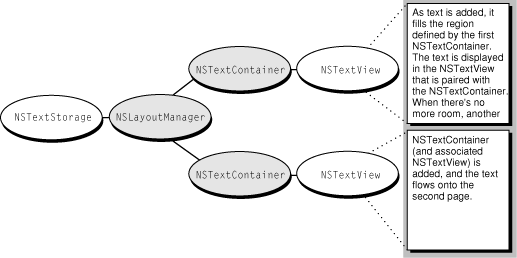
To display a single flow of text, arrange the objects as shown in Figure 1.
The NSTextView provides the view that displays the glyphs, and the NSTextContainer object defines an area within that view where the glyphs are laid out. Typically in this configuration, the NSTextContainer’s vertical dimension is declared to be some extremely large value so that the container can accommodate any amount of text, while the NSTextView is set to size itself around the text using the setVerticallyResizable: method defined by NSText, and given a maximum height equal to the NSTextContainer’s height. Then, with the NSTextView embedded in an NSScrollView, the user can scroll to see any portion of this text.
If the NSTextContainer’s area is inset from the NSTextView’s bounds, a margin appears around the text. The NSLayoutManager object, and other objects not pictured here, work together to generate glyphs from the NSTextStorage’s data and lay them out within the area defined by the NSTextContainer.
This configuration is limited by having only one NSTextContainer-NSTextView pair. In such an arrangement, the text flows uninterrupted within the area defined by the NSTextContainer. Page breaks, multicolumn layout, and more complex layouts can’t be accommodated by this arrangement.
By using multiple NSTextContainer-NSTextView pairs, more complex layout arrangements are possible. For example, to support page breaks, an application can configure the text objects as shown in Figure 2.
Each NSTextContainer-NSTextView pair corresponds to a page of the document. The gray rectangle in the diagram above represents a custom view object that your application provides as a background for the NSTextViews. This custom view can be embedded in an NSScrollView to allow the user to scroll through the document’s pages.
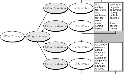
A multicolumn document uses a similar configuration, as shown in Figure 3.
Instead of having one NSTextView-NSTextContainer pair correspond to a single page, there are now two pairs—one for each column on the page. Each NSTextContainer-NSTextView controls a portion of the document. As the text is displayed, glyphs are first laid out in the top-left view. When there is no more room in that view, the NSLayoutManager informs its delegate that it has finished filling the container. The delegate can check whether there’s more text that needs to be laid out and add another NSTextContainer and NSTextView. The NSLayoutManager proceeds to lay out text in the next container, notifies the delegate when finished, and so on. Again, a custom view (depicted as a gray rectangle) provides a canvas for these text columns.
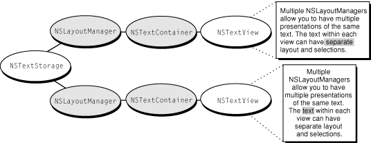
Not only can you have multiple NSTextContainer-NSTextView pairs, you can also have multiple NSLayoutManagers accessing the same NSTextStorage. Figure 4 illustrates the simplest arrangement with multiple layout managers.
The effect of this arrangement is to give multiple views on the same text. If the user alters the text in the top view, the change is immediately reflected in the bottom view (assuming the location of the change is within the bottom view’s bounds).
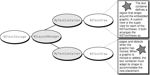
Finally, complex page layout requirements, such as permitting text to wrap around embedded graphics, can be achieved by a configuration that uses a custom subclass of NSTextContainer. This subclass defines a region that adapts its shape to accommodate the graphic image and uses the object configuration shown in Figure 5.
© 1997, 2009 Apple Inc. All Rights Reserved. (Last updated: 2009-04-08)


