Legacy Document
Important: The information in this document is obsolete and should not be used for new development.
Important: The information in this document is obsolete and should not be used for new development.
|
PATH |
The following Control Manager data types are new, changed, or not recommended with Appearance Manager 1.0:
ControlFontStyleRec
ControlButtonContentInfo
ControlEditTextSelectionRec
ControlTabInfoRec
AuxCtlRec
PopupPrivateData
CtlCTab
'CNTL'
'cctb'
'ldes'
'tab#'
You can use the ControlFontStyleRec
type to specify a control's font. You pass a pointer to the
control font style structure in the inStyle
parameter of SetControlFontStyle
to specify a control's font. If none of the flags in the flags
field of the structure are set, the control uses the system font unless the control variant kControlUsesOwningWindowsFontVariant
has been specified, in which case the control uses the window font. The ControlFontStyleRec
type is available with Appearance Manager 1.0 and later.
Note that if you wish to specify the font for controls in a dialog box, you should use a dialog font table resource, which is automatically read in by the Dialog Manager.
struct ControlFontStyleRec {

SInt16      flags;

SInt16      font;

SInt16      size;

SInt16      style;

SInt16      mode;

SInt16      just;

RGBColor    foreColor;

RGBColor    backColor;

};

typedef struct ControlFontStyleRec ControlFontStyleRec;

typedef ControlFontStyleRec *ControlFontStylePtr;
flags
flags
field of the structure are set, the control uses the system font unless the control variant kControlUsesOwningWindowsFontVariant
has been specified, in which case the control uses the window font.font
kControlUseFontMask
bit is set, then this field contains a value specifying the ID of the font family to use. If this bit is not set, then the system default font is used. A meta font constant can be specified instead; see Meta Font Constants
.size
kControlUseSizeMask
bit is set, then this field contains a value specifying the point size of the text. If the kControlAddSizeMask
bit is set, this value will represent the size to add to the current point size of the text. A meta font constant can be specified instead; see Meta Font Constants
.style
kControlUseFaceMask
bit is set, then this field contains a value specifying which styles to apply to the text. If all bits are clear, the plain font style is used. The bit numbers and the styles they represent are | 0 | Bold | |
| 1 | Italic | |
| 2 | Underline | |
| 3 | Outline | |
| 4 | Shadow | |
| 5 | Condensed | |
| 6 | Extended |
mode
kControlUseModeMask
bit is set, then this field contains a value specifying how characters are drawn in the bit image. See
Inside Macintosh: Imaging With QuickDraw
for a discussion of transfer modes.just
kControlUseJustMask
bit is set, then this field contains a value specifying text justification. Possible values are teFlushDefault
(0), teCenter
(1), teFlushRight
(-1), and teFlushLeft
(-2).foreColor
kControlUseForeColorMask
bit is set, then this field contains an RGB color value to use when drawing the text.backColor
kControlUseBackColorMask
bit is set, then this field contains an RGB color value to use when drawing the background behind the text. In certain text modes, background color is ignored.
You can use the ControlButtonContentInfo
structure to specify the content for a bevel button or image well. Values of type ControlButtonContentInfo
are set via SetControlData
and obtained from GetControlData
, in conjunction with the kControlBevelButtonContentTag
and kControlImageWellContentTag
constants; see Control Data Tag Constants
. The ControlButtonContentInfo
type is available with Appearance Manager 1.0 and later.
struct ControlButtonContentInfo {

    ControlContentType contentType;

    union {

        SInt16      resID;

        CIconHandle cIconHandle;

        Handle      iconSuite;

        Handle      iconRef;

        PicHandle   picture;

    } u;

};

typedef struct ControlButtonContentInfo ControlButtonContentInfo;

typedef ControlButtonContentInfo *ControlButtonContentInfoPtr;
contentType
contentType
field determines which of the other fields in the structure are used.resID
contentType
field is kControlContentIconSuiteRes
, kControlContentCIconRes
, or kControlContentPictRes
, this field contains the resource ID of a picture, color icon, or icon suite resource. cIconHandle
contentType
field is kControlContentCIconHandle
, this field contains a handle to a color icon. iconSuite
contentType
field is kControlContentIconSuiteHandle
, this field contains a handle to an icon suite. iconRef
contentType
field is kControlContentIconRef
, this field contains an IconRef
value. IconRef
values are supported under Mac OS 8.5 and later.picture
contentType
field is kControlContentPictHandle
, this field contains a handle to a picture.
You can use the ControlEditTextSelectionRec
type to specify a selection range in an editable text control. You pass a pointer to the
editable text selection structure to GetControlData
and SetControlData
to access and set the current selection range in an
editable text control. The ControlEditTextSelectionRec
type is available with Appearance Manager 1.0 and later.
struct ControlEditTextSelectionRec {

    SInt16  selStart;

    SInt16  selEnd;

};

typedef struct ControlEditTextSelectionRec ControlEditTextSelectionRec;

typedef ControlEditTextSelectionRec *ControlEditTextSelectionPtr;
selStart
selEnd
You can use the ControlTabInfoRec
type to specify the icon and title for a tab control. If you are not creating a tab control with a 'tab#'
resource, you can call SetControlMaximum
to set the number of tabs in a tab control. Then use the functions SetControlData
and GetControlData
with the ControlTabInfoRec
structure to access information for an individual tab in a tab control. The ControlTabInfoRec
type is available with Appearance Manager 1.0.1 and later.
struct ControlTabInfoRec {

    SInt16  version;

    SInt16  iconSuiteID;

    Str255  name;

};
version
iconSuiteID
name
The
auxiliary control structure is not recommend with the Appearance Manager. When the Appearance Manager is available and you are using standard controls, most of the fields of the auxiliary control structure are ignored except the acCTable
and acFlags
fields. If you are creating your own control definition function, the entire auxiliary control structure can be used.
The
pop-up menu private structure is not recommend with the Appearance Manager. When the Appearance Manager is available, you should not access the pop-up menu private data structure. Instead, you should pass the value kControlBevelButtonMenuHandleTag
in the tagName
parameter of GetControlData
to get the menu handle of a bevel button, and the menu handle and the menu ID of the menu associated with a pop-up menu.
The control color table structure is not recommend with the Appearance Manager. When the Appearance Manager is available and you are using standard controls, the control color table structure is ignored and the colors are determined by the current theme. If you are creating your own control definition function, you can use the control color table structure to draw a control using colors other than the system default.
'CNTL'
The
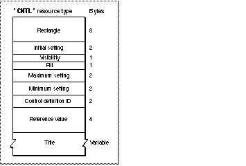
control resource is changed with the Appearance Manager to support the additional standard controls that are available with the Appearance Manager. You can use a control ('CNTL'
) resource to define a standard control. All control resources must have resource ID numbers greater than 127
. Use GetNewControl
to create a control defined in a control resource. The Control Manager uses the information you specify to create a control structure in memory. Figure 1-1
shows the structure of this resource.
Figure 1-1
Structure of a compiled control ('CNTL')
resource

The compiled version of a control resource contains the following elements:
true
, GetNewControl
draws the control immediately, without using the application's standard updating mechanism for windows. If this element contains the value false
, the application must use ShowControl
when it's prepared to display the control.kControlPopupUseAddResMenuVariant
variation code to the kControlPopupButtonProc
control definition ID. Note
The titles of all Appearance-compliant standard system controls appear in the system font. You should generally use the system font or small system font in your controls; see Mac OS 8 Human Interface Guidelines for more details.
The
control color table resource is not recommend with the Appearance Manager. When the Appearance Manager is available and you are using standard controls, the control color table ('cctb'
) resource is ignored and the colors are determined by the current theme. If you are creating your own control definition function, you can still use the control color table structure to draw a control using colors other than the system default.
You can use a
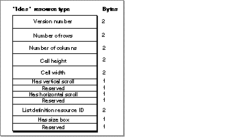
list box description resource to specify information in a list box. A list box description resource is a resource of type 'ldes'
. All list box description resources must have resource ID numbers greater than 127. The Control Manager uses the information you specify to provide additional information to the corresponding list box control. The list box description resource is available with Appearance Manager 1.0 and later.
Figure 1-2
shows the structure of this resource.
Figure 1-2
Structure of a compiled list box description ('ldes')
resource

You define a list box description resource by specifying these elements:
true
, the list box contains a vertical scroll bar; if false
, no vertical scroll bar.true
if your list requires a horizontal scroll bar; specify false
otherwise. true
, a size box will be drawn; if false
, a size box will not be drawn.
You can use a
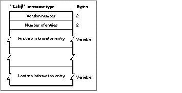
tab information resource to specify the icon suite ID and name of each tab in a tab control. A tab information resource is a resource of type 'tab#'
. All tab information resources must have resource ID numbers greater than 127. The Control Manager uses the information you specify to provide additional information to the corresponding tab control. The tab information resource is available with Appearance Manager 1.0 and later.
Figure 1-3
shows the structure of this resource.
Figure 1-3
Structure of a compiled tab information ('tab#')
resource

A compiled version of a tab information resource contains the following elements:
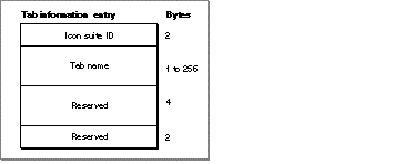
Figure 1-4
shows the format of a compiled entry in a 'tab#'
resource. A tab information entry specifies the icon suite ID and the name of a tab control.
Figure 4 Structure of a tab information entry
