Text
Although Mac OS X uses graphics as a primary means of user-computer interaction, text is prevalent throughout the interface for such things as button names, pop-up menu labels, dialog messages, and onscreen help. Using text consistently and clearly is a critical component of interface design.
Your product development team should include a skilled writer who is responsible for reviewing all user-visible onscreen text as well the instructional documentation. The writer should refer to the Apple Publications Style Guide for guidance on Apple-specific terminology.
In this section:
Fonts
Mac OS X supports standard fonts for interface elements. Whenever your application specifies a font, use the system-defined constants shown in Table 10-1; avoid using a specific font and point size. Using the system constants ensures that your application always displays the appropriate fonts regardless of changes to the Mac OS.
The system font (Lucida Grande Regular 13 point) is used for text in menus, dialogs, and full-size controls.
Use the emphasized system font (Lucida Grande Bold 13 point) sparingly. It is used for the message text in alerts (see Figure 14-47).
The small system font (Lucida Grande Regular 11 point) is used for informative text in alerts (see Figure 14-47). It is also the default font for column headings in lists, for help tags, and for small controls. You can also use it to provide additional information about settings in various windows, such as in the QuickTime preferences.
Use the emphasized small system font (Lucida Grande Bold 11 point) sparingly. You might use it to title a group of settings that appear without a group box, or for brief informative text below a text field.
The mini system font (Lucida Grande Regular 9 point) is used for mini controls. It can also be used for panel labels and text.
An emphasized mini system font (Lucida Grande Bold 9 point) is available for cases in which the emphasized small system font is too large.
If your application creates text documents, use the application font (Lucida Grande Regular 13 point) as the default font for user-created content.
The label font (Lucida Grande Regular 10 point) is used for the labels on toolbar buttons and to label tick marks on full-size sliders. You should rarely need to use this font. For an example of this font used to label a slider control, see the Dock size slider in Dock preferences.
Use the view font (Lucida Grande Regular 12 point) as the default font of text in lists and tables.
Note that the Lucida Grande font family includes mono-spaced numeric characters and variably-spaced alphabetics.
All user-visible text in your application should be anti-aliased, which is automatic if you use one of the standard system fonts.
Table 10-1 shows the constants to use in Carbon functions and the NSFont methods to use in Cocoa.
Font | Carbon constants | Cocoa methods |
|---|---|---|
System font |
| |
Emphasized system font |
| |
Small system font |
| |
Emphasized small system font |
|
|
Mini system font |
|
|
Emphasized mini system font | Not Available |
|
Application font |
| |
Label font |
|
Style
The Apple Publications Style Guide covers style and usage issues, and is the key reference for how Apple uses language. This document is available in the Guides > User Experience; consult it whenever you have a question about the preferred style of particular terms.
For issues that aren’t covered in the Apple Publications Style Guide, Apple recommends three other works: The American Heritage Dictionary,The Chicago Manual of Style, and Words Into Type. When these books give conflicting rules, The Chicago Manual of Style takes precedence for questions of usage and The American Heritage Dictionary for questions of spelling.
The rest of this section discusses specific details of how to present your text in a style that integrates properly with the Aqua user interface.
Inserting Spaces Between Sentences
If any part of your application's user interface displays two or more sentences in a paragraph, be sure to insert only a single space between the ending punctuation of one sentence and the first word of the next sentence.
Although much of the text in an application's user interface is in the form of labels and short phrases, application help, alerts, and dialogs often contain longer blocks of text. You should examine these blocks of text to make sure that extra spaces do not appear between sentences.
Using the Ellipsis Character
When it appears in the name of a button or a menu item, an ellipsis character (…) indicates to the user that additional information is required before the associated operation can be performed. Specifically, it prepares the user to expect the appearance of a window or dialog in which to make selections or enter information before the command executes. Because users expect instant action from buttons and menu items (as described in “Buttons” and “Menu Behavior”), it's especially important to prepare them for this alternate behavior by appropriately displaying the ellipsis character. The following guidelines and examples will help you decide when to use an ellipsis in menu item and button names.
Use an ellipsis in the name of a button or menu item when the associated action:
Requires specific input from the user.
For example, the Open, Find, and Print commands all use an ellipsis because the user must select or input the item to open, find, or print. The Save As command uses an ellipsis because it allows the user to give the file or document a new name, location, or both.
You can think of commands of this type as needing the answer to a specific question (such as "Find what?") before executing.
Is performed by the user in a separate window or dialog.
For example, Preferences, Customize Toolbar, and Send Feedback all use an ellipsis because they open a window (potentially in another application, such as a browser) or a dialog in which the user sets preferences, customizes the toolbar, or sends feedback.
To see why such commands must include an ellipsis, consider that the absence of an ellipsis implies that the application performs the action for the user. If, for example, the Send Feedback command did not include an ellipsis, it would imply that feedback is generated and sent automatically by the application.
Always displays an alert that warns the user of a potentially dangerous outcome and offers an alternative.
For example, Restart, Shut Down, and Log Out all use an ellipsis because they always display an alert that asks the user for confirmation and allows the user to cancel the action. Note that Close does not have an ellipsis because it displays an alert only in certain circumstances (specifically, only when the document or file being closed has unsaved changes).
Before you consider providing a command that always displays an alert, determine if it's really necessary to get the user's approval every time. Displaying too many alerts asking for user confirmation can dilute the effectiveness of alerts.
Don't use an ellipsis in the name of a button or menu item when the associated action:
Does not require specific input from the user.
For example, the New, Save, and Copy commands do not use an ellipsis because either the user has already provided the necessary information or no user input is required. That is, New always opens a new document or window, Save automatically saves the currently active document, and Copy copies the user's most recently selected text or item to the Clipboard.
Is completed by the opening of a panel.
A user opens a panel to view information about an item or to keep essential, task-oriented controls available at all times (for more information about panels, see “Panels”). A command to open a panel, therefore, is completed by the display of the window and should not have an ellipsis in its name. Examples of such commands are Get Info, About This Application, and Show Inspector.
Occasionally displays an alert that warns the user of a potentially dangerous outcome.
If you use an ellipsis in the name of a button or menu item that only sometimes displays an alert, you cause the user to expect something that will not always happen. This makes your application's user interface inconsistent and confusing. Therefore, even though Quit and Close display an alert if the execution of the action might result in the loss of data (such as when there are unsaved changes in a document), they do not display an alert when no data loss is possible. For this reason, commands such as Quit and Close should not include an ellipsis.
An ellipsis character can also show that there is more text than there is room to display in a document title or list item. If, for example, the name of an item is too long to fit in a menu or list box, you should insert an ellipsis character in the middle of the name, preserving the beginning and the end of the name. This ensures that the parts of the name that are most likely to be unique are still visible.
Important: Be sure to create the ellipsis character using the key combination Option-; (Option-semicolon). This ensures that an assistive application can provide the correct interpretation of the character to a disabled user. If you use 3 period characters to simulate an ellipsis, many assistive applications will be unable to make sense of them. Also, 3 period characters and an ellipsis do not look the same because the periods are spaced differently than the points of an ellipsis.
Using the Colon Character
Use the colon character (:) in text that introduces and provides context for controls. The text can describe what the controls do or a task the user can perform with them. The combination of introductory text, colon, and controls forms a visually distinct grouping that helps users find the controls that apply to a particular task and understand what the controls do.
Because a colon implies a direct connection between the descriptive text and a particular control or set of controls, it does not belong in the text that appears in a control, such as a push button name or a command pop-down menu title. Similarly, you should not use a colon in the text that appears in the following user interface elements:
Menu items (unless the colon is part of a user-created menu item) and menu titles
Tab and segmented controls
List view column headings
Note: The colon is not used as a pathname separator in Mac OS X. If it is necessary to display a raw pathname, use the forward slash character (/). Always be sure to avoid displaying a pathname in a window title.
Although the colon is a good way to associate introductory text with related controls, be aware that you can depict this connection in other ways. For example, you might choose to place related controls in a group box and display the introductory text as the title of the group box (see “Group Boxes” for group box guidelines). Or, you might use separators to divide a window into sections of related controls and display a section title aligned with each separator (see “Separators” for separator guidelines). You might also use tab or segmented controls to display different groups of related controls (see “Tab Views” and “Segmented Controls” for guidelines on how to use these controls). To see how the appearance of a window changes when some of these different grouping methods are used, see “Grouping Controls in a Window Body”
If you choose to use a group box or separator to group controls, do not use a colon in the text that serves as a group box title or the text that appears on the same line as a separator. In these cases, other graphical elements (that is, the group box and the separator) take the place of the colon and make explicit the relationship of the introductory text to the controls that follow it.
For example, Figure 10-1 shows the correct absence of a colon in text used as a group box title.
If you choose to use a colon to show the relationship between introductory text and controls, the following guidelines and examples will help you use it appropriately.
Use a colon in introductory text that precedes a control or set of related controls. The text can be a noun or phrase that describes either the target of the control or the task the user can perform. The following examples illustrate some variations on this arrangement of text and controls:
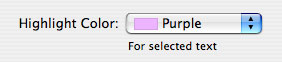
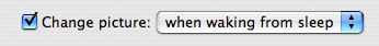
Figure 10-2 shows the correct usage of a colon in introductory text that describes the feature a control affects and appears on the same line with it.
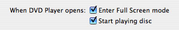
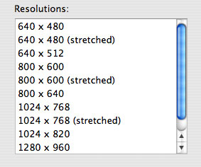
The introductory text shown in Figure 10-3 describes a task to which more than one control applies. The proximity of the two checkboxes and the colon in the descriptive text imply to the user that both controls can be used to affect the task.
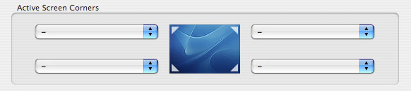
The grouping of text and controls in Figure 10-4 shows another way to use a colon in text that introduces multiple controls.
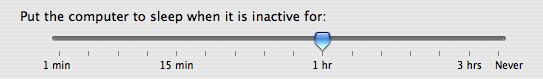
Introductory text that appears above the control it describes should include a colon, as shown in Figure 10-5
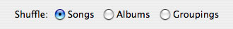
If the text describes a radio button or checkbox state and also introduces a second control, it should include a colon before the second control, as shown in Figure 10-6 (Note that if the text describing a checkbox or radio button state does not introduce a second control, it should not include a colon.)
A colon is optional before a control that is part of a sentence or phrase. This guideline is flexible because it depends on how much of the text follows the control and how the sentence or phrase can be interpreted. Consider the specific combination of text and controls and the overall layout of your window as you decide whether to use the colon in the following situations.
If, for example, none of the text follows the control, then the control's value supplies the end of the sentence or phrase. A colon is recommended in this case, because this is another variation of the guideline to include a colon in text that precedes a control. Figure 10-7 shows an example of this type of text.
If, on the other hand, a substantial portion of the sentence or phrase follows the control, as shown in Figure 10-8 a colon is optional.
Figure 10-8 A colon is optional if the text following the control forms a substantial part of the sentence

Similarly, if there is some text following the control, but that text does not represent a substantial portion of the sentence or phrase, the colon is optional. To help you decide whether a colon is appropriate in these cases, determine if the presence of a colon breaks the sentence or phrase (including the value of the control) in an awkward or unnatural way.
Labels for Interface Elements
Make labels for interface elements easy to understand and avoid technical jargon as much as possible. Try to be as specific as possible in any element that requires the user to make a choice, such as radio buttons, checkboxes, and push buttons. It’s important to be concise, but don’t sacrifice clarity for space. See “Capitalization of Interface Element Labels and Text” for information on the proper way to capitalize the words in interface element labels.
Menu items and buttons that produce a dialog should include an ellipsis (…). See “Using the Ellipsis Character” for details on when to use an ellipsis. The dialog title should be the same as the menu command or button label (except for the ellipsis) used to invoke it.
Capitalization of Interface Element Labels and Text
All interface element labels should be capitalized in either title style or sentence style. See Table 10-2 for examples of how to do this.
Title style means that you capitalize every word except:
Articles (a, an, the)
Coordinating conjunctions (and, or)
Prepositions of four or fewer letters, except when the preposition is part of a verb phrase, as in “Starting Up the Computer.”
In title style, always capitalize the first and last word, even if it is an article, a conjunction, or a preposition of four or fewer letters.
Sentence style means that the first word is capitalized, and the rest of the words are lowercase, unless they are proper nouns or proper adjectives. Use periods in dialogs only after complete sentences.
Using Contractions in the Interface
When space is at a premium, such as in pop-up menus, contractions may be used, as long as the contracted words are not critical to the meaning of the phrase. For example, a menu could contain the following items:
Don’t Allow Printing
Don’t Allow Modifying
Don’t Allow Copying
In each case, the contraction does not alter the operative word for the item. If a contraction does alter the significant word in a phrase, such as “contains” and “does not contain,” it is clearer to avoid the contraction.
You should also avoid using uncommon contractions that may be difficult to interpret and localize. In particular, you should:
Avoid forming a contraction using a noun and a verb, such as in the sentence "Apple's going to announce a new computer today."
Avoid using less common contractions, such as "it'll" and "should've."
Using Abbreviations and Acronyms in the Interface
Abbreviations and acronyms can save space in a user interface, but they can be confusing if users do not know what they mean. Conversely, some abbreviations and acronyms are better known than the words or phrases they stand for, and an application that uses the spelled-out version can seem out-of-date and unnecessarily wordy.
To balance these two considerations, you should gauge an acronym or abbreviation in terms of its appropriateness for your application's users. Therefore, before you decide which abbreviations and acronyms to use, you need to define your user audience and understand the user's mental model of the task your application performs. For more information on these concepts, see “Know Your Audience” and “Reflect the User’s Mental Model”
To help you decide whether or not to use a specific abbreviation or acronym in your application's user interface, consider the following questions:
Is this an acronym or abbreviation that your users understand and feel comfortable with? For example, almost all users are used to using CD as the abbreviation for compact disc, so even applications intended for novice users can use this abbreviation.
On the other hand, an application intended for users who work with color spaces and color printing can use CMYK (which stands for cyan magenta yellow key), even though this abbreviation might not be familiar to a broader range of users.
Is the spelled-out word or phrase less recognizable than the acronym or abbreviation? For example, many users are unaware that Cc originally stood for the phrase carbon copy, the practice of using carbon paper to produce multiple copies of paper documents. In addition, the meanings of Cc and carbon copy have diverged so that they are no longer synonymous. Using carbon copy in place of Cc, therefore, would be confusing to users.
For some abbreviations and acronyms, the precise spelled-out word or phrase is equivocal. For example, DVD originally stood for both digital video disc and digital versatile disc. Because of this ambiguity, it's not helpful to use either phrase; it's much clearer to use DVD.
If you use a potentially unfamiliar acronym or abbreviation in the user help book for your application, be sure to define it when you first use it. In addition, you should enable searching on your help book so users can easily find definitions of unfamiliar terms. See “User Assistance” for an overview of help technologies and Apple Help Programming Guide for details on working with Apple Help.
Developer Terms and User Terms
Don’t use technical jargon or programming terms in interface elements or user documentation. Table 10-3 shows a few examples; more are in Apple Publications Style Guide (available at the Mac OS X developer documentation website).
Developer term | User term equivalent |
|---|---|
Data browser | Scrolling list or multicolumn list |
Dirty document | Document with unsaved changes |
Focus ring | Highlighted area; area ready to accept user input |
User-visible text | Onscreen text |
Mouse-up event | Mouse click |
Reboot | Restart |
String length |
© 1992, 2001-2003, 2008 Apple Inc. All Rights Reserved. (Last updated: 2008-06-09)