Icons
This chapter describes the overall philosophy behind icons and shows how to design application, document, toolbar, and other types of icons for Mac OS X.
Aqua offers a photo-illustrative icon style—it approaches the realism of photography but uses the features of illustrations to convey a lot of information in a small space. Icons can be represented in 512 x 512 pixels to allow ample room for detail. Anti-aliasing makes curves and nonrectilinear lines possible. Alpha channels and translucency allow for complex shading and dimensionality. All of these qualities allow you to create lush, vibrant icons that capture the user’s attention.
To represent your application in Mac OS X, it’s essential to create high-quality application icons that scale well in the various places the icon appears—the Dock, Finder and Quick Look previews, alert dialogs, and so on.
In this section:
Icon Genres and Families
Application Icons
Document Icons
Toolbar Icons
Icons for Plug-ins, Hardware, and Removable Media
Icon Perspectives and Materials
Creating Icons
Designing Toolbar Icons
System-Provided Images
Icon Genres and Families
Icon genres help communicate what users can do with an application before they open it. Applications are classified by role—user applications, software utilities, and so on—and each category, or genre, has its own icon style. Creating icons that express this differentiation helps users distinguish between types of icons in the Dock.
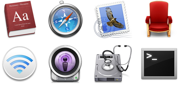
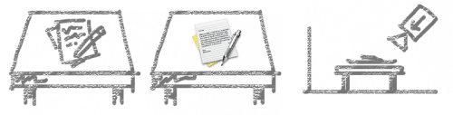
Figure 11-1 Application icons of different genres—user applications and utilities—shown as they can appear in the Dock

For example, the icons for user applications are colorful and inviting, whereas icons for utilities have a more serious appearance. Figure 11-2 shows user application icons in the top row and utility icons in the bottom row. These genres are further described in “User Application Icons” and “Utility Icons.”
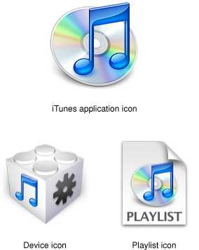
The graphic flexibility of Aqua icons can also help users identify files associated with an application. In iTunes, for example, a visual cue provided in the application icon is carried over into icons for other files associated with iTunes, forming an icon family, as shown in Figure 11-3.
Application Icons
Application icons are the most visible to users. Since they are seen in the Finder and the Dock even when your application is not running, they form a significant part of a user’s first impressions.
User Application Icons
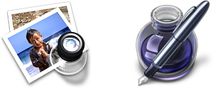
Mac OS X user application icons should be vibrant and inviting, and should immediately convey the application’s purpose. The TextEdit icon, for example, indicates clearly that this application is for creating text documents.

If the primary function of your application is creating or handling media, its icon should display the media the application creates or views. If appropriate, the icon should also contain a tool that communicates the type of task the application allows the user to accomplish. The Preview icon, for example, uses a magnification tool to help convey that the application can be used to view pictures. If you include a supportive tool element, it should closely relate to the base object that it rests upon.

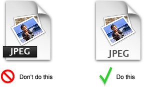
In the Stickies application icon, however, the yellow rectangles are easily identifiable as sticky notes; the icon doesn’t include a tool because it isn’t necessary to tell the icon’s story.

Notice that the text in the Stickies icon is actual text, not simply wavy lines representing text. If you want to “greek” text in an icon, use actual text and make it unreadable by shrinking it or doubling the layers.
Generally, Mac OS X user application icons are designed to appear as if they’re sitting on a desk in front of you. They have a slightly diminishing perspective (they are wider at the bottom). For more information, see “Icon Perspectives and Materials.”
Viewer, Player, and Accessory Icons
Some applications that represent objects or well known products, such as Calculator and QuickTime Player, are most easily recognized by the symbols or objects themselves. When creating icons for such applications, it’s more aesthetically pleasing to create a simplified, idealized representation of the object or symbol, instead of using an actual screen shot of the software. Re-creating the object is particularly important when users could confuse the icon with the actual interface.
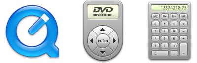
These icons, many of which are a precursor of what you’ll see when you open the application, use a straight-on perspective (rather than the “on a desktop” user application style). You never see the Calculator onscreen in three dimensions, for example, so its icon doesn’t depict it that way.
Utility Icons
Icons for utility applications—which are used less often and not simply for fun or creative activities— convey a more serious tone than those for user applications. Color in these icons is desaturated, predominantly gray, and added only when necessary to clearly communicate what the applications do.
Because utility applications are normally focused on a narrow set of tasks, it’s best to keep the number of elements in the icon to a minimum. The focus should be a single object that represents what the utility does. The perspective of utility icons is straight-on, as if they are on a shelf in front of you. For more information, see “Icon Perspectives and Materials.”
Document Icons
Traditionally, a document icon looks like a piece of paper with its top-right corner folded down. As previously suggested, document icons should make it obvious which application they are associated with. Preview documents, for example, include a graphic of the media (the pictures) used in the application icon. For simplicity and to avoid confusing the document with the application itself, the viewing tool is not repeated in the document icon.

Document icons are presented as if they are hovering on the desktop, with the shadow behind the document. For more information, see “Icon Perspectives and Materials.”
When you want to put an identifying badge over a document icon, treat the badge as an integrated element within the document instead of putting it over the top of the base image and breaking out of the overall document shape.
Toolbar Icons
Toolbar icons represent frequently used commands in an application. Typically, toolbar icons are not as rich in detail and photo-realism as other icon types, because they are intended to be small, streamlined representations of application-specific objects and tasks. For example, Keynote toolbar icons (some of which are shown in Figure 11-11) have more in common with sketches than with photographs, using simple shapes, constrained shading, and just enough detail to suggest each item.

For some guidelines on how to design toolbar icons (including the simpler style of icons that can be used inside toolbar controls), see “Designing Toolbar Icons.”
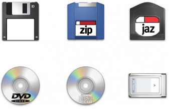
Icons for Plug-ins, Hardware, and Removable Media
Plug-in icons look like stackable components, with the associated application identifier on the left side and a plug-in–specific image on the right.
Hardware icons represent devices as you most often see them: on your desk. Because these devices are also frequently handled and carried, people are familiar with them as three-dimensional objects with weight. Therefore, the hardware icons reinforce their association with real objects.
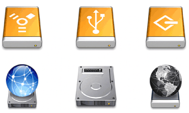
To help users distinguish between external devices, their icons provide a region for an identifying symbol (FireWire, USB, and so on).
Removable media such as CDs, floppy disks, and PC cards are depicted the way they look when you hold them in front of you—that is, the perspective is straight-on.
Icon Perspectives and Materials
The angles and shadows used for depicting various kinds of icons are intended to reflect how the objects would appear in reality. All interface elements have a common light source from directly above. The various perspectives are achieved by changing the position of an imaginary camera capturing the icon.
Application icons look like they are sitting on a desk in front of you.
Utility icons are depicted as if they were on a shelf in front of you. Flat objects appear as if there were a wall behind them with an appropriate shadow behind the object.
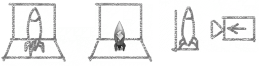
An actual three-dimensional object such as a rocket, however, would more realistically be viewed sitting on the ground; its icon shows the rocket sitting on a shelf, with its shadow below it.
For toolbar icons, the perspective is also straight-on, as if the object is on a shelf in front of you with the shadow below it. (For more information on designing toolbar icons, see “Designing Toolbar Icons.”)
Icons that represent actual objects should look as though they are made of real materials. Examine various objects to study the characteristics of plastic, glass, paper, and metal. Your icon will look more realistic if you successfully convey the item’s weight and feel, as well as its appearance.
Use transparency only when it is convincing and when it helps complete the story the icon is telling. You would never see a transparent sneaker, for example, so don’t use one in your icon. (See “Creating Icons for Mac OS X v10.5 and Later” for some advice on using transparency in an application icon.)
Creating Icons
Gorgeous, artistic icons are an important part of the Mac OS X user experience. Users expect beautiful icons that tell an application’s story in a clear and memorable way.
This section provides tips and a suggested icon-creation process you can follow as you design and create an icon. Then, it describes additional guidelines that help you design and create icons for applications running in Mac OS X v10.5 and later.
If you need to create toolbar icons, you should read this section first for general guidance, because many of the techniques and guidelines apply to both application icons and toolbar icons. Then, read “Designing Toolbar Icons” for specific advice on creating icons for use in a toolbar.
Tips for Designing Icons
Many of the suggestions listed here also apply to other graphics you develop for your application—for example, to augment a label or list item.
For great-looking icons, have a professional graphic designer create them.
Perspective and shadows are the most important components of making good icons. Use a single light source with the light coming from above the icon.
Use universal imagery that people will easily recognize. Avoid focusing on a secondary aspect of an element. For example, for a mail icon, a rural mailbox would be less recognizable than a postage stamp.
Strive for simplicity. Try to use a single object that captures the icon’s action or represents the control. Start with a basic shape.
Use color judiciously to help the icon tell its story; don’t add color just to make the icon more colorful. Smooth gradients typically work better than sharp delineations of color.
Avoid using Aqua interface elements in your icons; they could be confused with the actual interface.
Don’t use replicas of Apple hardware products in your icons. These symbols are copyrighted, and hardware designs change frequently.
Don’t reuse Mac OS X system icons in your interface; it can be confusing to users to see the same icon used to mean slightly different things in multiple locations.
A Suggested Process for Creating Icons
When you create an icon, you need to provide at least the following files:
A 128 x 128 pixel image (for Finder icons in all versions of Mac OS X)
A 512 x 512 pixel image (for Finder icons in Mac OS X v10.5 and later)
A mask that defines the image’s edges so that the operating system can determine which regions are clickable
Icons that display in the Finder are viewed at different sizes: They can be magnified in the Dock, they can be previewed at full size, and users can specify a preferred size. For the best-looking icons at all sizes, you should also provide custom image files (“hints”) at two other sizes: 32 x 32 pixels, and 16 x 16 pixels. Although the Dock doesn’t use hints (it uses a sophisticated algorithm on the 128 x 128 pixel version), hints are important for preserving crucial details in Finder icons.
If you are creating an icon that will never change size—on a bevel button, for example—you can supply the image in the actual size only.
Here are the suggested steps for creating an icon:
Sketch the icon.
Work out the concept and details of your design on paper, not with software. You should be ready to execute the idea by the time you open an image-design application.
Create a software illustration of the icon.
Although you may want the final icon to look like a photograph, in most cases it’s not advisable to start with an actual photograph. An illustration provides much more flexibility for conveying a concept in a very small space. An illustration also gives you necessary control over details, perspective, light and shadow, texture, and so on.
Add detail and color.
For each enhancement you make to a larger-version icon, consider whether it is truly adding something to the icon’s usability or whether it is just adding complexity or clutter.
Add shadows.
Shadows give objects dimensionality and realism. They also help tie the elements of an icon together so it doesn’t look like a collage. The light source should be above and slightly in front of the object. The resulting shadow should create the sense that the icon is resting on a surface.
In an image-editing program, manipulate the image to get precise effects and create the icon mask. (See “Scaling Your Artwork” for some tips that can help you successfully scale your artwork.)
Convert the icon to a
.icnsfile.You can complete this step with Icon Composer, included with the Xcode Tools, a set of tools for developers that are included in Mac OS X. There are also several third-party tools available for completing this step.
Creating Icons for Mac OS X v10.5 and Later
If you’re designing an application icon for Mac OS X v10.5 and later, you should supply a 512 x 512 pixel version of the image. When you do this, be sure to treat the 512 x 512 pixel version as its own resource; that is, don’t create it by blowing up each pixel of the 128 x 128 pixel version of the icon. For example, the 512 x 512 pixel version of the icon should not have thick strokes or look “vectorized.“ In general, the larger icon should be a higher quality rendition of the 128 x 128 pixel resource, which exhibits:
Richer texture
More details
Greater realism
For example, the 512 x 512 pixel version of the Front Row application icon (shown in Figure 11-20) reveals more detail in the wood grain of the chair frame and the velvet of the upholstery than in the 128 x 128 pixel version, resulting in a more realistic image.

You also need to be aware of how the Cover Flow view in Finder displays your application icon. In Cover Flow, icons are displayed against a black background, set above a highly reflective surface. Because of this, you may need to adjust your icon in the following ways:
If your icon includes a drop shadow, be sure to make the shadow fully black.
If the drop shadow contains any gray tones, the gray will show up against the black background and make the shadow look more like a glow.
If your icon is very dark or has black edges, consider adding a slight inner glow just inside the edges to make the icon stand out against the black background.
If you don’t add a glow to make the edges of your icon prominent, it might appear to dissolve into the black background of the Cover Flow view.
Avoid giving important parts of your icon high alpha levels (that is, lots of transparency), especially in the lower half of the icon. Areas with too much alpha may get clipped.
In Cover Flow view, the Finder positions icons so that they appear to be on the same plane. To do this, the Finder begins examining an icon at the bottom edge, looking for pixels that are opaque enough to use for alignment. If there is significant transparency in the lower area of your icon, the Finder ignores the transparent pixels in favor of the first opaque pixel it finds. The Finder uses the opaque pixel to determine the icon’s alignment with respect to the plane and may clip the transparent pixels below it.
To see why some of these adjustments might be necessary, you can examine the standard Mac OS X application icons in a computer running Mac OS X v10.5 or later. For example, in Figure 11-21, the Spaces icon includes a subtle glow inside the edge of the black frame, which makes it more visible on the black background.

The Mail icon, on the other hand, includes a cancellation mark that extends past the bottom edge of the stamp image (you can see this icon in Figure 11-2). Because this area of the icon has high alpha levels, the Finder uses an opaque pixel at the bottom left corner of the stamp image to align the icon, clipping some of the cancellation mark, as shown in Figure 11-22.

Scaling Your Artwork
As you work on creating your icon, you will probably need to spend some time scaling artwork to different sizes. As stated in “Creating Icons,” applications should include icon resources in these sizes:
512 x 512 pixels
128 x 128 pixels
32 x 32 pixels
16 x 16 pixels
If your practice is to start with a large master art file and scale it down to the smaller sizes, it’s especially useful to create your master image in a dimension that is a multiple of the icon sizes you need. If you also use an appropriate grid size in your image-editing application as you create the master image, you’ll be able to keep each smaller icon version crisp and reduce the amount of retouching and sharpening you need to do.
For example, to create icons in the recommended sizes listed above, create a 1024 x 1024 pixel version of your master file. In your image-editing application, you can set up an 8-pixel grid as you create the master file. This means that each block in the grid measures 8 x 8 pixels and represents one pixel in the 128 x 128 pixel icon. As you create your master file, “snap” the image to the grid and keep it within the boundaries to minimize the half pixels and blurry details that can result when you scale it down.
Although using an 8-pixel grid works fine when you need to create 512 x 512 pixel icons, you may prefer the increased precision you get when you use a 2-pixel grid to create the master image.
If you're not satisfied with the results when you scale art down to the 32 x 32 pixel and 16 x 16 pixel sizes, you can redraw the image at these sizes instead. If you decide to do this, setting up the proper grid can still help reduce extra work. For example, using a 32-pixel grid with a 1024 x 1024 pixel master file works well for creating the 32 x 32 pixel size, and a 64-pixel grid works well for creating the 16 x 16 pixel size.
Designing Toolbar Icons
The primary purpose of a set of toolbar icons is to provide users with easy access to frequently used commands (to learn more about the concepts behind toolbar design, see “Toolbars”). To represent these commands in a toolbar, you need small, unambiguous icons or images that users can easily distinguish and remember. To accommodate different application styles and appearances, Mac OS X provides a few different styles of toolbar items. Depending on the overall look of your application, you can:
Design icons that behave as buttons (see “Icon Buttons” for more information on these controls).
Design simplified icons to place in capsule-style toolbar controls (see “Capsule-Style Toolbar Controls” for more information on these controls).
Design small streamlined icons to place in rectangular-style toolbar controls (see “Rectangular-Style Toolbar Controls” for more information on these controls).
Use system-provided images in rectangular-style or capsule-style toolbar controls. Because you do not need to design these images, this section does not describe them. See “System-Provided Images” for more information on the images available to you, and see “Window-Frame Controls” for more information on the controls that can contain them.
Figure 11-23 shows some examples of these types of toolbar items.

A toolbar can also contain icons that represent recognizable interface elements from elsewhere in the system (such as the Colors window icon or the iDisk icon) when they make sense in the context of the application. If you choose to include an icon such as the Colors window icon, be sure to preserve its meaning. Users expect such icons to mean the same thing in every context, so you should not repurpose them when you use them in a toolbar. For example, the Numbers toolbar (the top image in Figure 11-23) contains the Colors window and Fonts window icons, which are standard icons used throughout Mac OS X. In Numbers, clicking these toolbar icons displays the Colors window and the Fonts window, respectively, just as users expect.
Important: Do not use a system icon, such as the yellow caution icon, in your toolbar. A system icon provides important information to the user in a specific context, such as in an alert window; using it in a toolbar blurs its meaning and dilutes it effectiveness in the system.
Regardless of which style of toolbar icon you decide to design, be sure that each toolbar item represents a unique object or action that is directly related to the command it stands for. The best toolbar icons use familiar visual metaphors that are instantly recognizable to users. As a general rule, a toolbar icon that depicts an identifiable, real-world object or recognizable user-interface element gives first-time users a clue to its function and helps experienced users remember it. As much as possible, therefore, identify parts of the user’s mental model that lend themselves to visual representation (to learn more about this concept, see “Reflect the User’s Mental Model”). For example, the iTunes toolbar (shown in Figure 11-24) displays rewind, play, and fast forward controls that use symbols similar to those users see in physical devices, such as iPod.

Making each toolbar icon distinct helps the user associate it with its purpose and locate it quickly. Variations in shape, color, and image all help to differentiate one toolbar icon from another. At the same time, however, an application's toolbar icons should harmonize together as much as possible in their perspective, use of color, size, and visual weight. This holds true whether the icon is free-standing or in a capsule-style toolbar control. As you can see in Figure 11-25, the icons inside the capsule-style toolbar controls in the Mail toolbar are easily distinguishable, yet consistent in size, color usage, and visual weight.

How you design icons to represent actions and objects depends on whether you want to use free-standing icon buttons or icons in capsule-style or rectangular-style toolbar controls in your toolbar. The following sections provide some guidelines for each of these situations.
Designing Icons for Icon Buttons
Although toolbar icons should conserve screen real estate (32 x 32 pixels is the recommended size), they should be inviting and easy to identify. The perspective of a toolbar icon is straight-on, as if it is sitting on a shelf in front of you (see “Icon Perspectives and Materials” for a graphic depiction of this perspective).
Although the perspective of icons designed specifically for use in a toolbar is straight-on, if you use a recognizable icon from elsewhere in the interface (such as the iDisk icon), that icon should retain its standard appearance and perspective. That is, don’t redesign a toolbar version of a well-known interface element. You may be able to use a system-provided image to represent a standard interface element; see “System-Provided Images” for more information on which images are available and how to use them.
Figure 11-26 The circled icons appear elsewhere in the interface; they retain their perspective when used in a toolbar
Designing Icons for Capsule-Style Toolbar Controls
Icons that look good in capsule-style toolbar controls are simple, colorful images that don’t have lots of detail. As you design an icon for a capsule-style toolbar control, keep the following points in mind:
Include only enough detail to unambiguously represent the object
Use a straight-on perspective with minimal shadow
Provide enough contrast so that the image stands out against the control background
Consider using bright, clear colors
Make sure the image is visually centered in the control (note that visually centered might not be the same as mathematically centered)
Designing Icons for Rectangular-Style Toolbar Controls
Icons that look good in rectangular-style toolbar controls are streamlined, black images that convey meaning through outline and contour, not internal detail. Because your icons should echo the appearance of the existing Mac OS X images inside rectangular-style toolbar controls, use the system-provided template images as a guide. As you design an icon for a rectangular-style toolbar control, keep the following points in mind:
Make the outline sharp and clear
Use a straight-on perspective
Use full black and a few shades of gray to suggest dimensionality
Use anti-aliasing
Make sure the image is visually centered in the control (note that visually centered might not be the same as mathematically centered)
Icons for regular-size rectangular-style toolbar controls should measure no more than 19 x 19 pixels.
System-Provided Images
Throughout Mac OS X, you can see quantities of small, black images in rectangular-style toolbar controls, gradient buttons, and scope buttons. Some of the most familiar are those used in the Finder toolbar, as shown in Figure 11-27.

In addition to these images, many Mac OS X applications display full-color standard images such as the icons that represent the Colors window, .Mac, and a smart folder (Figure 11-26 shows images similar to these).
In Mac OS X v10.5 and later, many standard images of both types are available for you to use. Using system-provided images confers significant advantages, such as:
Shorter development time and less effort spent on creating custom versions of standard art.
Automatic updating of images if appearance changes are part of future operating system updates.
Established user familiarity with the meaning of standard images.
To realize these advantages, however, it is crucial that you use the images correctly. Specifically, this means that you should use an image in accordance with its documented meaning and recommended usage; you should never use an image to mean something other than what it was designed to mean. If you repurpose an image you confuse users who already know what the image means. Also, if a later update to the operating system includes a change to the image’s look, you confuse users again when the new image appearance no longer makes sense in your application.
As a hypothetical example, imagine that the “go forward” image (currently a right-pointing triangle) is changed to look like a capital letter “F.” If you correctly used this image in a control that performs a “go forward” action, your control would still make sense. If, however, you used the image to mean “play,” your control would no longer make any sense.
If you can’t find a system-provided image that has the appropriate meaning for a specific purpose in your application, it’s better to design your own than to misuse a system-provided image. “Designing Icons for Rectangular-Style Toolbar Controls” provides some guidelines for designing icons for use in controls; “Designing Icons for Icon Buttons” outlines how to design standalone icons for a toolbar.
Note: Each image described in the following sections is listed with its constant name, as defined in the NSImage programming interface. However, the string value for each constant consists of the constant name without the “ImageName” portion. For example, the constant NSImageNameAddTemplate has “NSAddTemplate” as its string value. You might need to use the string value, rather than the constant name, to locate images by name in Interface Builder.
System-Provided Images for Use in Controls
Mac OS X v10.5 and later provides many small, black images intended for use primarily in rectangular-style toolbar controls. These images, some of which are shown in Figure 11-27, are known as template images in Application Kit, because they are expected to receive additional processing by an NSButtonCell object before being displayed. The additional processing can, for example, make such an image look different when its control is pressed. Because these images require the presence of a bounding box (which is supplied by the control), they are not as useful for standalone buttons or free-standing toolbar icons. Instead, see “System-Provided Images for Use as Standalone Buttons” for images you can use as standalone buttons, and see “System-Provided Images for Use as Toolbar Items” for images you can use as free-standing toolbar icons.
As with all system-provided images, you should avoid using the template images to represent actions other than those they are designed for. Table 11-1 shows the standard template images available in Mac OS X v10.5 and later, along with the actions they represent and their names.
Image | Meaning | Constant name |
|---|---|---|
| View in Quick Look |
|
| Connect via Bluetooth |
|
| Open iChat Theater |
|
| View in a slide show |
|
| Action pop-up menu |
|
| Create smart item |
|
| View objects as icons |
|
| View objects in a list |
|
| View objects in columns |
|
| View objects in a Cover Flow mode |
|
| View the path of the object |
|
| Unlock the object (this image indicates the object is currently locked) |
|
| Lock the object (this image indicates the object is currently unlocked) |
|
| Go to the right or go forward |
|
| Go to the left or go back |
|
| Add an item (to a list, for example) |
|
| Remove an item (from a list, for example) |
|
| Enter full-screen mode |
|
| Exit full-screen mode |
|
| Stop progress on the current process |
|
| Refresh the current view or restart the process |
|


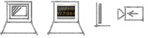
System-Provided Images for Use as Standalone Buttons
Mac OS X v10.5 and later provides a handful of free-standing images that can be used as borderless buttons. These images do not require further processing by an NSButtonCell object.
Two of the free-standing images are standalone versions of similar template images. To see why you might need both versions of such an image, consider how Safari offers stop-progress functionality to users. In the Downloads window, Safari uses the free-standing NSImageNameStopProgressFreestandingTemplate image inline with a progress indicator to allow users to stop an in-progress download. (Figure 11-28 shows this control in the Safari Downloads window.) Because this window can display several separate download processes at the same time, it’s important to display a stop-progress control for each individual process. Contrast this with the NSImageNameStopProgressTemplate image (shown in Table 11-1) that Safari uses in a toolbar button. Here, the process users might want to stop is the downloading of a webpage in the main Safari window, so it makes sense to offer this functionality in a toolbar button.

As with all system-provided images, each free-standing image must be used according to its documented meaning and recommended usage. Table 11-2 lists each image, along with its meaning and name.
Image | Meaning | Constant name |
|---|---|---|
| The data on the left is invalid (for example, the user entered a zip code in a phone number field) |
|
| Reveal contents or details about the object |
|
| Open the link in a new window or page |
|
| Stop progress on the current process |
|
| Refresh the current view or restart the process |
|


System-Provided Images for Use as Toolbar Items
Mac OS X v10.5 and later provides several images you can use as standalone icons in toolbars. These images are represent three types of items:
System entities or elements
Preferences categories
Common toolbar items
Use the first set of images (shown in Table 11-3) to give users access to system entities, such as Dot Mac and network. For the most part, the images in Table 11-3 identify system entities, they do not represent actions. However, if you needed to represent an action, such as “create a new smart folder,” you could add a plus sign badge to the smart folder icon.
Image | System element | Constant name |
|---|---|---|
| Bonjour |
|
| Dot Mac |
|
| The Macintosh computer currently running |
|
| A burnable folder |
|
| A smart folder |
|
| Network or Internet |
|


The second set of images is intended for use as standalone icons in preferences window toolbars. Use these images to give users access to familiar preferences categories, such as user-account settings and advanced settings. Table 11-4 shows the images you can use in a preferences window toolbar.
Image | Preferences category | Constant name |
|---|---|---|
| Advanced |
|
| General |
|
| User accounts |
|


The third set of images is suitable for toolbar items in windows other than preferences windows. You can use these images as standalone icons in a window or panel toolbar to give users access to the system-provided Colors and Fonts windows or to an Info or inspector window you supply. Table 11-5 shows the images you can use in a non-preferences window toolbar.
Image | Toolbar item | Constant name |
|---|---|---|
| Show/hide information |
|
| Show/hide Fonts window |
|
| Show/hide Colors window |
|


System-Provided Images that Indicate Privileges
Mac OS X v10.5 and later provides images that represent the standard “user,” “group,” and "all” categories of permissions or privileges, including access control lists (or ACLs). Each of these images is shown in Table 11-6, along with its meaning and name. It is recommended that you use these images to clarify which users have permissions to read, write, or execute an item. These images allow you to avoid displaying Unix-style permissions indicators, such as rwxr-xrw-, which are suitable only for very sophisticated users.
Note that the “user group” permissions image shown in Table 11-6 looks similar to the image for the “user accounts” preferences category, shown in Table 11-4. As with all system-provided images, however, similar appearance does not imply similar meaning or usage. Be sure to avoid using system-provided images incorrectly.
Image | Permissions category | Constant name |
|---|---|---|
| User |
|
| A user group |
|
| All users |
|


A System-Provided Drag Image
Mac OS X v10.5 and later provides an image you can display when a user drags multiple documents or items. As with all system-provided images, you should use the multiple-documents image in accordance with its intended meaning. Figure 11-29 shows the multiple-documents drag image. (The constant name of the drag image is NSImageNameMultipleDocuments.)

© 1992, 2001-2003, 2008 Apple Inc. All Rights Reserved. (Last updated: 2008-06-09)