Windows
Windows provide a frame for viewing and interacting with applications and data.
From a developer’s perspective, there are several types of windows in Mac OS X. Although users tend to see them all as windows, the distinctions in behavior (layering, zooming, minimizing) and appearance (presence or absence of title bars) among the various types of windows contribute to the Macintosh user experience. It is important that you understand the different types of windows available, general window behavior, and behavior specific to each type of window.
This chapter first introduces the different types of windows and then focuses on the appearance and behavior of document and application windows and panels. Dialogs and alert windows are unique types of windows with guidelines in addition to those for standard windows. They are discussed in detail in “Dialogs.” Note that unless explicitly stated, dialogs should behave like windows.
In this section:
Types of Windows
Window Appearance
Window Elements
Window Behavior
Panels
Dialogs
Types of Windows
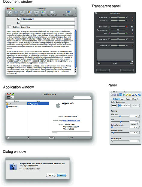
As a developer or a designer, you should be aware of four main types of windows. Although their behavior is generally the same, they have important differences.
Document windows contain file-based user data. They present a view into the content that people create and store. If the document is larger than the window, the window shows a portion of the document’s contents and provides users with the ability to scroll to other areas.
Application windows are the main windows of applications that are not document-based. These windows use the standard Aqua window look and features; if the application is running in versions of Mac OS X prior to v10.5 (Leopard), these windows can use the optional brushed metal look.
Panels float above other windows and provide tools or controls that users can work with while documents are open. In some cases, panels can be transparent. In end-user documentation, panels should be called windows. Panels are discussed in more detail in “Panels.”
Dialogs and alerts require a response from the user. Dialogs and alerts are discussed in “Dialogs.”
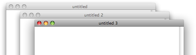
Examples of all of these types of windows are shown in Figure 14-1.
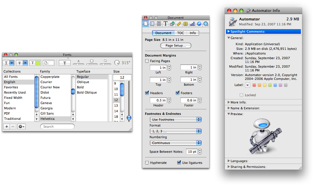
Window Appearance
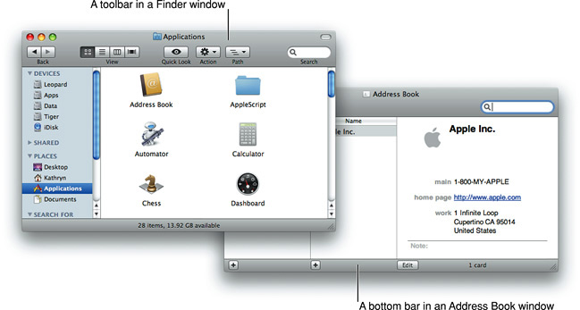
A window consists of window-frame areas and a window body. The window-frame areas include the title bar, the toolbar, and the bottom bar (note that in Mac OS X v10.5 and later, the toolbar is not visually distinct from the title bar). The window body is the main content area that extends from the bottom edge of the title bar (or toolbar, if present) to the bottom edge of the window, not including the bottom bar, if one is present. The toolbar and the bottom bar are optional elements that not all windows have. Figure 14-2 shows examples of these areas in different windows.
In Mac OS X v10.5 and later, no window-frame surface is visible on the sides of windows; the window-body area, the toolbar, and the bottom bar stretch from the left edge to the right edge. Users can drag a window from any window-frame area, including a bottom bar.
All window-frame areas have a gray gradient surface. In the window body, content views (such as text or column views) display a white background by default; the surrounding window-body background is a shade of light gray.
Important: In Mac OS X v10.5 and later, there are no brushed metal windows. Windows that were designed as brushed metal windows to run in earlier versions of Mac OS X should adopt the Leopard look in Mac OS X v10.5. For the most part this is automatic. You may need to adjust your layout so that no window-frame material is visible on the sides of the window and you should ensure that the controls you used in the toolbar are still appropriate. See “Window-Frame Controls” for more information on appropriate controls and “Legacy Toolbar Controls” for some transition advice.
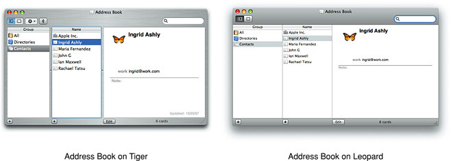
Figure 14-3 shows the Address Book application’s transition from brushed metal to the Leopard look. Notice the removal of all window-frame surface on the sides, the use of appropriate toolbar and bottom-bar controls, and the adoption of the “zero-width” splitters that are standard in Mac OS X v10.5 (for more information about this control, see “Split Views”).
Window Elements
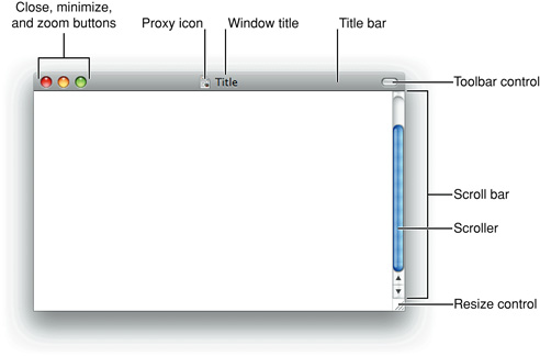
Every document and application window and panel should have, at a minimum:
A title bar. Even if a window does not have an actual title (a tools panel, for example), it should have a title bar so that users can move the window.
A close button, so that users have a consistent way to dismiss the window.
A standard document window may also have the following additional elements that an application window or panel might not have:
Horizontal or vertical scroll bars, or both (if not all the window’s contents are visible)
A proxy icon (after a document has been saved)
The title of the document
A resize control
A toolbar control (if the window contains a toolbar)
Figure 14-4 shows most of these elements in their proper placements in a document window (to see the proper placement of a horizontal scroll bar, see Figure 14-37).
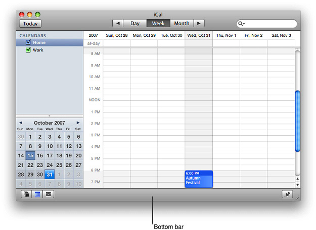
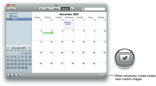
Windows can also display a bottom bar, which is a portion of the window frame that extends below the main content area of the window body. A bottom bar contains controls that directly affect the contents and organization of the window. Controls in a bottom bar are important, but less so than controls in a toolbar. Figure 14-5 shows the bottom bar in an iCal window.
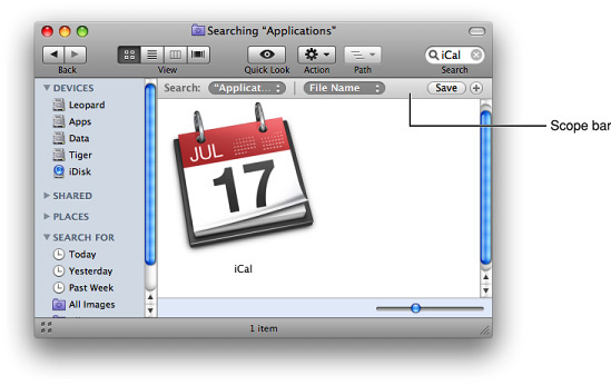
Another optional window element is the scope bar. A scope bar appears below an application’s toolbar and allows users to narrow down a search operation or to filter objects or other operations by identifying specific sets of characteristics. Figure 14-6 shows the scope bar in the Finder.
The Title Bar
All windows should have a title bar even if the window doesn’t have a title (which should be a very rare exception). In Mac OS X v10.5 and later, all windows display the title bar unified with the toolbar, if a toolbar is present. The following sections describe the components of the title bar.
The Window Title
A document window should display the name of the document being viewed. Application windows display the application name. Panels display a descriptive title appropriate for that window. If the contents of the window can change, it might be appropriate to change the title to reflect the current context. For example, in the Keynote inspector panel, the title of the window changes to reflect which pane has been selected.
If you need to display more than one item in the title, separate the items with an em dash (—) with space on either side. For example, the main viewer window of Mail displays the currently selected message mailbox and the selected folder, if any. When a message is viewed in its own window, the message title is displayed.
Don’t display pathnames in window titles. When displaying document titles, use the display name and show the extension if the user has elected to show extensions. If you need to display a path in the body of a window you can use the path control, described in “Path Controls.”
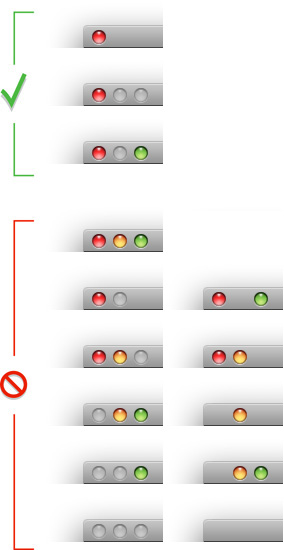
The only controls that belong in a title bar are the close, minimize, and zoom buttons. If a title bar is combined with a toolbar, the unified area can contain the toolbar control and the toolbar customization contextual menu (these controls are described in “Title Bar Buttons”). Do not place other controls in a title bar.
Title Bar Buttons
Document and application windows always display active close and minimize buttons. (See “Closing Windows” and “Minimizing and Expanding Windows” for details on what the close and minimize buttons do.) Include the zoom button if the window can be adjusted in size. Information on how the zoom button works is in “Resizing and Zooming Windows.”
Panels always display an active close button but never an active minimize button.
If buttons are not active, they should at least all be present in an inactive state. The exception is in panels, where it is acceptable to display only one button, the close button. For more information on panels, including information on their title bar buttons, see “Panels.”
Alerts and modal dialogs do not display any of these buttons.
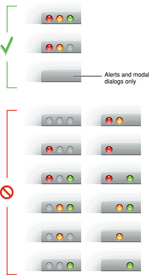
The title bar should include a toolbar control if a toolbar is present in the window (see “Toolbars”). Figure 14-7 shows the appropriate configurations of title bar buttons for standard windows (and alerts and modal dialogs); Figure 14-39 shows appropriate title bar button configurations for panels.
Indicating Changes with the Close Button
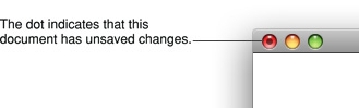
When a document has unsaved changes, the close button should display a dot, as shown in Figure 14-8.
The Proxy Icon
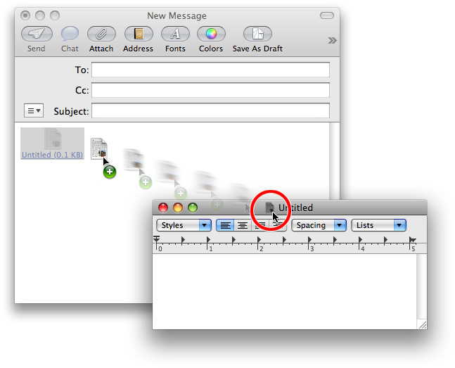
Document windows can include a proxy icon in the title bar after the content is saved for the first time. After pressing a proxy icon for a brief period, users can manipulate it as if they were manipulating the corresponding file-system object. For example, you can attach a document to an email message by dragging its proxy icon into the email message, as shown in Figure 14-9.
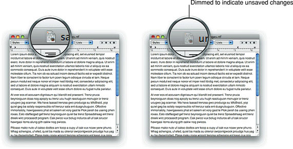
A proxy icon appears in its normal state as long as the state of the document and the file-system object are the same. When a document has unsaved changes, its proxy icon appears dimmed. Note the difference between the proxy icon in the document with unsaved changes versus the document with saved changes in Figure 14-10.
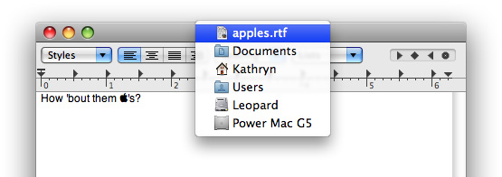
Command-clicking the title or the proxy icon displays a pop-up menu illustrating the document path (note that you do not place a standard pop-up menu control in the title bar to provide this behavior). As shown in Figure 14-11, the document path displays the document itself and all containing folders up to the volume that contains the user’s home directory. Because Mac OS X is a multiple-user environment, it’s especially important to show the complete path of a document to avoid confusion.
Toolbars
A toolbar is useful for giving users immediate access to the most frequently used features in an application. Any item in a toolbar should also be available as a menu command. An application-wide toolbar in its own window is also called a tool panel (or less frequently, a tool palette); for more information, see “Panels.” This section describes toolbars that are part of a window with other content.
Toolbar Appearance and Behavior
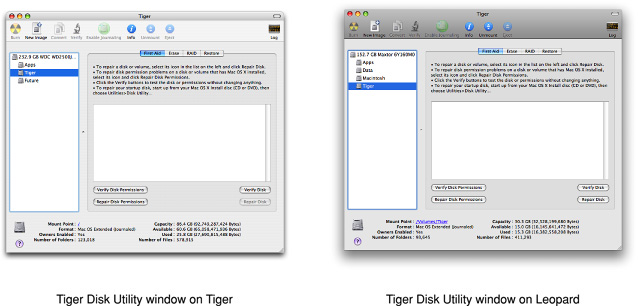
In Mac OS X v10.5 and later, all windows that contain a toolbar display the unified toolbar–title bar appearance by default. This includes windows that were designed for earlier versions of Mac OS X, but are running in Mac OS X v10.5. For example, Figure 14-12 shows a Tiger version of Disk Utility running in Mac OS X v10.4 (on the left) and in Mac OS X v10.5 (on the right).
Figure 14-12 Many Tiger applications automatically receive the Leopard look when running in Mac OS X v10.5 and later
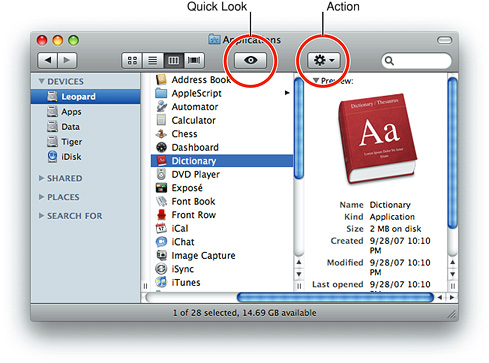
Toolbars can contain a few types of controls and both standard and custom icons. Mac OS X v10.5 provides a small set of controls that are suitable for use in toolbars; standard Aqua controls do not belong in toolbars. Mac OS X v10.5 also provides a range of standard images you can use in toolbar controls, such as the Action menu and the Quick Look symbols, both of which are used in the Finder toolbar (as shown in Figure 14-13). See “Window-Frame Controls” for more information on the controls you can use in toolbars. See “System-Provided Images” for more information about the sytem-provided images you can use and see “Designing Toolbar Icons” for information on designing custom icons or images for a toolbar.
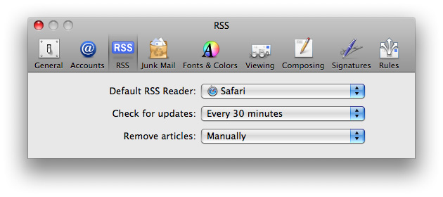
When the user clicks an item in the toolbar an immediate action occurs, such as opening a new window, switching to a different view, displaying a menu, or inserting (or removing) an object. In preferences windows, toolbar items often function as mode switchers: When the user clicks a toolbar item in a preferences window, the entire content of the window changes. This type of toolbar item should maintain its pressed state to indicate which item is currently selected. For example, Figure 14-14 shows the RSS pane of the Mail preferences window. Notice the background highlighting that indicates which toolbar item is the active one.
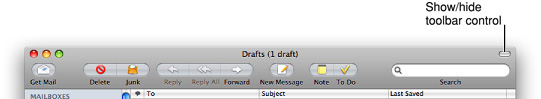
An application or document window that includes a toolbar should provide a control in the window’s title bar area for showing and hiding the toolbar, as shown in Figure 14-15. You should also put commands for showing and hiding the toolbar in the View menu (see “The View Menu”). A preferences window that contains a toolbar that functions as a mode switcher should not have a toolbar control.
Toolbar items can support click-through, which means that the user can activate the item when the containing window is inactive. You can choose to support click-through for any subset of toolbar items; for guidelines on when this might be appropriate, see “Click-Through.”
Designing a Toolbar
Note: This section provides guidelines for designing a toolbar in an application or document window. Although a preferences window can also contain a toolbar, some guidelines for designing such a toolbar differ from the ones in this section. For example, the items in a preferences toolbar should not be available as menu commands and preferences toolbars should not be customizable. See “Preferences” to learn more about choosing items to include in a preferences window and “Preferences Windows” for more information on the look and behavior of preferences windows.
To help you decide what items to put in a toolbar, consider the user’s mental model of the task your application performs (to learn more about the mental model, see “Reflect the User’s Mental Model”). Keep in mind that a toolbar has limited space, so it’s important to include items most users need regularly and to avoid including items that are used very infrequently. Using the user’s mental model as a guide, examine the functionality of your application and identify the most useful features, commands, and objects.
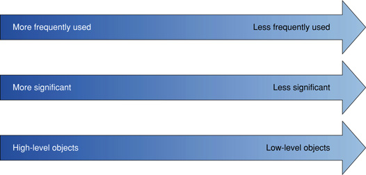
Then, try to identify logical groupings or rankings of the commands and objects you’ve chosen. Place the items that should have the highest visibility in the left end of the toolbar. For example, one good design is to place more frequently used toolbar items to the left of less frequently used items. Another successful arrangement is to position toolbar items according to importance, significance, or place in an object hierarchy. In this design, the most important or significant items, or the ones closest to the root of the hierarchy, should have the highest visibility and are therefore towards the left end of the toolbar.
Often, you can define logical subsets of these features and objects, such as a subset of commands related to the manipulation of a document and a subset of commands related to the objects on a document page. When this is the case, you can then arrange the items in each subset according to importance or frequency of use, and then use the same criteria to position the subsets in the toolbar. Figure 14-16 shows three ways to arrange toolbar items.
For example, in the default Keynote toolbar, items are grouped by functionality. Then, Keynote positions the groups so that they range from items that handle slide decks and slides to items that provide inspection and selection of object attributes. Specifically, slide creation and management items are on the left, slide contents and object management items are in the middle, and object adjustment and selection are on the far right. Figure 14-17 shows about half of these groups.

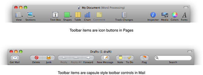
As you design the appearance of the toolbar items themselves, you have two options. First, if the features you’ve chosen lend themselves to iconic representation, you can create a recognizable image to stand for each one. Depending on the overall look of your application, decide whether you want to place the images in capsule-style toolbar controls or to use them as free-standing icon buttons. For example, both Pages and Mail use recognizable images to represent important commands, but Pages displays its images as icon buttons and Mail uses capsule-style toolbar buttons, as shown in Figure 14-18. For more information about icon buttons, see “Icon Buttons”; for more information about capsule-style toolbar buttons, see “Capsule-Style Toolbar Controls.”
Second, it may be that you can use the system-provided images to clearly represent all or most of the commands you’ve identified for display in the toolbar (these images are described in detail in “System-Provided Images”). If this is the case, you can choose to place these images in either the rectangular-style or capsule-style toolbar controls. For example, Finder includes several toolbar controls that display system-provided images, as shown in Figure 14-13.
Important: If you choose to use system-provided images in your toolbar controls, be sure to avoid creating new meanings for them. For example, use the Action gear symbol in an Action menu only; don’t use it to stand for “build” or “advanced.”
The default set of toolbar items you provide should fit in the default window size, and the order in which they appear should reflect the user’s mental model in some way. However, users should be able to customize which items appear in the toolbar and in what order. Additionally, a toolbar should display items with text labels by default; users should be able to change the display to items only or text only. You can provide these options with a Customize Toolbar command in the View menu.
Make sure that every toolbar item you create has an associated menu command. However, you should not create a toolbar item for every menu command, because not all commands are important enough or used frequently enough to warrant inclusion in a toolbar.
Avoid putting an application-specific contextual menu in your toolbar. The only contextual menu that makes sense in a toolbar is the toolbar customization contextual menu. If you need to offer a set of commands that act upon an object the user selects, use an Action menu control (described in “Action Menus”).
Scope Bars
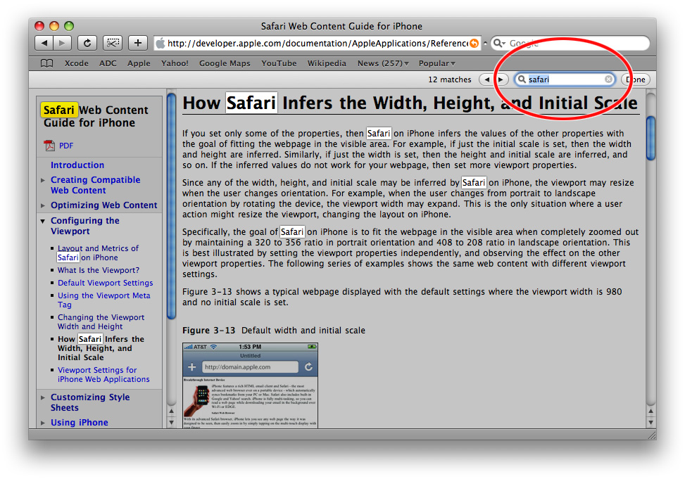
A scope bar allows users to specify locations or rules in a search or to filter objects by specific criteria. In general, scope bars are not visible all the time, but appear when the user initiates a search or similar operation. Figure 14-19 shows the scope bar Safari displays when the user performs a find (because the Safari find operation does not allow the addition of scoping criteria, you can think of it as using an implied scope of “all”).
Scope Bar Appearance and Behavior
A scope bar is a horizontal strip that can appear just below your application’s toolbar. It can be visible at all times, but is usually invisible until the user initiates an operation such as a search or find.
Although a scope bar may contain a search field control, it often contains only two types of controls, both of which are designed solely for use in a scope bar. The first control is the recessed-style scope button, which is used to display scoping locations and categories. The second is the round rectangle–style scope button, which is used to save or manipulate a scoping operation (for details on these controls, see “Scope Buttons”).
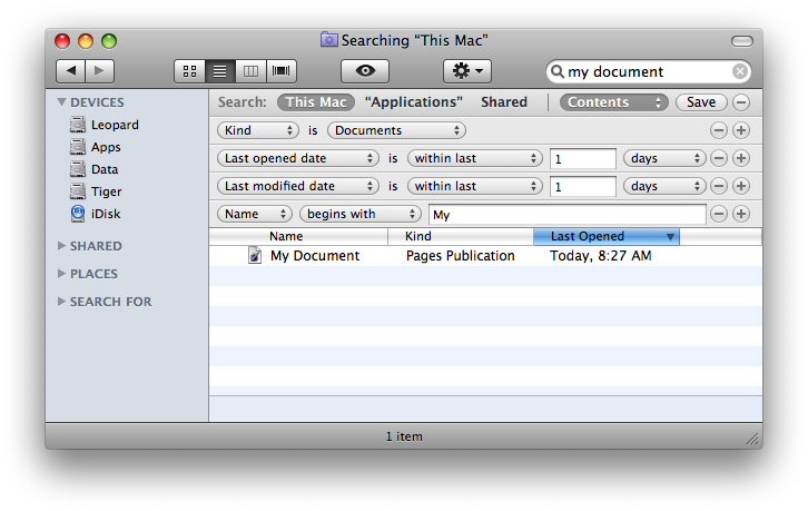
You can also display filter rows below a scope bar that allow users to specify additional rules that help refine the scoping operation. In addition to the round rectangle–style scope button (used for selecting or saving scoping criteria), a filter row can also contain text fields that accept user input. For example, when users search in the Finder, they can click the Add button to view a new row with supplementary rules they can use to refine their search. Figure 14-20 shows a Finder window with several filter rows displayed below the scope bar.
Designing a Scope Bar
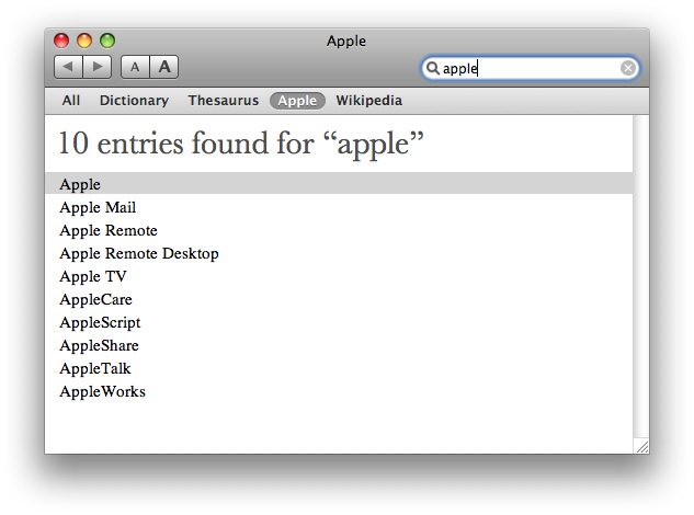
Scope bars are useful for integrating search or filtering in your application. You might choose to provide a scope bar (instead of a separate Find window, for example) if you want the user’s focus to remain on the window. Be sure that you use a scope bar only to specify and narrow a search or to filter items by specified criteria. If you need to provide a way for users to navigate or to select collections of items or data that should appear in the window, however, you should use a source list instead (described in “Source Lists”). For example, the Dictionary application uses a scope bar to allow users to dynamically filter results by reference type (such as dictionary, thesaurus, or Apple dictionary), as shown in Figure 14-21.
As you choose the locations and categories that should appear in a scope bar, revisit the user’s mental model of the tasks your application performs. (See “Reflect the User’s Mental Model” for more information on discovering this cognitive model.) Determine the objects the user works with, and identify the attributes of those objects. For example, an application that allows users to create, use, and store recipes might display a scope bar when the user begins a search, providing buttons that correspond to different recipe collections.
If appropriate, allow users to define subsets of the locations and categories you offer by providing filter rows that display additional rules and filtering criteria. For example, the recipe application described above could display filter rows that allow users to filter their results by ingredient, cuisine, seasonal availability, complexity, date last used, diet type, and other criteria. You should also allow users to save their searches. As shown in Figure 14-20, the Finder offers many types of additional filtering functionality and the ability to save searches.
Source Lists
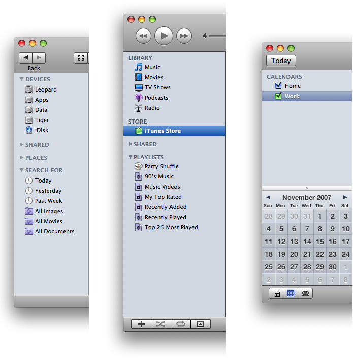
A source list (also called a sidebar) is an area of a window, usually set off by a movable splitter, that provides users with a way to navigate or select objects in the application (for more information on splitters, see “Split Views”). Typically, users select an object in the source list that they act on in the main part of the window. You can provide a source list as the primary means of navigating or viewing within your application, as the Finder and iTunes do, or as a way to select a view in a part of the application, as some panes in System Preferences do.
Figure 14-22 shows some examples of source lists that function as primary navigation and selection mechanisms.
Source List Behavior and Appearance
In Mac OS X v10.5 and later, source lists look different depending on their usage. A source list that provides the primary navigation or selection mechanism for the application as a whole displays a blue background. This type of source list should be the only source list in the application window and should always be visible (unless the user chooses to hide it). The Finder sidebar (shown on the left in Figure 14-22) is an example of this type of source list: It provides primary navigation and selection functionality for the application, it's separated from the rest of the window by a movable splitter, and it’s always visible (unless the user chooses to hide it and the toolbar).
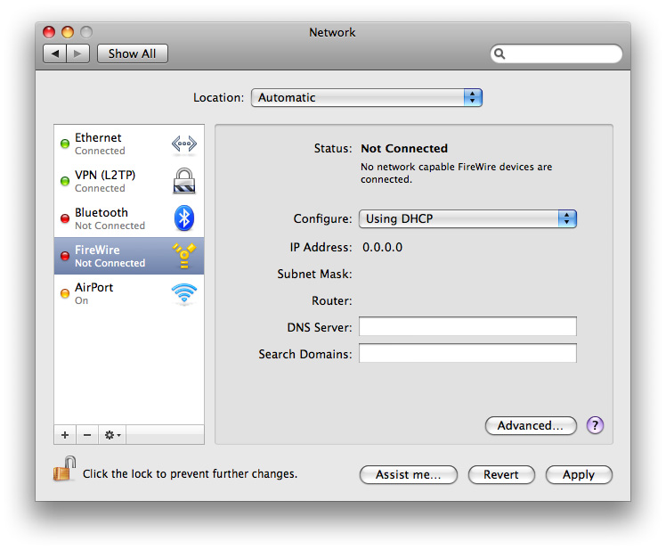
The other style of source list is often used in preferences windows. This type of source list provides selection functionality for the window, but not the application as a whole. A source list of this type displays a white background and might not be separated from the rest of the window by a movable splitter. The Network System Preferences pane contains this type of source list, as shown in Figure 14-23.
Source lists don’t generally have headers like lists can, but they can display titles to distinguish subsets of objects or data. For example, the Finder displays several useful subsets of locations in its sidebar, such as Devices, Shared, and Places, as shown on the left in Figure 14-22.
Designing a Source List
Source lists provide a very effective file-system abstraction. This means that a source list can shield users from the details of file and document management, allowing them to work with user-customizable, application-specific containers that hold related items. These high-level container objects can hide the actual file-system locations of their files and data and conceal the associations between them. This can relieve users of the burden of locating and opening the auxiliary or related files they need to do their work.
Source lists are especially useful in single-window applications that are not necessarily document-based, but that allow users to create and manage content. For example, iTunes allows users to ignore the file-system locations of their songs, podcasts, and movies, and instead work with libraries and playlists. Similarly, iWeb focuses on website creation, not file management.
You should consider including a source list in your application when:
Navigation and selection of content are primary tasks.
Collections of objects are key to the user’s mental model (see “Reflect the User’s Mental Model” to learn more about the mental model).
The hierarchical arrangement of objects presents a natural way to navigate.
Arranging objects hierarchically removes complexity.
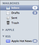
Because the source list is a navigation and selection tool, it should not contain controls other than controls used to organize the data itself. For example, you can use a disclosure triangle to reveal an additional level of hierarchy (disclosure triangles are described in “Disclosure Triangles”). Figure 14-24 shows how Mail uses disclosure triangles to display two levels of hierarchically organized information.
A source list should not contain more than two levels of hierarchy. If the data you need to display is organized in more than two levels of hierarchy, you can use a second source list, but you should not use additional disclosure triangles to expose additional levels of hierarchy in a single source list. If, however, your application is centered on the navigation of deeply nested objects, you should consider using a browser view instead of multiple source lists.
As mentioned in “Source List Behavior and Appearance,” if your application contains a single source list that provides primary navigation and selection functionality, you can use the blue background. In all other cases, however, you should use the white background. Specifically, use the white background when:
Your window contains more than one source list.
You use a source list in a panel or preferences window.
You should allow users to customize the contents of a source list. This way, you allow users to decide what object containers are most important to them. You should also consider using Spotlight to support smart data containers. For more information on using Spotlight in your application, read Spotlight Overview.
If you need to allow users to add, remove, manipulate, or get information about items in the source list, you have two options:
If your window has a bottom bar, you can place window-frame controls in the bottom bar directly below the source list. See “Rectangular-Style Toolbar Controls” for more information about the controls you can use in a bottom bar; see “Bottom Bars” for more information on designing bottom bars.
If your window does not have a bottom bar, you can use gradient buttons at the bottom edge of the source list. Gradient buttons blend well with the background of the source list and look good with the bottom edge of the window-body area. See “Gradient Buttons” for details about using gradient buttons.
Bottom Bars
A bottom bar is a window-frame area that is below the window body. Bottom bars give users access to controls that directly affect the contents or organization of the window body.
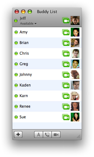
In general, controls in a bottom bar are frequently used, but are somewhat less important than controls in a toolbar. For example, the bottom-bar controls in iChat allow users to add buddies to the list and to text message, call, or video chat with a selected buddy, whereas the controls in the toolbar are focused on the user of the application. Figure 14-25 shows the iChat bottom bar.
Bottom Bar Appearance and Behavior
Because a bottom bar is part of the window frame, it has the same gray gradient surface that is visible in the toolbar–title bar area.
Bottom bars can contain either regular-size or small rectangular-style toolbar controls; bottom bars should not contain icon buttons, capsule-style toolbar controls, custom controls, or any standard Aqua controls. See “Rectangular-Style Toolbar Controls” for more information about controls that are suitable for use in a bottom bar.
Important: If you choose to use system-provided images in your bottom-bar controls, be sure to avoid redefining their meanings. For example, use the Quick Look symbol to mean "preview with Quick Look” only; don’t use it to mean “magnify.“
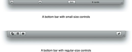
At the top of Figure 14-26 you can see the Address Book bottom bar (which uses small controls) and below it you can see the iCal bottom bar (which uses regular-size controls).
Designing a Bottom Bar
Because of its subordinate position at the bottom edge of the window, a bottom bar should not contain controls for the most frequently used commands. After all, users don’t typically look at the bottom area of a window more often than they look at the top area, so placing the most important controls at the bottom makes them harder to find. However, although items in a bottom bar are less frequently used than items in a toolbar, you should still take care to choose items that give users an easy way to perform common tasks.
Unlike toolbars, bottom bars are not user-customizable, so it’s especially important to provide a set of useful controls that is neither too general nor too specific. To help you determine which commands will be the most useful in the bottom bar of your window, be sure you understand the user’s mental model of the tasks users perform with your application. To learn more about this concept, see “Reflect the User’s Mental Model.”
After you’ve decided what commands you want to provide in a bottom bar, you need to choose or create simple, streamlined icons that are easily recognized as metaphors for these tasks. (Note that you can also use a text label in a bottom-bar control, such as “Edit.“) If possible, you should use the system-provided images (described in “System-Provided Images”) because users are already familiar with their meanings. If you must design an icon for a bottom-bar control, try to imitate the clean lines of the system-provided images, as iCal does for its to-do bottom-bar control, shown in Figure 14-27. (For more information on designing icons for use in bottom-bar controls, see “Designing Icons for Rectangular-Style Toolbar Controls.”)
As with toolbar items, every bottom-bar item should also be available as a menu command. Also, bottom bars should not contain contextual menus. If you need to offer a collection of commands that users can perform on a selected item in the window body, provide an Action menu control that displays the system-provided Action image (see “Action Menus” for more information on this control).
To decide whether to use regular-size or small controls in a bottom bar, consider the prominence these controls should have and the overall look of your window.
Create a bottom bar by leaving a horizontal strip of the window frame visible below the window body content view. If you want to place regular-size controls in a bottom bar, leave a strip that is 32 pixels high; if you want to use small controls, leave a strip that is 22 pixels high. For guidelines that help you place text and controls in a bottom bar, see “Positioning Text and Controls in a Bottom Bar.”
Drawers
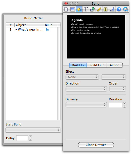
A drawer is a child window that slides out from a parent window and that the user can open or close (show or hide) while the parent window is open. A drawer should contain frequently accessed controls that don’t need to be visible at all times. For example, Figure 14-28 shows a drawer that provides details about slide builds in the Keynote Build inspector.
When to Use Drawers
Use drawers only for controls that need to be accessed fairly frequently but that don’t need to be visible all the time. This is in contrast to the criterion for a panel, which should be visible and available whenever its main window is in the top layer. (For more information about panels, see “Panels.”)
Although a drawer is somewhat similar to a sheet in that it attaches to a window and slides out, the two elements are not interchangeable. Sheets are modal dialogs (as described in “When to Use Sheets”), whereas drawers provide additional functionality. When a sheet is open, it is the focus of the window and it obscures the window contents; when a drawer is open, the entire parent window is still visible and accessible.
You should not use a drawer to provide users with a way to navigate hierarchically arranged content in your window. If you need to do this in your application, you should use a source list instead. See “Source Lists” to learn more about source lists.
Drawer Behavior
The user shows or hides a drawer, typically by clicking a button or choosing a command. If a drawer contains a valid drop target, you may also want to open the drawer when the user drags an appropriate object to where the drawer appears.
When a drawer opens, it appears to be sliding from behind its parent window, to the left, right, or down. You should ensure that a parent window’s default position allows its drawer to open fully without disappearing offscreen. If a user moves a parent window to the edge of the screen and then opens a drawer, it should open on the side of the window that has room. If the user makes a window so big that there’s no room on either side, the drawer opens off the screen.
To support the illusion that a closed drawer is hidden behind its parent window, an open drawer should be smaller than its parent window. When the parent window is resized vertically, an open drawer resizes, if necessary, to ensure that it does not exceed the height of the parent window. (A drawer can be shorter than its parent window.) The illusion is further reinforced by the fact that the inner border of a drawer is hidden by the parent window and that the parent window’s shadow is seen on the drawer when appropriate.
The user can resize an open drawer by dragging its outside border. The degree to which a drawer can be resized is determined by the content of the drawer. If the user resizes a drawer significantly—to the point where content is mostly obscured—the drawer should simply close. For example, if a drawer contains a scrolling list, the user should be able to resize the drawer to cover up the edge of the list. But if the user makes the drawer so small that the items in the list are difficult to identify, the drawer should close. If the user sets a new size (if that is possible) for a drawer, the new size should be used the next time the drawer is opened.
A drawer should maintain its state (open or closed) when its parent window becomes inactive or when the window is closed and then reopened. When a parent window with an open drawer is minimized, the drawer should close; the drawer should reopen when the window is made active again.
A drawer can contain any control that is appropriate to its intended use. Follow normal layout guidelines, as stated in “Positioning Regular-Size Controls in a Window Body.”
Consider a drawer part of the parent window; don’t dim a drawer’s controls when the parent window has focus, and vice versa. When full keyboard access is on, a drawer’s contents should be included in the window components that the user can select by pressing Tab.
Window Behavior
This section discusses how you should open, position, resize, and close windows and provides guidelines on how they should behave when a user interacts with them.
Opening Windows
Your application should open a window when a user does any of the following:
Double-clicks the icon for a document supported by your application in the Finder
Double-clicks your application icon
Selects a document in the Finder and chooses open from the File menu (or selects the document and presses Command-O in the Finder)
Chooses a file from within an Open dialog
Chooses the New command from the File menu
Clicks the application icon in the Dock when no windows are open
When the user opens an existing document, make sure its title is the display name, which reflects the user’s preference for showing or hiding its filename extension. Don’t display pathnames in document titles.
New windows should be named as described in “Naming New Windows.”
The content of some windows changes depending on the user’s selection. For example, when the user clicks one of the icons at the top of the Mail Preferences window, the display at the bottom of the window changes. Some windows, such as Displays in System Preferences, switch panes using a tab control (see “Tab Views”).
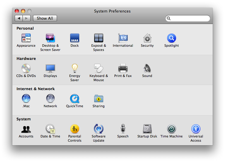
Windows with changeable panes should reopen in their previous state as long as the application is open and return to their default views when the user quits. In a window with toolbars, if the toolbar represents only a subset of multiple possible views (favorites), the default state should be to show all of the options below the toolbar, not a particular pane. If the toolbar displays all of the possible selections, then the default state of the window should be to display whichever pane the user last selected. For example, when System Preferences opens, all of the possible selections are visible, but when Mail preferences opens, it displays the last pane selected by the user. The System Preferences window is shown in Figure 14-29.
Naming New Windows
If your application is not document-based, use the name of your application as the window title. If your application has a short name, use it as the title.
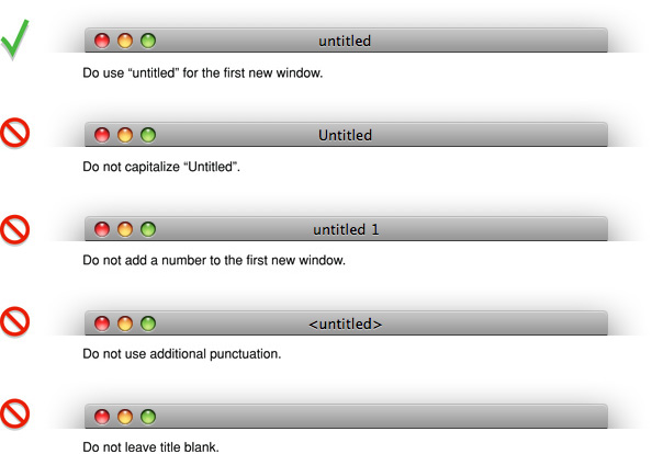
Name a new document window “untitled”; leaving it lowercase makes it more obvious that the window doesn’t have a name and encourages people to save the document. If the user chooses New again before saving the first untitled window, name the second window “untitled 2,” and so on. Add numbers to window titles only when there is more than one open untitled window. Don’t put a “1” on the first untitled window, even after the user opens other new windows. Figure 14-30 shows titles you should use for new, unsaved document windows.
If the user dismisses all untitled windows by saving or closing them, then the next new document should start over as “untitled,” the next should be “untitled 2,” and so on. Figure 14-31 shows the correct title for a new window followed by various examples of incorrect titles.
Positioning Windows
Whenever your application displays a window, you must decide where to put it and how big to make it.
New document windows should open horizontally centered and should display as much of the document content as possible. The top of the document window should butt up against the menu bar (or the application’s toolbar, if one is open and positioned below the menu bar). Subsequent windows should open to the right 20 pixels and down 20 pixels. Make sure that no part of a new window overlaps with the Dock. For more information about the Dock, see “The Dock.”
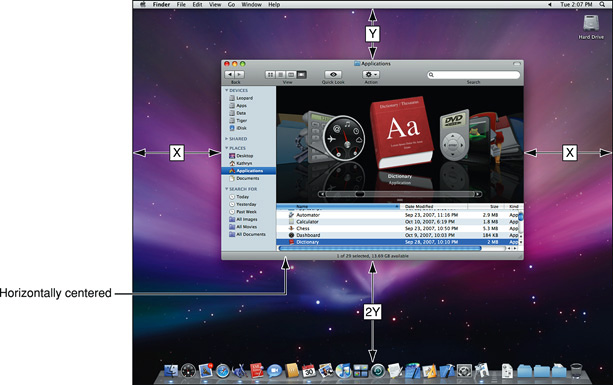
For nondocument windows, the preference is to open new windows horizontally centered as shown in Figure 14-32. The vertical position should be visually centered: The distance from the bottom of the window to the top of the Dock (if it’s at the bottom of the screen) should be approximately twice the distance as that from the bottom of the menu bar to the top of the window. Subsequent windows are moved to the right 20 pixels and down 20 pixels. Make sure that no part of a new window overlaps with the Dock.
If a user changes a window’s initial size or location, maintain the user’s choices the next time the associated file or window (in the case of a single-window application) opens. If a user opens, moves, and closes a document window without making any other changes, save the new window position but don’t modify the file’s date stamp.
Before reopening a window, make sure that the size and state are feasible for the user’s current monitor setup, which may not be the same as the last time the document was open. Try to maintain the window’s previous location (the top-left corner of the window) and, if possible, its size. If you can’t replicate both, maintain the location and reduce the window’s size. If that is not possible, try to keep the window on the same monitor, open the window so that as much of the content as possible is visible, and follow the guidelines for opening a new window, as described previously.
For example, if a user opens a document to full size on a wide aspect-ratio display and then opens the file on a computer with a smaller display, the document should open in a window sized for the smaller display, not in the larger, saved size. For more information on appropriate window size, see “Resizing and Zooming Windows.”
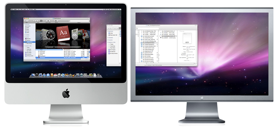
On a computer with more than one display, display the first new window visually centered in the screen containing the menu bar. If the user doesn’t move that first window, display each additional window below and to the right of its predecessor. If the user moves the window, display each additional window on the screen that contains the largest portion of the frontmost window, as shown in Figure 14-33. For example, if the user creates a window, drags it completely to a second monitor, and then creates a new window, display the new window on the second screen. If there is sufficient room on the screen, display subsequent windows to the lower right of the frontmost window. If there isn’t enough room on the screen, display subsequent windows starting in the original visually centered position, and then continue to display additional windows slightly offset to the lower right.
If the user moves a window so that it is entirely positioned on a second monitor and then opens the window on a single-monitor system, respect the window’s previous size, if possible.
Figure 14-33 Appropriate placement of a new window on a system with multiple monitors (the user moved the first window to span the screens)
If the user opens several windows on a multiple-monitor system, continue to place the windows on the screen where the user is working, each new one below and to the right of its predecessor. Don’t open a window so that it spans monitors; the initial position of a window should always be contained on a single screen.
Moving Windows
The user moves a window by dragging any part of the window frame (see “Window Appearance” for more information on parts of the window). As a user drags, the full window and its contents move.
Pressing the Command key while dragging an inactive window moves the window but does not make it active. See “Main, Key, and Inactive Windows” for more information about active and inactive windows.
Your application should never allow users to move a window to a position from which they can’t reposition it.
Resizing and Zooming Windows
Your application determines the minimum and maximum window size. Base these sizes on the resolution of the display and on the constraints of your interface. For document windows, try to show as much of the content as possible, or a reasonable unit, such as a page.
Your application also sets the values for the initial size and position of a window, called the standard state. Don’t assume that the standard state should be as large as possible; some monitors are much larger than the useful size for a window. Choose a standard state that is best suited for working on the type of document your application creates and that shows as much of the document’s contents as possible.
The user can’t change the standard size and location of a window, but your application can change the standard state when appropriate. For example, a word processor might define the standard size and location as wide enough to display a document whose width is specified in the Page Setup dialog.
The user changes a window’s size by dragging the size control (in the lower-right corner). As a user drags, the amount of visible content in the window changes. The upper-left corner of the window remains in the same place. The actual window contents are displayed at all times.
If the user changes a window’s size or location by at least 7 pixels, the new size and location is the user state.The user can toggle between the standard state and the user state by clicking the zoom button. When the user clicks the zoom button of a window in the user state, your application should first determine the appropriate size of the standard state. Move the window as little as possible to make it the standard size, and keep the entire window on the screen. The zoom button should not cause the window to fill the entire screen unless that was the last state the user set.
When a user with more than one monitor zooms a window, the standard state should be on the monitor containing the largest portion of the window, not necessarily the monitor with the menu bar. This means that if the user moves a window between monitors, the window’s position in the standard state could be on different monitors at different times. The standard state for any window must always be fully contained on a single monitor.
When zooming a window, make sure it doesn’t overlap with the Dock. For more information about the Dock, see “The Dock.”
Minimizing and Expanding Windows
When the user clicks the minimize button, double-clicks the title bar, or presses Command-M, the window minimizes into the Dock. The window’s icon remains in the Dock until the user clicks it or, if it is the application’s only open window, until the user clicks the application icon in the Dock. For more information about the Dock, see “The Dock.”
Clicking an application icon in the Dock should always result in a window—a document or another appropriate window—becoming active. If a document-based application is not open when the user clicks the Dock icon, the application should open a new, untitled window.
While an application is open, the Dock icon has a symbol below it. When a user clicks an open application’s icon in the Dock, the application becomes active and all open unminimized windows are brought to the front; minimized document windows remain in the Dock. If there are no unminimized windows when the user clicks the Dock icon, the last minimized window should be expanded and made active. If no documents are open, the application should open a new window. (If your application is not document-based, display the application’s main window.)
Closing Windows
Users can close windows by:
Choosing Close from the File menu
Pressing Command-W
Clicking the close button
When a user closes a document window, your application should:
Decide what to do with unsaved data (see “Dialogs for Saving, Closing, and Quitting”)
Store the window’s onscreen position and size (so they can be used when the window is reopened)
In most cases, applications that are not document-based should quit when the main window is closed. For Example, System Preferences quits if the user closes the window. If an application continues to perform some function when the main window is closed, however, it may be appropriate to leave it running when the main window is closed. For example, iTunes continues to play when the user closes the main window.
Window Layering
Each application and document window exists in its own layer, so documents from different applications can be interleaved. Clicking a window to bring it to the front doesn’t disturb the layering order of any other window.
A window’s depth in the layers is determined by when the window was last accessed. When a user clicks an inactive document or chooses it from the Window menu, only that document, and any open panels, should be brought to the front. Users can bring all windows of an application forward by clicking its icon in the Dock or by choosing Bring All to Front in the application’s Window menu. These actions should bring forward all of the application’s open windows, maintaining their onscreen location, size, and layering order within the application. For more information, see “The Window Menu.”
Panels are always in the same layer, the top layer. They are visible only when their application is active and they float on top of any document windows in the application.
Users can cycle forward or backward through all open document windows by using Command-Grave Accent (Command-`) and Command-Shift-Grave Accent (Command-Shift-`). If full keyboard access is on, they can cycle through all windows by using Control-F4 and Shift-Control-F4.
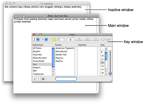
Main, Key, and Inactive Windows
Windows have different looks based on how the user is interacting with them. The foremost document or application window that is the focus of the user’s attention is referred to as the main window. The main window is often also the key window. The key window is the window that accepts user input, whether from the keyboard, mouse, or alternative input device. The “close window” keyboard shortcut, Command-W, targets the key window.
However, the main window is not always the key window. There are times when a window other than the main window takes the focus of the input device, while the main window still remains the focus of the user’s attention. For example, when a person is using an inspector, a Find dialog, or the Fonts or Colors windows, the document is the main window and the other window is the key window.
If the main and key window are different windows, they are distinguished from one another by the look of their title bars (and toolbars, if they are present). In particular, note that the key window displays title-bar controls with color.
Main and key windows are both active windows. An active window is visually distinct from an inactive window in that its title bar (and its toolbar, if there is one) displays the standard window-frame color, while the title bar (and toolbar) of an inactive window displays a lighter shade of the window-frame color. Inactive windows are windows the user has open, but that are not in the foreground. Main and key windows are always in the foreground, but only the controls of the key window have color. An active window that is not key has active, but clear, controls.
Note: A transparent panel that is key displays a subtly reflective title bar and a white title, whereas a non-key transparent panel displays a darker title bar and a light gray title. See “Transparent Panels” for more information about transparent panels.
The visual distinctions between main, key, and inactive windows are shown in Figure 14-34.
Click-Through
An item that provides click-through is one that a user can activate on an inactive window with one click, instead of clicking first to make the window active and then clicking the item. Click-through provides greater efficiency in performing such tasks as closing or resizing inactive windows, and copying or moving files. In many cases, however, click-through could confuse a user who clicks an item unintentionally.
Click-through is not a property of a class of controls. Any control, including toolbar items, can support click-through in many contexts, but the same control could disable click-through when its use could be destructive or difficult to reverse in a particular context.
In an inactive window, items that do not provide click-through should appear in their disabled state. Figure 14-35 shows controls that do support click-through in an inactive window.
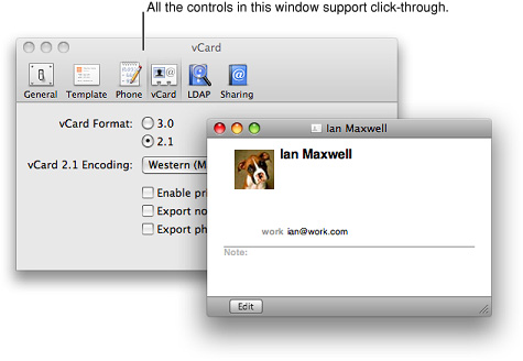
In a single window, you can provide click-through for any subset of items; you do not have to choose between supporting click-through for all items or none. Examine the controls in your window to see which items a user might want to activate while the window is inactive. Use the following guidelines to help you determine which items should not support click-through.
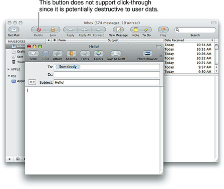
Don’t provide click-through for an item or action that:
Is potentially harmful and does not allow the user to cancel it (for example, the Delete button in Mail)
Is difficult or impossible to cancel (such as the Send button in Mail)
Dismisses a dialog without telling the user what action was taken (for example, the Save button in a Save dialog that overwrites an existing file and automatically dismisses the dialog)
Removes the user from the current context (for example, selecting a new item in a Finder column can change the target of the Finder window)
Clicking in any one of these situations should result in the containing window being brought forward, but no action being taken. Figure 14-36 shows an example of a control that does not support click-through, because its action is destructive.
In general, you can implement click-through for a command that provides confirmation feedback before executing, even if the command ultimately results in destruction of data. For example, you can provide click-through for a delete button if you make sure to provide the user with the ability to cancel or confirm the action before it executes. For example, in Accounts preferences, the button for deleting users provides click-through because it also provides a confirmation dialog before executing.
If you want to implement click-through for an item that doesn’t provide confirmation feedback, consider how difficult it will be for the user to undo the action after it’s performed. For example, in Mail, the Delete button does not provide click-through because it deletes a message without providing feedback first, which is a potentially harmful action and one that is difficult to undo. Click-through for the New button in Mail is fine because its resulting action is not harmful and is easy to undo.
Scrolling Windows
People use scroll bars to view areas of a document or a list that is larger than can fit in the current window. Only active windows can be scrolled. A window can have a horizontal scroll bar, a vertical scroll bar, both, or neither. A window that has one or more scroll bars also has a resize control in the bottom right corner. Figure 14-37 shows the parts of a scroll bar in a window.
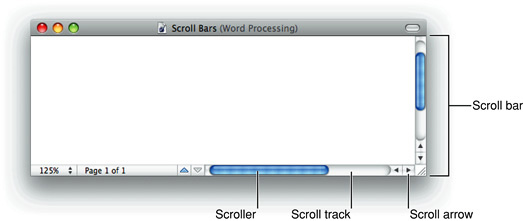
The scroller size reflects how much of the content is visible; the smaller the scroller, the less of the content the user can see at that time. The scroller represents the relative location, in the whole document, of the portion that can be seen in the window.
If the entire contents of a document is visible in a window, the scroll bars do not contain scrollers. Scroll bars in inactive windows have an inactive appearance. In Figure 14-36 you can see the inactive appearance in the scroll bar of the Mail viewer window.
For most document windows that contain a single view (scrolling text or tables, for example), do not specify any space between the window edge and scroll bars.
The user can use scroll bars by doing the following:
Dragging the scroller. This method is usually the fastest way to move around a document. The window’s contents changes in “real time” as the user drags the scroller.
Clicking a scroll arrow. This means, “Show me more of the document that’s hidden in this direction.” The scroller moves in the direction of the arrow. Each scroll arrow click moves the content one unit; your application determines what one unit equals. For example, a word processor would move a line of text per click, a spreadsheet could move one row or column. To ensure smooth scrolling effects, specify units of the same size throughout a document.
Clicking or pressing in the scroll track. Clicking advances the document by a windowful (the default) or to the pointer’s hot spot, depending on the user’s choice in Appearance preferences. A “windowful” is the height or width of the window, minus at least one unit of overlap to maintain the user’s context. This unit of overlap should be the same as one scroll arrow unit (for example, a line of text, a row of icons, or part of a picture). The Page Up and Page Down keys also move the document view by a windowful.
Pressing in the scroll track displays consecutive windowfuls of the document until the location of the scroller catches up to the location of the pointer (or until the user releases the mouse button).
It’s best not to add controls to the scroll-bar area of a window. If you add more than one control to this area, it’s hard for people to distinguish among controls and click the right one. Acceptable additions to the scroll area include a splitter bar and a status bar that shows, for example, the current page. To ensure that window controls are easy to use and understand, it’s best to place the majority of your features in the menus as commands. If you really want to provide additional access to features, consider creating a panel. Only frequently accessed features that significantly benefit users’ productivity should be elevated to the primary interface.
Panels that coexist with other windows and need to use the least amount of screen space possible may use small or mini scroll bars. If a window has small or mini scroll bars, all other controls within the window content area should also be the smaller version. For more information, see “Positioning Small and Mini Controls in a Window Body.”
Make sure you don’t use a scroll bar when you should really use a slider. Use sliders to change settings; use scroll bars only for representing the relative position of the visible portion of a document or list. For information about sliders, see “Sliders.”
Automatic Scrolling
Most of the time, the user should be in control of scrolling. Your application must perform automatic scrolling in these cases:
When your application performs an operation that results in making a new selection or moving the insertion point (for example, when the user searches for some text and your application locates it), scroll the document to show the new selection.
When the user enters information from the keyboard at a location not visible within the window (for example, the insertion point is on one page and the user has navigated to another page), scroll the document automatically to incorporate and display the new information.
Your application determines the distance to scroll.
When the user moves the pointer past the edge of the window while holding down the mouse button to make an extended selection, scroll the document in the direction the pointer moves.
When the user selects something, scrolls to a new location, and then tries to perform an operation on the selection, scroll so the selection is showing before your application performs the operation.
Whenever your application scrolls a document automatically, move the document only as much as is necessary. That is, if part of a selection is showing after the user performs an operation, don’t scroll at all. If your application can reveal the selection by scrolling in only one direction, don’t scroll in both.
When automatically scrolling to a selection, try to show the selection in context. When the selection is too large to show in its entirety, it might be a good idea to show some context instead of having the selection fill the window.
Panels
The term panel is a general term used to describe auxiliary windows that contain controls and options that affect the active document or selection. Different types of panels may have more specific names, such as Colors window or inspector. Note that in end-user documentation, it’s usually clearer to describe panels as windows, when it is necessary to specify their type. When possible, you should refer to all windows by their title, not their type.
For some applications, such as highly visual, immersive applications, transparent panels are appropriate. For most applications, however, standard panel types are best. See Figure 14-1 for an example of a transparent panel; to learn more about them, see “Transparent Panels.”
Panels are either application-specific or systemwide. Application-specific panels disappear when the application is deactivated.
Systemwide panels, such as the Colors window and the Fonts window, float on top of all open windows.
You can create a modeless panel, such as a tools panel, to present controls or settings that affect the active document window. Panels are useful for keeping extremely important controls or information accessible at all times in the context of a user task. Because panels take up screen space, however, don’t use them when you can meet the need by using a modeless dialog (the user changes settings and then closes the dialog) or by adding a few appropriate controls to a toolbar.
A user can open several panels at a time; they float on top of document windows. When a user makes a document active, all of the application’s panels should be brought to the front, regardless of which document was active when the user opened the panel. When your application is inactive, its panels should be hidden. Panels should not be listed in the Window menu as documents, but you may put commands to show or hide all panels in the Window menu. Figure 14-38 shows examples of different styles of panels.
A panel may have a title. An untitled panel should have a title-bar region for dragging it.
A user would never need to minimize a panel because it is displayed only when needed and disappears when its application is inactive. Therefore, the minimize button is always unavailable. A panel should have the close and zoom buttons or, if you don’t want users to be able to use the zoom button, only the close button. These configurations are shown in Figure 14-39.
For information about designing the layout of a panel, see “Positioning Small and Mini Controls in a Window Body.”
Inspector Windows
An inspector is a panel that allows users to view the attributes of a selection. Inspectors (also called inspector windows) can also provide ways to modify these attributes. Pages, Keynote, and the Finder all make use of inspectors. Figure 14-40 shows an inspector window in Numbers.
Inspectors should update dynamically based on the current selection. Contrast this behavior with that of an Info window, which shows the attributes of the item that was selected when the window was opened, even after the focus has been changed to another item. Also, an Info window is not a panel; it is listed in the application’s Window menu and it does not hide when the application becomes inactive.
You can provide both inspectors and Info windows in your application, because in some cases it’s more useful to have one window in which context changes when each new item is selected (an inspector) and in other cases it’s more useful to be able to see the attributes of more than one item at the same time (a set of Info windows). Multiple inspector windows and Info windows can be open at the same time.
Transparent Panels
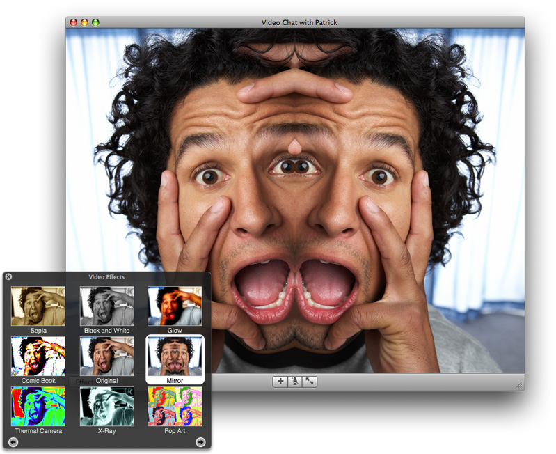
A transparent panel gives users a way to make quick adjustments to their content or task without being distracted from their work. Although the behavior of a transparent panel is similar to the behavior of a standard panel, its appearance is designed to complement applications that focus on highly visual content or that provide an immersive experience, such as a full-screen slide show. For example, Figure 14-41 shows a transparent panel iChat provides.
When to Use Transparent Panels
It’s important to understand that transparent panels are not intended to replace all panels in every application. In fact, in applications that don't focus on highly visual content or provide an immersive environment, a transparent panel can be more distracting to users than a standard panel, because there is no logical reason for its presence.
In general, therefore, you should use transparent panels only when at least one of the following statements is true:
Your application is media-centric, that is, focused on movies, photos, or slides.
Users use your application in a dark environment or in an immersion mode.
A standard panel would distract users from the main window.
Users make only quick adjustments in the panel and dismiss it quickly.
For example, in Aperture (a photo post-production and management tool), a transparent panel is appropriate because it does not block the content the way a standard panel would. In addition, the transparent adjustment panel in Aperture contains easy-to-use controls that don’t require any keyboard input from the user. Figure 14-42 shows how this transparent panel allows users to focus on the images.
Figure 14-42 A transparent panel allows users to make adjustments without distracting them from the main window
If your application focuses on highly visual content only at specific times or only in some modes, a combination of standard and transparent panels is reasonable, as long as each panel is suited to its task and environment. Also, if you provide a transparent panel under these circumstances, don’t transform the panel into a standard (nontransparent) panel when your application switches modes. In other words, a transparent panel is always a transparent panel; it never converts to a standard panel.
For example, Keynote allows users to create presentations that contain text, images, video, and sound. In addition to providing the Mac OS X Colors and Fonts windows, Keynote provides an inspector window and a media browser, which are standard panels. The inspector window allows users to set slide transitions, edit tables and graphs, and make complex adjustments to text and formatting, and the media browser allows them to navigate collections of media files and make selections. Neither of these panels focuses solely on adjustments to visual content, so there is no reason for them to be transparent.
But Keynote also provides an image-adjustment panel, which helps users make simple adjustments to slide images. The image-adjustment panel is transparent, because users use it while they are focusing on the image, watching the effect of the adjustments they make. Figure 14-43 shows the transparent image-adjustment panel in Keynote.
Designing a Transparent Panel
If a transparent panel is appropriate for your application, it’s important to design it appropriately to ensure that it looks good and meets users’ needs. In particular, a transparent panel should contain only simple adjustment controls that do not require much, if any, typing. Sliders and stepper-style controls work well, because they’re easy for users to use without focusing on them. As much as possible, you should avoid controls that require users to type or to select items, because they force users to shift their attention from the content to the panel. This defeats one of the main advantages of transparent panels, which is to allow users to focus on their content.
Because controls and text need to be visible on the dark translucent background of a transparent panel, you should design controls that are white with gray accents and use white or gray text. As users focus on the content behind the panel, the white text and controls appear to be floating above it.
Often, small amounts of color can enhance the information you provide in a transparent panel. For example, the morsels of color in the Aperture Adjustments panel (shown in Figure 14-42) communicate ranges in white balance and exposure, in addition to color-specific settings, in a clear and unobtrusive way.
If you want to use color in your transparent panel, be sure to use it sparingly, because an overuse of color lessens its impact and can be distracting. At the same time, however, the small amounts of color you use should be high contrast to look good on the dark translucent background.
In general, transparent panels should be small, so the text and controls you design should be small, too. As you lay out a transparent panel, be sure to follow the standard Aqua layout guidelines. For more information on center equalization, label and control alignment, appropriate spacing, and visual balance, see “Positioning Regular-Size Controls in a Window Body.”
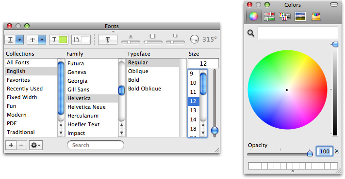
Fonts Window and Colors Window
Mac OS X includes standard windows for users to select fonts or colors. If you need a way for users to set fonts or colors, use these standard windows instead of creating your own. In this way, users don’t have to learn a new way to accomplish a familiar task. Figure 14-44 shows these standard system-provided panels.
About Windows
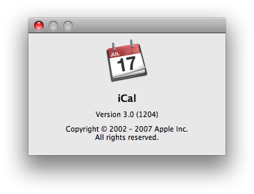
An About window, also called an About box, is an optional window that contains your application’s version and copyright information. Unlike other windows, an About window combines some of the behaviors of panels and windows: Like a panel, an About window is not listed in the application’s Window menu and like a window, it remains visible when the application is inactive. An About window should be modeless so the user can leave it open and perform other tasks in the application. For example, iCal provides an About window, as shown in Figure 14-45.
If you decide to provide an About window, it should:
Have a title bar with no title
Be movable
Display application branding, such as a logo
Include the full application name and version number (the version number should be the same as the version number displayed by the Finder)
It is recommended to also provide text that briefly describes what the application does, copyright information, and technical support contact information.
If you want to give the user a convenient way to visit your website or contact your company from your About window, be sure to create buttons that accomplish these tasks. Do not provide a clickable URL or email address because it is not necessarily clear that there is an action associated with it. Of course, it’s best to provide most of your company contact information in the first page of your help documentation (see “The Help Menu” for more information on Help menu items).
An About window is the appropriate place for product branding elements; avoid putting such elements (logos or slogans) in document windows and dialogs.
Dialogs
A dialog is a window designed to elicit a response from the user. Many dialogs—the Print dialog, for example—permit the user to provide many responses at one time.
An alert is a dialog that appears when the system or an application needs to communicate information to the user. Alerts provide messages about error conditions or warn users about potentially hazardous situations or actions.
For information about using the keyboard to interact with dialogs, see “Keyboard Focus and Navigation.”
For specific design information on how to lay out dialogs, see “Layout Guidelines.”
Types of Dialogs and When to Use Them
Mac OS X applications can use these types of dialogs:
Modeless. A modeless dialog enables users to change settings in a dialog while still interacting with document windows; the Find window in many word processors is an example of a modeless dialog. Most modeless dialogs include only the close button title-bar control, because users usually interact briefly with a modeless dialog and then close it, they do not need to zoom it or minimize it.
Document modal. A document-modal dialog prevents the user from doing anything else within a particular document. The user can switch to other documents in the application and to other applications. Document-modal dialogs should be sheets, which are discussed in “Sheets (Document-Modal Dialogs).”
Application modal. An application-modal dialog prevents the user from doing anything else within the owner application, although the user can switch to another application. Most application-modal dialogs do not have the standard title bar controls (close, minimize, zoom); the user dismisses these dialogs by clicking a push button, such as OK or Cancel. Application-modal dialogs that appear as the result of the user choosing a command, such as the Open dialog in Figure 14-55 should display a title that matches the command.
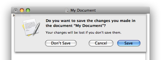
An alert can be document modal or application modal. If the error condition or notification applies to a single document, the alert should be document modal (that is, a sheet). See the Save Changes alert in Figure 14-46 for an example. If the alert applies to the state of the application as a whole, or to more than one document or window belonging to that application, the alert should be application modal. Both the Review Changes alert for multiple unsaved documents (Figure 14-60) and the Save Changes alert for applications that are not document-based (Figure 14-59) are application modal.
Sheets (Document-Modal Dialogs)
A sheet is a modal dialog attached to a particular document or window, ensuring that the user never loses track of which window the dialog applies to. Because a sheet is attached to the window from which it emerges, a sheet does not have its own title. Figure 14-46 shows an example of a sheet.
The ability to keep a dialog attached to its pertinent window helps users take full advantage of the Mac OS X window layering model (see “Window Layering”). Sheets also allow users to perform other tasks before dismissing the dialog, with no sense of the system being “hijacked” by the application.
Lay out sheets as you would any other dialog in Mac OS X. For guidelines on laying out a dialog, see “Positioning Regular-Size Controls in a Window Body.”
Sheet Behavior
Sheets are displayed as an animation that appears to emerge from the window’s title bar. When a sheet opens on a window near the edge of the screen and the sheet is wider than the window it’s attached to, the sheet moves the window away from the edge; when the sheet is dismissed, the window returns to its previous position.
Only one sheet may be open for a window at any one time. A sheet prevents any other operation on that window until the sheet is dismissed. If, when the user responds to a sheet, another sheet for that document must open, the first sheet closes before the second one opens.
A sheet on an active document window should cover (appear on top of) any active panels (if necessary). However, if the user leaves a sheet open and clicks another document in the same application, the inactive window and its sheet should go behind any open panels.
In an application that allows multiple windows for the same document (so that the user can see different parts of a document simultaneously), a sheet is not appropriate. Use an application modal dialog in this situation to make it clear that changes to one window affect other windows in the application.
In an application that displays multiple documents in a single window at different times, such as in a tabbed browser, a sheet is appropriate even though it applies to only the current document in the view. This is because, in a single-window situation, the user can’t move the view and its sheet aside to handle later when choosing to view a different document. Rather, the user in effect dismisses the view’s contents when choosing to view a different document. The user should therefore dismiss the sheet on the current view before selecting a different document.
When to Use Sheets
Use sheets for dialogs specific to a document when the user interacts with the dialog and dismisses it before proceeding with work. Here are some examples of when to use sheets:
A modal dialog for an activity that is specific to a particular document, such as saving or printing.
A modal dialog that is specific to a single-window application that does not create documents. A single-window utility program might use a sheet to request acceptance of a licensing agreement from the user, for example.
Other window-specific dialogs that are typically dismissed by the user before proceeding. Use a sheet when a dialog benefits from being attached to the window as a modal dialog, even if you might otherwise design the dialog as a modeless dialog.
When Not to Use Sheets
Don’t use sheets in the following situations:
For dialogs that apply to several windows. Use sheets only when a particular dialog is associated with only one window.
For modeless operations in which the dialog should be left open to allow the user to observe the effects of changes applied. Such tasks (find and replace operations, for example) are better suited to modeless dialogs, panels, or drawers.
On a window that doesn’t have a title bar. Sheets should emerge from a definite visual edge.
When the user will need information in the window that is essential to filling in requested information in the dialog.
Alerts
Alerts display messages to inform users of situations that are notable or potentially dangerous. Alerts are modal dialogs. For an alert that applies to one document or in single-window applications, display the alert as a sheet. See “When to Use Sheets” for guidelines.
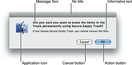
Figure 14-47 shows the elements of an alert.
See “A Standard Alert” for more information on laying out alerts.
The Elements of an Alert
An alert should contain only the following elements:
Alert message text. This text, in emphasized (bold) system font, provides a short, simple summary of the error or condition that summoned the alert. This should be a complete sentence; often it is presented as a question. See “Writing Good Alert Messages” for more information.
Informative text. This text appears in the small system font and provides a fuller description of the situation, its consequences, and ways to get out of it. For example, a warning that an action cannot be undone is an appropriate use of informative text.
Buttons for addressing the alert. Button names should correspond to the action the user performs when pressing the button—for example, Erase, Save, or Delete. The rightmost button in the dialog, the action button, is the button that confirms the alert message text. The action button is usually, but not always, the default button. (Note that in Cocoa methods, the rightmost button is always referred to as the default button even though it might not be.) For more information, see “Dismissing Dialogs.”
The application icon. Because of the Mac OS X window layering model (described in “Window Layering”), an icon is necessary to make it clear to the user which application is displaying the alert.
In rare cases, you may want to display a caution icon in your alert, badged with the application icon as shown in Figure 14-48. A badged alert is appropriate only if the user is performing a task, such as installing software, and a possible side effect of that task would be the inadvertent destruction of data. Don’t use a caution icon for tasks whose only purpose is to overwrite or remove data, such as Save or Empty Trash; too-frequent use of the caution icon dilutes its significance.
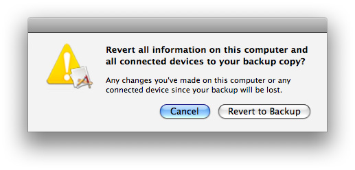
Writing Good Alert Messages
A good alert message states clearly what caused the alert to appear and what the user can do about it. Express everything in the user’s vocabulary. Figure 14-49 shows an example of an alert message that provides little useful information.
You could improve this message by describing the problem in the user’s vocabulary as shown in Figure 14-50.
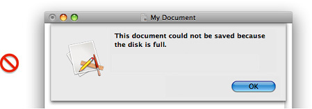
To make the alert really useful, provide a suggestion about what the user can do about the current situation. Even if the alert serves as a notification to the user and no further action is required, provide as much information as needed to describe the situation. Figure 14-51 shows the alert with additional information.
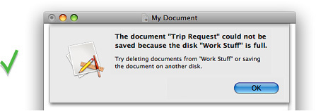
Dialog Appearance and Behavior
When appropriate, your application’s dialogs should display default values for controls and text fields so the user can verify information rather than generate it from scratch.
Display a selection or an insertion point in the first location—a text entry field or a list, for example—that accepts user input.
When it provides an obvious user benefit, static text in a dialog should be selectable. For example, a user should be able to copy an error message, a serial number, or IP address to paste elsewhere.
In dialogs that display columns and are user resizable, such as the Open dialog, as the dialog is made bigger, the columns should grow and additional columns should appear. All other elements should remain the same size and be anchored to the right, center, or left side of the dialog.
Accepting Changes
In general, all changes a user makes in a dialog should appear to take effect immediately. There are three possible opportunities for data validation in a dialog:
When the user types data
When the user moves out of a data field (by pressing Tab, for example)
When the user clicks a button to apply changes
It is your responsibility to make the three states as clear as possible to the user. For example, checkboxes and radio buttons update immediately and display the appropriate results.
You need to decide when your application does error checking of user input. Possible approaches are to:
Evaluate the input and check for errors as the user tabs from one field to the next. The drawback is that it isn’t clear to the user that the changes are taking effect as he or she tabs among items. The user doesn’t click a button, and so isn’t aware of completing an action.
Save user input in a queue and apply it when the user clicks a button, closes the dialog, or switches to another application. If your application waits to check user-input errors until the user tries to dismiss the dialog, you may have to present an alert, thereby forcing the user to revisit the dialog. If you do error checking as the user enters input, it takes more time up front, but you can warn the user immediately when invalid data is entered.
In most cases, validating input after each keystroke is annoying and unnecessary. It’s better to design your interface to automatically disallow invalid input. For example, your application could automatically convert lowercase characters to uppercase when appropriate.
In addition to error checking, you need to decide when to apply user input. In some cases, changes can take effect immediately—for example, View Options for Finder windows. In other cases, it may be appropriate to wait until the user performs an action, such as clicking an Apply button.
In a dialog that has multiple panes (selected by buttons, tabs, or a pop-up menu), avoid validating data when a user switches from one pane to another.
Finally, you need to determine whether your application should automatically perform an operation based on user input or whether the user should initiate the operation—for example, by clicking a button. It’s acceptable to automatically perform an operation that completes quickly and returns user control within a couple of seconds. For an operation that takes a longer time to execute, it’s best to warn the user of the estimated time required and let the user initiate it.
Dismissing Dialogs
The buttons at the bottom right of a dialog all dismiss the dialog. A button that initiates an action is furthest to the right. This action button confirms the alert message text. The Cancel button is to the left of this button.
If there’s a third button for dismissing the dialog, it should go to the left of the Cancel button. If the third button could result in data loss—Don’t Save, for example—position it at least 24 pixels away from the “safe” buttons (Cancel and Save, for example).
A button that affects the contents of the dialog itself, such as Reset, should have its left edge aligned with the main dialog text or if there is a Help button, 12 pixels to the right of it.
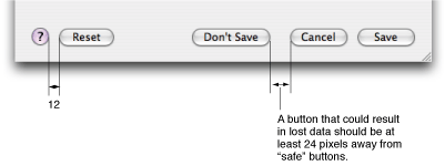
Usually the rightmost button or the Cancel button is the default button. The default button should be the button that represents the action that the user is most likely to perform if that action isn’t potentially dangerous. A default button has color and pulses to let the user know that it is the default. When the user presses the Enter key or the Return key, your application should respond as if the user clicked the default button.
Don’t use a default button if the most likely action is dangerous—for example, if it causes a loss of user data. When there is no default button, pressing Return or Enter has no effect; the user must explicitly click a button. This guideline protects users from accidentally damaging their work by pressing Return or Enter. You can consider using a safe default button, such as Cancel. Figure 14-48 shows an example of a safe default button.
Don’t use a default button if you use the Return key in text entry boxes. Having two behaviors for one key can confuse users and make the interface less predictable.
In addition to the action button or buttons, it’s a good idea to include a Cancel button. This button returns the computer to the state it was in before the dialog appeared. It means “forget I mentioned it.” Always map the keyboard shortcut Command-period and the Esc (Escape) key to the Cancel button. These keyboard equivalents, along with Return and Enter, are accelerator keys and serve the purpose of letting the user respond quickly to a dialog or an alert. In general, it’s not a good idea to assign other keyboard shortcuts to buttons. If you find it useful to assign keyboard shortcuts to some buttons that are used very often in your application, be sure to follow the guidelines in “Keyboard Shortcuts.”
In some circumstances, it’s appropriate to implement an Apply button—for example, to permit a user to see the effect of multiple text attributes before committing to them. In cases like these, clicking Cancel should undo any of the applied changes. Cancel should never silently commit the changes the user previewed by clicking Apply. For more guidelines on using an Apply button, see “Providing an Apply Button in a Dialog.”
Providing an Apply Button in a Dialog
You may choose to provide an Apply button in a dialog that displays multiple settings that affect the user’s view of data. An Apply button should allow a user to preview the effect of the selected settings without committing to the changes. Be cautious about using an Apply button for operations that take a long time to implement or undo; it might not be obvious to users that they can interrupt or reverse the process. Save dialogs or dialogs that allow users to make changes that can’t be previewed easily should not include an Apply button.
Clicking the Apply button does not dismiss the dialog because the user must decide whether to accept the previewed changes (by clicking OK) or to reject them (by clicking Cancel). Do not use the Apply button as another OK button—when the user dismisses the dialog without clicking OK, all previewed changes should be discarded.
Expanding Dialogs
Sometimes you need to provide the user with additional information or functionality in a dialog, but you don’t want to display it all the time. To do this, you use one of the disclosure controls to expand the dialog and reveal the additional information or capability to the user.
If you want to allow the user to view details that elaborate on the primary information in a dialog, you use a disclosure triangle (note that disclosure triangles are also used in hierarchical lists). The disclosure triangle expands the dialog, revealing additional information and, if appropriate, extra functionality. An example of a dialog expanded by a disclosure triangle is shown in Figure 15-76. For more information about how to use a disclosure triangle in your dialog, see “Disclosure Triangles.”
If you want to provide the user with additional choices directly related to the selections offered in a pop-up or command pop-down menu in a dialog, you use a disclosure button. The disclosure button expands the dialog to reveal selections in addition to those listed in the pop-up or command pop-down menu. An example of a dialog expanded by a disclosure button to reveal additional choices is shown in Figure 14-58. For more information about how to use a disclosure button in your dialog, see “Disclosure Buttons.”
Find Windows
A Find window is a modeless dialog that opens in response to the Find command to provide an interface for specifying items to search for. Its appearance can vary depending on the needs of your application, but if your application handles text you might want to make your Find window similar to the one shown in Figure 14-53 to provide a consistent user experience.
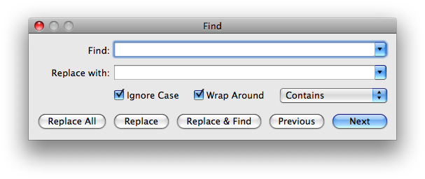
Find windows are useful in document-creation applications, because users can use one Find window to search for a term in several different documents. If your application is not document-based or if it is a single-window application, however, you might instead choose to offer find or searching functionality in a scope bar. A scope bar is attached to a window and provides both search and filtering capabilities to users. Figure 14-19 shows a scope bar in Safari. For more information about scope bars and how to use them in your application, see “Scope Bars.”
Preferences Windows
A preferences window is a modeless dialog that contains settings the user changes infrequently. In general, the user opens a preferences window to change the default way an application displays an item or performs a task, closes the window, and expects the new settings to have taken effect. For some guidance on how to provide preferences in your application, see “Preferences.”
Often, an application needs to provide a set of preferences for each of several different categories of functionality. For example, Safari allows the user to set preferences for bookmarks, webpage appearance, RSS display, and security measures, among other things. Because these categories are unrelated to each other, it would be confusing to display settings for all of them in one pane. Therefore, Safari (and many other applications) provides a preferences window with a toolbar that contains a toolbar item for each category. When the user clicks a toolbar item, the window displays a pane that contains the settings associated with that item. Figure 14-54 shows the General pane of Safari preferences.
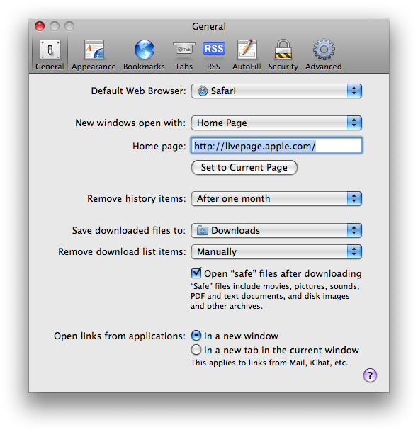
If you choose to create a preferences window that uses a toolbar to switch among different categories of settings, make sure the toolbar is not customizable. This is because a toolbar in a preferences window does not provide a shortcut to frequently used commands, but acts as a convenient way to group settings. In addition, you should remove the show/hide toolbar control in your preferences window toolbar (you can see this control in Figure 14-4). This is because there is no need to hide the toolbar in a preferences window (hiding it would also hide all but the currently selected collection of settings), and because novice users might mistakenly click the toolbar control when they mean to click the close button.
A preferences window should not include a resize control. In general, preferences windows do not need to display active minimize or zoom buttons. Remember that preferences windows are intended to provide users with a place to make adjustments to the way an application behaves, so there’s seldom a need for preferences windows to be resized or to remain open for a long time.
If you have changeable panes in your preferences window, the title of the window should be the title of the currently selected pane. For example, the title of the window shown in Figure 14-54 is “General” because the currently selected toolbar icon is labeled “General.” (If your preferences window does not contain additional panes, the title should be “Application Name Preferences”.) In addition, a changeable-pane preferences window should remember which pane the user selected the last time the window was open.
The menu item to open your preferences window should be in the application menu and be labeled Preferences. Use Command-comma for the keyboard shortcut.
The Open Dialog
The Open dialog appears when the user chooses the Open command or presses Command-O. The Open dialog is application modal (that is, the user can switch to other applications before closing the Open dialog).
If you implement an Open command, you should also include an Open Recent command so users can open recently opened documents without going through the dialog. Figure 14-55 shows an example of an Open dialog.
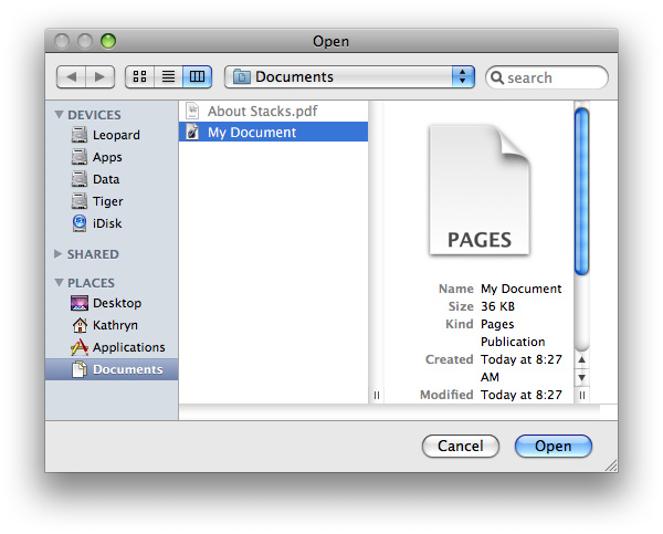
The Open dialog contains these elements:
A default title (“Open”); you should add your application’s name to the Open dialog title—”TextEdit: Open,” for example.
Back and forward buttons to navigate back and forth between selections made in list or column view.
A pop-up menu that contains common places a user might save things and Recent Places (the five most recent folders the user opened or saved documents to). Your application specifies the default location, typically one of the predefined folders in the user’s home folder. If the user selects another folder, the dialog should “remember” the user’s selection the next time the dialog appears.
A source list that mirrors the Finder sidebar.
A column or list view for navigating the file system.
A Cancel button and an Open (default) button.
A resize control in the lower-right corner.
The ability for expert users to specify a pathname by pressing Command-Shift-G. (Note that the pathname separator is the “/” character.)
You can extend the Open dialog as appropriate for your application as illustrated in Figure 14-56. You might, for example, include a pop-up menu allowing users to filter the type of files that appear in the list. Items that do not meet the filtering criteria would appear dimmed. The system creates a list of native file types supported by the application to populate the menu. You can supplement this list with custom types and specify the default to show when the dialog opens. You should include an All Applicable Files item, but it does not have to be the default.
Open dialogs should support document preview. In addition, an Open dialog can support multiple selection if your application allows more than one document to be open at a time.
Dialogs for Saving, Closing, and Quitting
This section describes the standard dialogs that you use when a user is saving a document for the first time, closing a document, or quitting an application.
Save Dialogs
An application that saves the contents of individual windows—which would be most text and graphics applications—should use document-specific sheets for its Save dialogs. In a Save dialog, users can save a document for the first time or change the name or location (or both) of a previously saved document.
The Save dialog has two states: minimal and expanded. Clicking the disclosure button toggles between these states. If the user changes the state, the next Save dialog should open in the selected state.
Your application should pass in a filename extension as part of every filename. Users can control its visibility using the Hide Extension checkbox in the expanded Save dialog; see Figure 14-30. Existing documents do not get extensions added to or removed from their filenames unless the user chooses Save As and changes the setting in the Save dialog.
The Minimal Save Dialog
In the minimal Save dialog (shown in Figure 14-57), users can specify a name and choose a frequently accessed location to store a document.
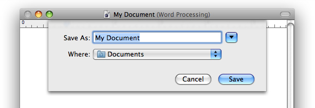
The minimal Save dialog contains these elements:
Save As text field for the document name. Expert users can enter pathnames by pressing Command-Shift-G. (Note that the pathname separator is the “/” character.)
If the document has not been saved previously, your application should put the default name (such as “untitled”) in this field, and the filename should be selected. If the user has chosen to make the filename extension visible, the extension is not selected.
If the document has been saved previously and the user chooses Save As, the Save dialog should open with the document name highlighted in the Save As field. The filename extension (if it is visible) is not selected.
Where pop-up menu, containing mounted volumes, the folders in the Finder sidebar, and Recent Places (the five most recent folders the user opened or saved documents to). Your application specifies the default location, typically the predefined Documents folder in the user’s home folder. If the user selects another folder, the dialog should “remember” the user’s selection the next time the dialog appears.
A Save button (default).
A Cancel button. Dismisses the dialog and returns the application to its previous state.
A disclosure button. Clicking it displays the expanded Save dialog. (For more information about how to use disclosure buttons, see “Disclosure Buttons.”)
Any custom elements you add go between the Where pop-up menu and the buttons at the bottom of the dialog.
The Expanded Save Dialog
In contrast with the minimal Save dialog, the expanded Save dialog lets users save documents in locations other than those available in the minimal Save dialog’s Where pop-up menu. An example of the expanded Save dialog is shown in Figure 14-58.
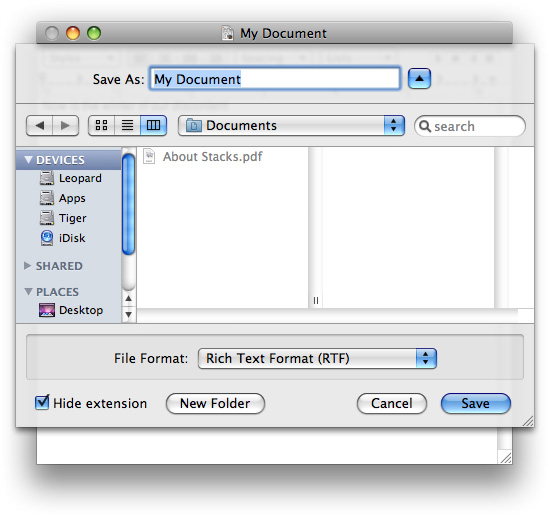
In addition to the items in the minimal Save dialog, the expanded Save dialog displays the following:
Back and forward buttons to navigate back and forth between selections made in the list or column view.
A source list that mirrors the Finder sidebar.
A column or list view for navigating the file system.
A File Format (or Format) pop-up menu, which displays a list of file formats from which the user can choose.
A New Folder button, which displays an application-modal dialog that asks the user to name the new folder, and then creates it.
A “Hide extension” checkbox, which allows the user to control whether or not the filename’s extension (
.jpg,for example) is visible. The “Hide extension” checkbox should be selected as the default (that is, filename extensions should not appear in user-visible filenames unless the user requests them).If the user changes the state of the checkbox for a particular document, the next new document should match the last user-selected state, even after the user quits and reopens the application. The filename in the Save As field updates in real time as the checkbox is selected or deselected.
If you add other elements to customize the Save dialog, they should appear above the Cancel and Save buttons. When the dialog is expanded, custom elements should appear between the file-system browser and the push buttons.
In default keyboard navigation mode, pressing Tab in the expanded Save dialog shifts the keyboard focus from the Save As text field to the source list, to the visible columns, and then back to the text field.
Closing a Document With Unsaved Changes
When the user attempts to close a document that has unsaved changes, present a Save Changes alert. An application that saves the contents of individual windows—such as most text and graphics applications—should use document-specific sheets, like the one shown in Figure 14-46 for its Save Changes alert.
In an application that can display multiple views of the same file, if the user chooses the Close File command instead of Close Window, you should use an application-modal dialog instead of a sheet. This emphasizes the fact that the user’s actions affect the file as a whole, not just the portion displayed in the current view. In this situation, change the word “document” in the Save Changes alert message to the word “file”. After the user clicks Save or Don’t Save, close all open views of the file.
When a Save Changes sheet is open, the document’s close button and the Close command in the File menu are unavailable; the user can’t close the document until the Save Changes sheet is addressed.
Attempting to Save a Locked or Read-Only Document
If the user edits a locked or read-only document and then quits the application or chooses Save, do not display the standard Save Changes alert. Instead, display a sheet explaining that because the document is read-only, it cannot be saved. The sheet should then offer the user the options of saving a copy, rejecting the changes, or continuing to view or edit the document.
Saving Documents During a Quit Operation
Users can interrupt a quit operation with documents still unsaved. For example, if a user chooses Quit and a save alert (a sheet) opens for a document, the user can work on other documents or switch to another application without addressing the save alert.
When a user quits an application in which all open documents have been saved, all documents close immediately and the application quits.
Quitting an Application That Is Not Document-Based
When a user attempts to quit an application that is not document-based but that has many windows whose contents are saved simultaneously, present an application-modal Save Changes alert, such as the one shown in Figure 14-59.
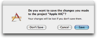
Quitting an Application With Multiple Unsaved Documents Open
When a user attempts to quit a document-based application and there is more than one document with unsaved changes open, present an application-modal Review Changes alert, such as the one shown in Figure 14-60.
Figure 14-60 The Review Changes (application-modal) alert that appears when the user quits with more than one unsaved document open
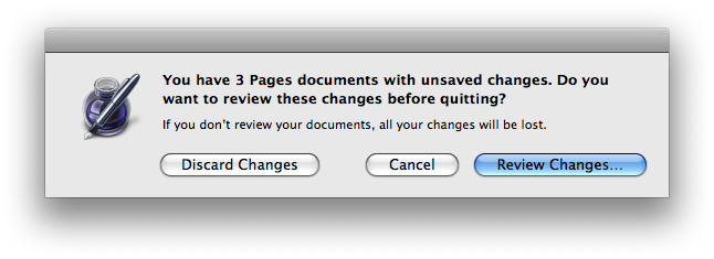
The appropriate action for each button is as follows:
Discard Changes. Closes all documents without saving changes and quits the application.
Cancel. Cancels the Quit command.
Review Changes. All open documents (including those minimized in the Dock) come forward, with the unsaved documents on top. The active document presents a Save Before Quitting alert. If the user clicks Save, the Save dialog appears (if the document has not previously been saved). If the user clicks Don’t Save, the next unsaved document comes forward with its Save Before Quitting alert. If the user dismisses the last Save Before Quitting alert with Save or Don’t Save, all documents close and the application quits.
During the review, if the user activates another unsaved document, it should come forward with its Save Before Quitting sheet open. Save Before Quitting sheets on other documents remain open. During the review, if the user activates a saved document, the review process continues when the next unsaved document becomes active.
If, in the midst of a quit operation, the user clicks the application icon in the Dock or chooses Bring All to Front from the Window menu, documents should appear in this order: documents with open sheets on top, unsaved documents next, and then saved documents.
At any time during the review process, the user can click Cancel to stop the quit operation. If the user initiates a Quit command during the review process, the process begins again with the application-modal alert shown in Figure 14-60.
Saving a Document With the Same Name as an Existing Document
If the user types the name of a document that already exists in the same location into the Save As field of a Save dialog, and then clicks Save, present an application-modal alert in which the user can confirm whether or not to replace the previous document.
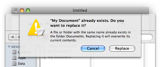
The Choose Dialog
A Choose dialog lets a user select an item as the target of a task. For example, when a user attempts to open a broken alias, the Fix Alias dialog lets the user choose another item for the alias to open. An application can have more than one Choose dialog, but only one can be open at a time. In some situations, it may be appropriate for a Choose dialog to be a sheet. Figure 14-62 shows an example of a Choose dialog.
A Choose dialog:
Can be opened by various commands
Can support multiple selection
Supports document preview
Can be resized with the resize control in the lower-right corner
Can include a Show pop-up menu, which allows the user to filter the type of files that appear in the list. Items that do not meet the filtering criteria appear dimmed. The system creates a list of native file types supported by the application to populate the menu. You can supplement this list with custom types and specify the default to show when the dialog opens. You should include an All Applicable Files item, but it does not have to be the default.
If the dialog is not a sheet, the dialog’s default title is “Choose,” but you should change it to include the name of the task. For example, if the command that brings up the dialog is Choose Picture, the dialog should be titled “Choose Picture.” Also include some instructional text at the top, such as “Choose a picture to display in the background of ‘Documents.’” If it’s helpful, also change the Choose button to something more specific.
The default location is the user’s home folder. If the dialog is targeted to volumes only, the default location is the user’s directory. Files and folders not appropriate for the target selection should be dimmed.
Note: Recent Places (in the Where pop-up menu of a Save dialog) does not record folders selected in Choose dialogs.
The Print Dialog
In addition to printing, the minimal Print dialog lets users choose a printer and printer settings, save, mail, or fax a document in the PDF or PostScript formats, and preview a document before printing. The expanded Print dialog adds printing-specific settings, such as number of copies, page range, paper settings, and layout.
Print Dialog
In the Print dialog, user options are provided via the features pop-up menu, which displays panes drawn and controlled by printing dialog extensions (PDEs). PDEs are provided by the operating system, printer modules, and applications. Apple provides a number of printing panes. The standard Print dialog is shown in Figure 14-63.
Options for choosing paper type and print quality are displayed through the features pop-up menu. The ability to save the document in PDF or PostScript format, fax the document, or save it to iPhoto or other applications is available in the PDF pop-down menu in the lower left. You can create custom print panes by following the interface guidelines provided throughout this document and the layout guidelines described in “Positioning Regular-Size Controls in a Window Body.” Here are some specific guidelines to keep in mind if you implement custom printing features:
Choose a menu item name that doesn’t conflict with menu items already in the features pop-up menu.
The menu item (the pane name) should help users easily determine the options the pane contains.
Make sure the features you implement are appropriate for your application. For example, an option to print in reverse order should be provided by the operating system, not by your application. (Implementing this feature requires the application to know the hardware’s capabilities.)
Make interdependencies among options clear to users. For example, if a user selects double-sided printing, the option to print on transparencies should become unavailable.
Separate more advanced features from frequently used features. When the user chooses to display the advanced features, there should be an “advanced options” title above the advanced controls.
Provide visual feedback (such as the preview in the Layout pane of the Print dialog) when appropriate. A thumbnail showing the effect of changing a tone control, for example, helps users determine desired settings.
Save a user’s printing preferences for a document, at least while the document is open. Provide a way for users to save custom settings.
Page Setup Dialog
The Page Setup dialog provides a way for users to set the scaling and orientation options for a document based on the intended output paper size and the printer. Save the settings in this dialog with the document. Figure 14-64 shows an example of a page setup dialog.
© 1992, 2001-2003, 2008 Apple Inc. All Rights Reserved. (Last updated: 2008-06-09)