Controls
Controls are graphic objects that cause instant actions or visible results when users manipulate them with the mouse or other input device. Standard controls include push buttons, scroll bars, radio buttons, checkboxes, sliders, and pop-up menus.
This chapter discusses the behavior and appearance of controls available in Mac OS X. It also provides usage recommendations for each control so you can use them correctly in your application. When appropriate, this chapter also offers control dimensions, labeling guidelines, and recommended spacing metrics to help you lay out controls in your window (for more extensive window-layout guidelines, see “Layout Guidelines”). Note that, in most cases, one dimension of a control (typically the height) is fixed and should not be changed. When this is the case, the description of the control may include the pixel measurement of the fixed dimension, but only to help you lay out your window, not because you need to use this measurement to create the control.
You are strongly encouraged to use standard, system-provided controls in your application. When you do this, you benefit in two important ways. First, these controls are automatically updated whenever the Mac OS X user interface is refreshed, which means that you don’t have to produce a new version of your application to take advantage of the new look. Second, the appropriate use of familiar controls allows users to predict how to operate your application and therefore spend more time discovering what it does.
In addition, you should strive to use only the standard control sizes, which are regular, small, and mini. Most applications look best with regular-size controls, although small and mini controls can work well when space is very limited, such as in a panel. In particular, take care to avoid vertically resizing controls. In Mac OS X v10.5 and later, vertically resizing a control can cause it to produce an undesirable look that does not harmonize with the window appearance.
Important: Every control described in this chapter is accompanied by at least one illustration that shows an example of the control. These illustrations show the appearance of the control, usually demonstrate a recommended usage, and sometimes show spacing metrics. However, the images of the controls themselves do not necessarily exhibit the precise measurements or colors you would observe in a running application. Therefore, you should never measure the images in this document and use those measurements to create controls or other user-interface elements. Note that when you use Interface Builder to create your user interface, you automatically get the proper control sizes.
In this section:
Window-Frame Controls
Buttons
Selection Controls
Indicators
Text Controls
View Controls
Grouping Controls
Window-Frame Controls
As described in “Window Appearance,” the window frame consists of the title bar, toolbar, and bottom-bar areas, and the window body is between the toolbar–title bar area and the bottom bar (if there is one). A small subset of Mac OS X controls are intended for use only in the window-frame areas, because they have been specially designed to look good on the window-frame surface. These controls should not be used anywhere in the window body. Conversely, all other controls available in Mac OS X can be used in the window body, and most should not be used in the window-frame areas.
Of the controls that are designed for use in the window body, there are three that can also be used in window-frame areas:
Icon buttons (including icon buttons that contain a pop-up menu)—see “Icon Buttons” and “Icon Buttons and Bevel Buttons with Pop-Up Menus” for more information.
Action menus—see “Action Menus” for more information.
Search fields—see “Search Fields” for more information.
This section describes the controls that are designed solely for use in the window-frame areas. If your window contains a toolbar or bottom bar, be sure to use only the controls that are appropriate for each area, including icon buttons, Action menus, and search fields, as needed.
Rectangular-Style Toolbar Controls
The rectangular-style toolbar control can be used in both the toolbar and the bottom bar. (The capsule-style toolbar control, described in “Capsule-Style Toolbar Controls,” should be used in toolbars only.) The rectangular-style toolbar control is a very versatile control that can behave as a push button, a toggle button, a segmented control, or a pop-up menu. Figure 15-1 shows some variations of the rectangular-style toolbar control in Address Book.

Rectangular-Style Toolbar Control Usage
In a toolbar, use rectangular-style toolbar controls to give users access to frequently used commands and objects (for guidelines on designing the contents of a toolbar, see “Designing a Toolbar”). For example, the Finder uses a combination of rectangular-style toolbar buttons and segmented controls to allow users to preview an item with Quick Look, choose a view style, see the path of an item’s location, navigate through previously viewed items, and perform an action on an item. Figure 15-2 shows the rectangular toolbar buttons and segmented controls the Finder uses.

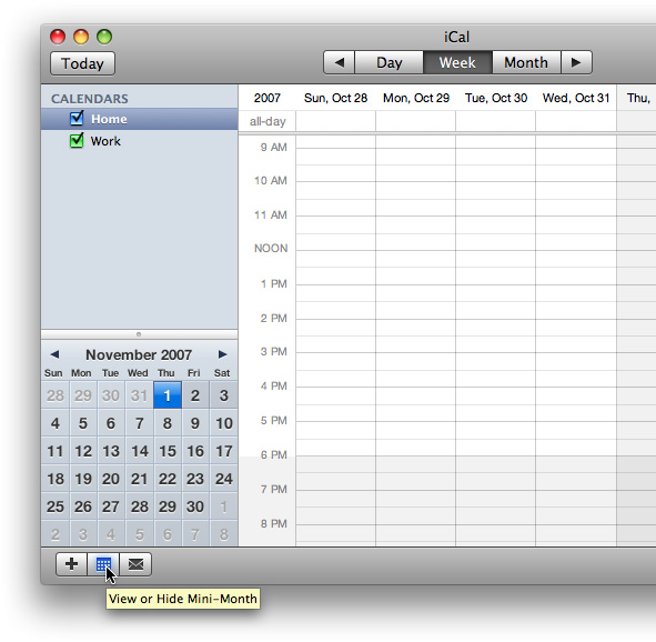
In a bottom bar, use rectangular-style toolbar controls when you need to provide controls that directly affect the contents or organization of the window body. In general, controls in the bottom bar are important, but they are less frequently used than controls in the toolbar (see “Bottom Bars” for guidelines on designing the contents of a bottom bar). For example, the rectangular-style toolbar controls in the iCal bottom bar include a segmented control that allows users to add calendars and change the items displayed in the source list, and a button that shows or hides the to-do list, as shown in Figure 15-3.

Rectangular-Style Toolbar Control Contents and Labeling
A rectangular-style toolbar button can contain either text or icons. In addition, this button can contain a downward-pointing arrow that indicates the presence of a pop-up menu. A rectangular-style toolbar segmented control can also contain either text or icons, but should not contain a mix of text and icons.
If you display an icon in a rectangular toolbar control, be sure the meaning of the image is clear and unambiguous (see “Cultural Values” for some advice on choosing appropriate imagery). In Mac OS X v10.5 and later, Interface Builder makes it easy to add to a control one of the system-provided images, such as the plus sign, the accounts symbol, or the locked symbol. You can see some of these symbols in the controls in the Finder toolbar, shown in Figure 15-2. See “System-Provided Images” for more information on standard images available in Mac OS X v10.5 and later. If you need to design your own image, see “Designing Icons for Rectangular-Style Toolbar Controls” for some metrics and guidelines.
If you want to display text in a rectangular-style toolbar control, be sure it is either a noun (or noun phrase) that describes an object, setting, or state, or that it is a verb (or verb phrase) that describes an action. For example, the nouns used in the iCal toolbar controls clearly indicate the function of the controls. Text in rectangular-style toolbar controls should have title-style capitalization (see “Capitalization of Interface Element Labels and Text” for more on this style).
If you use a rectangular-style toolbar control that behaves like a checkbox or a toggle button in a toolbar or bottom bar, you may be able to benefit from the automatic highlighting that signifies the on state of the button. If you do this, however, be very sure the control clearly indicates the correct state in the correct situation. Also, if you put such a control in a toolbar, you should provide two descriptive labels that can be displayed below the control. One label should describe the on (or pressed) state and one should describe the off (or unpressed) state. Finally, be sure to describe both of the states in the control’s help tag, whether the control appears in a toolbar or a bottom bar. To learn more about the on-state appearance, see “Rectangular-Style Toolbar Control Implementation.”
For example, iCal offers toggle controls in its bottom bar that allow users to show or hide various views. When one of these views is visible, the associated toggle control is highlighted; when the view is hidden, the highlighting disappears. Figure 15-4 shows the iCal bottom bar, along with a help tag that describes both states.
Important: You must supply a descriptive label for each rectangular-style toolbar control you place in a toolbar so that users can customize the toolbar to display both images and text. This is the external label users see when they select the Icon & Text or Text Only display options in the Customize Toolbar dialog.
Rectangular style toolbar controls used in a bottom bar do not need external descriptive labels.
Rectangular-Style Toolbar Control Specifications
Control sizes: Rectangular-style toolbar controls are available in regular, small, and mini sizes. In a toolbar, display the regular size by default, but be sure to supply the small size to allow users to customize the toolbar.
In a bottom bar, you can use either the regular or the small size, depending on the dimensions of the bottom bar. See “Designing a Bottom Bar” for guidelines on how to create and lay out a bottom bar.
Label spacing and fonts: Labels for rectangular-style toolbar controls should be in the system font appropriate for the size of the control (these fonts are automatically supplied by Interface Builder):
Regular size: System font.
Small: Small system font.
Mini: Mini system font.
Control spacing: There should be 8 pixels between individual rectangular-style toolbar controls. Note that this happens automatically, and that this spacing can change depending on the length of the external label.
Rectangular-Style Toolbar Control Implementation
Rectangular-style toolbar controls are available in Interface Builder. In the Interface Builder library, these controls are called Round Textured Buttons. To create one using Application Kit programming interfaces, use the setBezelStyle: method of NSButtonCell with NSTexturedRoundedBezelStyle as the argument.
The blue glow you see behind the calendar image in the iCal segmented control (shown in Figure 15-4) is an effect Application Kit provides under some circumstances. The effect indicates an on state in a properly configured segmented control that behaves like a set of checkboxes or a button that behaves like a toggle button. Although it is possible that the precise appearance of this on-state look may change in future releases of Mac OS X, you can continue to receive appropriate on-state processing if you configure these two controls as described here.
To provide a segmented control that displays an on-state appearance (similar to the segmented control in the iCal bottom bar), use an NSSegmentedControl object with style NSSegmentStyleTexturedRounded and mode NSSegmentSwitchTrackingSelectAny. If you’re using Interface Builder, place a Segmented Control object in your toolbar or bottom bar; in the Attributes pane of the inspector, set the style to Textured Rounded and the mode to Select Any. Be sure to provide an image for the control (in Interface Builder, select an image from the Image combo box in the Attributes pane of the inspector).
To provide a toggle-style button that displays an on-state appearance, use an NSButton object with style NSTexturedRoundedBezelStyle, with which you’ve associated an image. Be sure the button cell’s showsStateBy mask contains NSContentsCellMask. This means that Application Kit uses the alternate image and title when the cell’s state is NSOnState. However, to get the on-state glow do not provide an alternate image. If you’re using Interface Builder, place a Rounded Textured Button object in your toolbar or bottom bar; in the Attributes pane of the inspector, set the mode to Toggle, provide an image, and do not provide an alternate image.
Capsule-Style Toolbar Controls
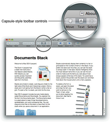
The capsule-style toolbar control can be used in toolbars, but should not be used in bottom bars. The capsule-style toolbar control is a versatile control that can be used as a push button, a toggle button, or a segmented control. Figure 15-5 highlights one of the variations of the capsule-style toolbar control in a Preview window.
Capsule-Style Toolbar Control Usage
Use capsule-style toolbar controls in a toolbar to give users access to frequently used objects and commands (for guidelines on designing the contents of a toolbar, see “Designing a Toolbar”). For example, Mail uses capsule-style toolbar buttons and segmented controls to provide a myriad of functions to the user, such as getting new mail, creating notes or to-do items, and flagging messages. Figure 15-6 shows these controls in the Mail toolbar.

Do not use capsule-style toolbar controls in a bottom bar. If you use capsule-style toolbar controls in the toolbar, but you also need to provide bottom-bar controls, instead use rectangular-style toolbar controls in both areas to avoid mixing the styles in a single window. See “Rectangular-Style Toolbar Controls” for more information about the rectangular-style toolbar controls.
Capsule-Style Toolbar Control Contents and Labeling
Capsule style toolbar buttons can contain text or images. If you provide a capsule-style segmented control, avoid displaying text in some segments and icons in others. Instead, make sure every segment in the control has the same type of content.
If you display an icon in a capsule-style toolbar control, be sure the meaning of the icon is clear and unambiguous (see “Cultural Values” for some advice on choosing appropriate imagery). In Mac OS X v10.5 and later, Interface Builder makes it easy to add system-provided images, such as the plus sign, the accounts symbol, and the Action menu symbol. See “System-Provided Images” for more information on images available in Mac OS X v10.5 and later.
If you decide to create your own icons to display in a capsule-style toolbar control, see “Designing Icons for Capsule-Style Toolbar Controls” for some tips and guidelines.
If you want to display text in a capsule-style toolbar control, use a noun (or noun phrase) that describes an object, setting, or state, or use a verb (or verb phrase) that describes an action. Text in capsule-style toolbar controls has title-style capitalization (see “Capitalization of Interface Element Labels and Text” for more on this style).
Important: You must supply a descriptive label for each capsule-style toolbar control you place in a toolbar so that users can customize the toolbar to display both images and text. This is the external label users see when they select the Icon & Text and Text Only display options in the Customize Toolbar dialog.
Capsule-Style Toolbar Control Specifications
Control sizes: Capsule-style toolbar controls are available in regular, small, and mini sizes. You should use regular-size capsule-style toolbar controls by default, but you should also provide small versions of the controls so users can customize the toolbar.
If you use system-provided images in a capsule-style toolbar control, you don’t have to worry about changing the width of the control to accommodate its contents. If you provide a custom icon, be sure to avoid extending it into the end-cap space of the control.
Label spacing and fonts: Labels for capsule-style toolbar controls should be in the system font appropriate for the size of the control (these fonts are automatically supplied by Interface Builder):
Regular size: System font.
Small: Small system font.
Mini: Mini system font.
Control spacing: There should be 8 pixels between separate capsule-style toolbar controls. Note that this happens automatically, and that this spacing can change depending on the length of the external label.
Capsule-Style Toolbar Control Implementation
Capsule-style toolbar controls are available in Interface Builder. Drag a segmented control object into your window and specify how many segments you want it to have. To create a standalone button (like the Get Mail button in the Mail toolbar), specify one segment. To create one using Application Kit programming interfaces, use the NSSegmentedControl class.
Legacy Toolbar Controls
In versions of Mac OS X prior to v10.5, if your application used a brushed metal window, it also used metal buttons. In Interface Builder and the Application Kit, this button type was referred to as “textured.“ As discussed in “Window Appearance,” however, Mac OS X v10.5 and later does not include the brushed-metal look for windows. If you designed an application to run in versions of Mac OS X prior to v10.5, you will probably receive the Leopard window look automatically when the application runs in Mac OS X v10.5 and later, but you may need to update the buttons you used.
As discussed in “Window-Frame Controls,” there are only three standard window-body controls that can be used in a toolbar, in addition to the rectangular-style and capsule-style toolbar controls introduced in Mac OS X v10.5. These three controls are:
Icon buttons (including icon buttons that contain a pop-up menu)
Action menus
Search fields
If your toolbar contains any control types other than the three listed above and rectangular-style and capsule-style toolbar controls, remove them.
If you used a metal (textured) button in your toolbar or bottom-bar area, examine its height. If the height is 23 pixels for the regular size (18 pixels for the small size), the button should automatically appear as a rectangular-style toolbar control when the application runs in Mac OS X v10.5 and later.
The Interface Builder library in Interface Builder 3.0 and later provides a style of an NSButton object called “textured,“ but this button style should be considered a transitional control only. If you place a regular-size textured button in a window-frame area and resize its height to 23 pixels (from the default height of 20 pixels), you’ll notice that its appearance changes to that of the rectangular-style toolbar control. Therefore, if you’re developing an application to run in both Mac OS X v10.5 and versions of Mac OS X prior to v10.5, you can use this button style to ensure the appropriate look for these versions.
Buttons
Buttons initiate an immediate action. If a button initiates an indeterminate process, the button should be dimmed until the process is complete, and status feedback should be provided.
If you need to offer two opposing functions, such as Reload and Stop in a browser, consider using two separate buttons instead of one dual-purpose button that changes state. Providing one dual-purpose button can lead to the situation in which a user clicks the button when it is in one state, but the click is received and processed after the button has changed to the other state.
If you must provide one dual-purpose button, be sure to keep track of when the button changes state so you can process the clicks appropriately. Also, be sure to provide immediate and informative feedback.
Important: The controls described in this section are suitable for use in the window body; they should not be used in the window-frame areas. The single exception is the icon button, which can also be used in a toolbar. See “Window-Frame Controls” for controls designed specifically for use in the toolbar and bottom-bar areas in your window.
Push Buttons
A push button performs an instantaneous action, such as saving a document, completing operations defined by a dialog, or acknowledging an error message. Push buttons are designed for use in the window body only, not in the window-frame areas (for more information about these window parts, see “Window Elements”). Figure 15-7 shows several different usages of the push button.

Push Button Usage
Because users expect an immediate action to occur when they press a push button, it is important to avoid using push buttons to merely display information or to mimic the behavior of other controls. In particular:
Do not use a push button to indicate a state, such as on or off. Instead, you can use checkboxes to indicate state, as described in “Checkboxes.”
Do not use a push button as a label. Instead, use static text to label elements and provide information in the interface (for more information, see “Static Text Fields”).
Avoid associating a menu with a push button. If you need to associate a menu with a button, use a bevel button instead (see “Bevel Buttons” to learn how to do this).
Push Button Contents and Labeling
A push button always contains text, it does not contain an image. If you need to display an icon or other image on a button, use instead a bevel button, described in “Bevel Buttons.”
The label on a push button should be a verb or verb phrase that describes the action it performs—Save, Close, Print, Delete, Change Password, and so on. If a push button acts on a single setting, label the button as specifically as possible; “Choose Picture…,” for example, is more helpful than “Choose…” Because buttons initiate an immediate action, it shouldn’t be necessary to use “now” (Scan Now, for example) in the label.
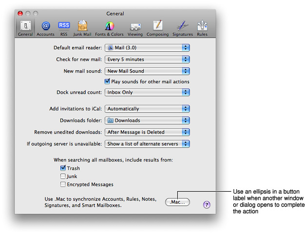
Push button labels should have title-style capitalization, as described in “Capitalization of Interface Element Labels and Text.” If the push button immediately opens another window, dialog, or application to perform its action, you can use an ellipsis in the label. For example, Mail preferences displays a push button that includes an ellipsis because it opens .Mac system preferences, as shown in Figure 15-8.
All push buttons should be clear in appearance, that is, without color, except the default button. The default button is the button that performs a safe action in a dialog and is activated when the user presses Return or Enter (for more information about the default button, see “Dismissing Dialogs”). When the user presses a nondefault button, such as Cancel, that button acquires color and the default button loses its color. If you use system-provided push buttons, this behavior is automatic.
Push Button Specifications
Control sizes: Push buttons are available in regular, small, and mini sizes. The height of a push button is fixed for each size, but you specify the width, depending on the length of the label text you supply. If you don’t specify a wide enough button, the end caps clip the text.
Label spacing and fonts: Push button label text should not have a shadow or any other effects on it, and it should be in the system font appropriate for the button size (these fonts are automatically supplied by Interface Builder):
Regular size: System font.
Small: Small system font.
Mini: Mini system font.
Control spacing: Push buttons should be placed far enough from each other to allow the user to click a specific one easily. In particular, note that a push button that could lead to a potentially dangerous or destructive action (such as Delete) should be farther away from safe buttons than the distances recommended in this section (see “Dismissing Dialogs” for more information).
Regular size: Leave at least 12 pixels of space between buttons aligned horizontally or stacked vertically.
Small: Leave at least 10 pixels of space between buttons aligned horizontally or stacked vertically.
Mini: Leave at least 8 pixels of space between buttons aligned horizontally or stacked vertically.
Push Button Implementation
Push buttons are available in Interface Builder. To create one using Application Kit programming interfaces, create an NSButton object of type NSMomentaryPushInButton or NSMomentaryLightButton.
Icon Buttons
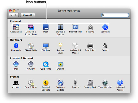
An icon button behaves like a bevel button, but it does not have a visible rectangular edge around it. In other words, the entire button is clickable, not just the icon. Figure 15-10 shows the icon buttons in the System Preferences window.
Icon Button Usage
Typically, icon buttons are used to display clickable icons in a toolbar (as described in“Window-Frame Controls,” an icon button is one of three standard window-body controls you can use in a toolbar). If you want to use icon buttons in your toolbar, avoid mixing them with rectangular-style or capsule-style toolbar controls. Icon buttons should not be used in a bottom bar.
An icon button can have a pop-up menu attached. See “Icon Buttons and Bevel Buttons with Pop-Up Menus” for more information about this usage.
Icon Button Contents and Labeling
Icon buttons contain icons; in addition, they can display a text label that users can choose to view. Icon buttons can also contain a single downward-pointing arrow, which indicates the presence of a pop-up menu.
Icon button labels should name a thing (such as Network or Accounts) or describe an action (such as Mask or Show Art). Remember that users can choose to view the icon without the label, so make sure the meaning of the icon is clear and unambiguous. See “Designing Icons for Icon Buttons” for more information on designing attractive and useful toolbar icons.
Icon Button Specifications
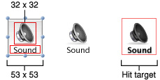
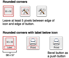
Control sizes: The outer dimensions of an icon button are not visible, but they determine the hit target area. Typically, the outer dimensions of an icon button include a margin of about 10 pixels all the way around the icon and label.
Label spacing and fonts: Use the small system font for the labels. The text should be below the icon as shown in Figure 15-11.
Icon sizes: Icons for icon buttons work best when they are between 24 x 24 pixels and 32 x 32 pixels in size. For example, the icon shown in Figure 15-11 is 32 x 32 pixels.
Control spacing: For buttons with a 24 x 24 pixel (or larger) icon, leave at least 8 pixels between button edges (not between icon edges), stacked vertically or aligned horizontally.
Icon Button Implementation
To create an icon button in Interface Builder, drag a bevel button or a square button into your window, add your icon, and deselect the Bordered checkbox in the Attributes pane of the inspector. To create one using Application Kit programming interfaces, use the setBezelStyle method of NSButtonCell with NSShadowlessSquareBezelStyle as the argument.
You can also use Interface Builder to create an icon button that includes a pop-up menu. First, drag a pop-up button into your window then, in the Attributes pane of the inspector, change the type to Pull Down. Finally, in the same pane, change the style to either Bevel or Square (it doesn’t matter which) and deselect the Bordered checkbox.
Scope Buttons
A scope button is used in a scope bar to specify the scope of an operation, such as search, or to save or manipulate a set of scoping criteria. These two complementary functions are supported by two styles of scope buttons, the recessed button and the round rectangle button, respectively (see “Scope Button Usage” for examples of these controls). See “Scope Bars” for more information about scope bars.
Scope Button Usage
Important: Scope buttons are designed to be used in scope bars and related filter rows only. They are not intended to be used in the toolbar or bottom-bar areas or outside of a scope bar in the window body.
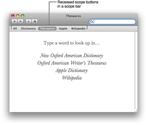
The recessed scope button style is used to display types or groups of objects or locations the user can select to narrow the focus of a search or other operation. For example, Dictionary displays recessed scope buttons that allow users to look up a word in a dictionary, a thesaurus, an Apple terminology database, Wikipedia content, or in all locations simultaneously. Figure 15-12 shows the recessed scope buttons used in Dictionary.
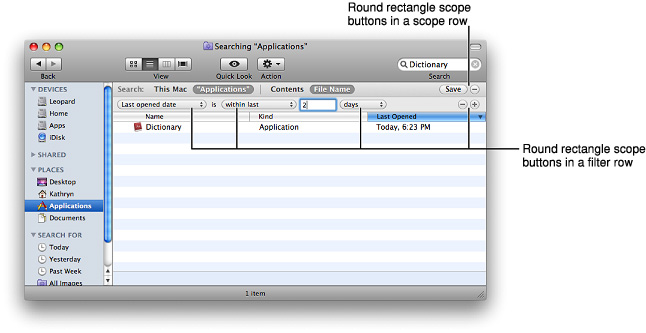
The round rectangle scope button style is used to allow users to save a set of search criteria and to change or set scoping criteria. For example, the Finder uses round rectangle scope buttons to display search criteria, such as creation and last opened dates, and to provide a save search button. Figure 15-13 shows the round rectangle scope buttons used in the Finder.
Scope Button Contents and Labeling
Typically, round rectangle and recessed scope buttons contain text, but they can instead contain images. If you want to display an image in a scope button, be sure to consider the system-provided images before you spend time designing your own. If you decide to design a custom icon for use in a scope button, see “Designing Icons for Rectangular-Style Toolbar Controls” for some guidelines.
Scope Button Specifications
Control sizes: The round rectangle scope button is available in regular, small, and mini sizes. The height of the control is fixed for each size, but you set the width.
Label spacing and fonts: If you choose to use text to label scope buttons, use the view font (12-point Lucida Grande). Use the view font in bold for recessed scope buttons and the regular view font for round rectangle scope buttons.
Scope Button Implementation
Scope buttons are available in Interface Builder. You can also use Application Kit programming interfaces to create them. To create a recessed scope button, use the setBezelStyle: method of NSButtonCell with NSRecessedBezelStyle as the argument. To create a round rectangle scope button, pass NSRoundRectBezelStyle as the argument to the setBezelStyle: method.
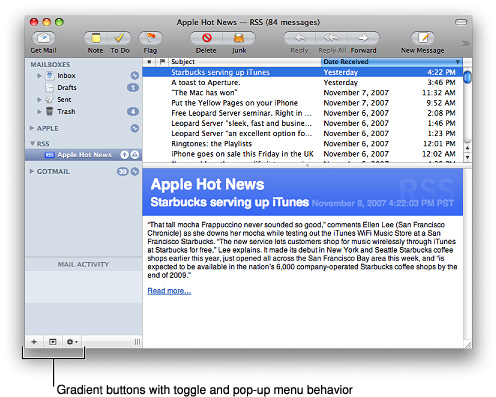
Gradient Buttons
A gradient button performs an instantaneous action related to a view, such as a source list. For example, in Keyboard & Mouse preferences (shown in Figure 15-14), gradient buttons allow the user to add and remove keyboard shortcuts for specific applications.

Gradient Button Usage
Use a gradient button when you need to offer functionality that is directly related to a source list or other view, such as a column view. Gradient buttons can have push-button, toggle, and pop-up menu behavior. For example, Mail uses gradient buttons at the bottom of the sidebar to offer New Mailbox, Show/Hide Mail Activity, and Action menu functionality, as shown in Figure 15-15.
Gradient buttons do not belong in the window-frame areas. If you need to offer an Action menu or other functionality in a bottom bar, use a rectangular-style toolbar control instead (see “Rectangular-Style Toolbar Controls” for more information).
Gradient Button Contents and Labeling
Gradient buttons should contain images; they should not contain text. Because the function of a gradient button is closely tied to the view with which it’s associated, there’s little need to describe its action using a label.
When possible, you should use the system-provided images, such as the Action menu image and the Add image, because their meaning is familiar to users. You should create a custom image only when none of the system-provided images is suitable. See “System-Provided Images” for more information on the system-provided images available to you. If you decide to create your own icons to use in a gradient button, see “Designing Icons for Rectangular-Style Toolbar Controls” for some guidelines on how to do this.
Gradient Button Specifications
Control sizes: Gradient buttons are available in regular size only.
Control spacing: Although you can use a single gradient button by itself, it is more common for multiple gradient buttons to be displayed in a row. If you display more than one gradient button in a row, such as below a source list or other view, the buttons should abut each other. If the gradient buttons are not attached to a source list or other view within a window, leave 12 pixels between the bottom edge of the source list (or other view) and the gradient buttons associated with it.
Gradient Button Implementation
Gradient buttons are available in Interface Builder. To create one using Application Kit programming interfaces, use the setBezelStyle: method of NSButtonCell with NSSmallSquareBezelStyle as the argument.
The Help Button
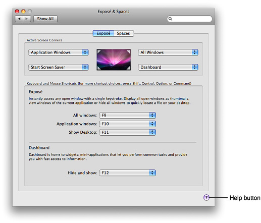
The Help button opens a window that displays a specific help page appropriate for the context of the button. Don’t create a custom button to do this; use the standard Help button, which contains the Mac OS X question mark graphic.
In dialogs (including preferences windows) and drawers, the Help button can be located in either the lower-left or lower-right corner. In a dialog that includes OK and Cancel buttons (or other buttons used to dismiss the dialog), the Help button should be in the lower-left corner, vertically aligned with the buttons. In a dialog that does not include OK and Cancel buttons, such as a preferences window, the Help button should be in the lower-right corner. Figure 15-16 shows an example of a preferences pane that includes a Help button.
For information on providing help in your application, see “User Assistance.”
The standard Help button is 20 pixels in diameter and should be placed at least 12 pixels from other interface elements. See “A Simple Preferences Window” for an example of Help button placement in a dialog.
The standard Help button is available in Interface Builder. To create a Help button using Application Kit programming interfaces, use the setBezelStyle: method of NSButtonCell with NSHelpButtonBezelStyle as the argument.
Bevel Buttons
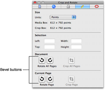
A bevel button is a multipurpose button designed for use in the window-body area. You can use bevel buttons singly (as a push button) or in groups (as a set of radio buttons or checkboxes). Figure 15-17 shows bevel buttons used as push buttons in the Preview inspector window.
Bevel buttons can have square or rounded corners. The square-cornered variation can be used when space is limited or when adjoining a set of bevel buttons. You may notice, however, that bevel buttons are not very frequently used in applications running in Mac OS X v10.4 and later. This is due in part to user interface style changes and in part to alternative controls that became available. You can still use bevel buttons if they provide exactly the look you need, but you should consider alternatives, such as gradient buttons and segmented controls (described in “Gradient Buttons” and “Segmented Controls,” respectively).
Bevel Button Usage
Bevel buttons can behave like push buttons or can be grouped and used like radio buttons or checkboxes. For example, you could use bevel buttons to graphically represent text-alignment options.
Use bevel buttons in the window body. If you need a similarly versatile button for use in the window-frame areas, consider using a rectangular-style toolbar button (described in “Rectangular-Style Toolbar Controls”).
Bevel Button Contents and Labeling
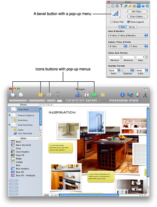
Bevel buttons are very versatile and can display text, icons, or other images. Bevel buttons can also display a single downward-pointing arrow in addition to text or an image, which indicates the presence of a pop-up menu. See “Icon Buttons and Bevel Buttons with Pop-Up Menus” for more information about this usage.
If you choose to display an icon or image instead of a text label, be sure the meaning of the image is clear and unambiguous (see “Cultural Values” for some advice on choosing appropriate imagery). Interface Builder provides several built-in images you can use on a bevel button; see “System-Provided Images” for more information about system-provided images.
You can also combine an icon (or image) and a text label on a bevel button. You can place the text anywhere on the button in relation to the icon (you specify the location in Interface Builder or programmatically). Use label font (10-point Lucida Grande Regular) for text labels.
If you use a bevel button as a push button, its label should be a verb or verb phrase that describes the action it performs. If you provide a set of bevel buttons to be used as radio buttons or checkboxes, you might label each with a noun that describes a setting or a value.
Bevel Button Specifications
Control sizes: The dimensions of bevel buttons vary; 20 x 20 pixels is the recommended size for use in a tool panel (see “Panels” for more information on panels).
Icon sizes: 32 x 32 pixels is the largest recommended icon size. Maintain a margin of between 5 and 15 pixels between the icon and the outer edges of the button. A button that contains an icon and label combined may need a margin around the edge that’s closer to 15 pixels than to 5 pixels.
Control spacing: For bevel buttons with rounded corners that contain a 24 x 24 pixel (or larger) icon, leave at least 8 pixels between buttons, stacked vertically or aligned horizontally. Otherwise, buttons should butt up against each other.
Figure 15-18 shows some examples of these configurations.
Bevel Button Implementation
Bevel buttons are available in Interface Builder. To create one using Application Kit programming interfaces, use the setBezelStyle: method of NSButtonCell with NSRegularSquareBezelStyle as the argument. To create a square-cornered bevel button, use NSShadowlessSquareBezelStyle as the argument for the setBezelStyle: method.
You can also use Interface Builder to add a pop-up menu to a bevel button. First, drag a pop-up button into your window then, in the Attributes pane of the inspector, change the type to Pull Down. Finally, in the same pane, change the style to Bevel (for a standard bevel button look) or Square (for a square-cornered bevel button look).
Round Buttons
Like a push button, a round button initiates an immediate action. Unlike a push button, however, a round button does not contain text.
Round buttons, like bevel buttons, are seldom used in applications running in Mac OS X v10.4 and later. You might be able to use a gradient button that contains a system-provided (or custom) image as an alternative. See “Gradient Buttons” for more information about gradient buttons; see “System-Provided Images” for more information about system-provided images available in Mac OS X v10.5 and later.
Round Button Usage
Round buttons are seldom used, but they can be useful when you need a simple iconic push button that initiates an immediate action. Typically, round buttons are used as navigation controls.
Don’t use a round button to create a Help button. If you provide onscreen help, use the standard Help button instead (see “The Help Button” for more on this control). In addtion, you should not use round buttons as radio buttons or as checkboxes.
Round Button Contents and Labeling
Round buttons contain images only, not text. If you need to display a single letter in a round button you should treat the letter as an icon.
Round Button Specifications
Control sizes: Round buttons are available in regular and small sizes only. The regular-size round button is 25 pixels in diameter; the small round button is 20 pixels in diameter.
Control spacing: Leave 12 pixels between round buttons or between a round button and another interface element.
Round Button Implementation
Round buttons are available in Interface Builder. To create one using Application Kit programming interfaces, use the setBezelStyle: method of NSButtonCell with NSCircularBezelStyle as the argument.
Selection Controls
The controls described in the following sections provide ways for users to make selections from multiple items. Some selection controls allow only a single selection, others can be configured to allow a single selection or multiple selections.
Important: The controls described in this section are suitable for use in the window body; they should not be used in the window-frame areas. The single exception is the icon button with a pop-up menu, which can also be used in a toolbar. See “Window-Frame Controls” for controls designed specifically for use in the toolbar and bottom-bar areas in your window.
Radio Buttons
A group of radio buttons provides users with a set of mutually exclusive, but related, choices. For example, Security preferences uses radio buttons to allow users to choose which connections can get through the firewall, as shown in Figure 15-20.

Radio Button Usage
Use a group of radio buttons when you need to display a set of choices from which the user can choose only one. If you need to display a set of choices from which the user can choose more than one at the same time, use checkboxes instead. Also, if you need to display a single setting, state, or choice the user can either accept or reject, don’t use a single radio button; instead you can use a checkbox. To learn more about checkboxes, see “Checkboxes.”
A group of radio buttons should contain at least two items and a maximum of about five. If you need to display more than five items, consider using a pop-up menu (described in “Pop-Up Menus”).
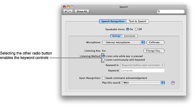
A radio button should never initiate an action, although the choice of a radio button can change the state of the application. For example, Speech preferences allows the user to choose between two listening methods, as shown in Figure 15-21. If the user chooses the second listening method (“Listen continuously with keyword”), the keyword setup preferences are automatically enabled.
Radio Button Contents and Labeling
The selected and unselected appearances of a radio button are provided automatically; you cannot display any text or images in a radio button.
Radio buttons should be accompanied by text labels that describe the choice associated with each button. These labels should have sentence-style capitalization, as described in “Capitalization of Interface Element Labels and Text.”
A set of radio buttons is never dynamic; that is, the contents and labels shouldn’t change depending on the context.
Radio Button Specifications
Control sizes: The dimensions of the radio button itself are fixed for each size, but you determine the length of the label that introduces the group and the length of each radio button label.
Label spacing and fonts: Radio button text (both the introductory label and control label) should be in a font that is proportional to the size of the control. The following fonts are supplied automatically by Interface Builder:
Regular size: System font.
Small: Small system font.
Mini: Mini system font.
Use the following metrics to position the introductory labels correctly:
Regular size: 8 pixels from the end of the label (the colon) to the control.
Small: 6 pixels from the end of the label (the colon) to the control.
Mini: 5 pixels from the end of the label (the colon) to the control.
Control spacing: Radio buttons can be arranged vertically or horizontally, depending on the overall layout of your window or dialog. Typically, however, radio buttons are stacked vertically to emphasize the mutually exclusive relationship among the buttons.
If you position a group of radio buttons horizontally, measure the space needed to accommodate the longest radio button label. Use that measurement to make the space between each pair of radio buttons consistent.
Use the following metrics when you position radio buttons vertically:
Regular size: 6 pixels between controls.
Small: 6 pixels between controls.
Mini: 5 pixels between controls.
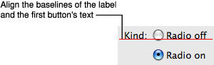
For radio buttons stacked vertically or horizontally, be sure to align the baseline of the introductory label with the baseline of the first button’s label, as shown in Figure 15-22.
Radio Button Implementation
Radio buttons are available in Interface Builder. To create one using Application Kit programming interfaces, create an NSButton object with type NSRadioButton.
Checkboxes
A checkbox describes a state, action, or value that can be either on or off. In a group of checkboxes, each checkbox should be independent of all the others, unless interdependency is clearly indicated (for example, by displaying a subordinate checkbox indented below a superior checkbox).
For example, in Sound preferences (shown in Figure 15-23), checkboxes allow users to make choices about sound effects and choose whether to display the volume setting in the menu bar. Notice that users can select or deselect any of the three sound effects checkboxes, because these controls are independent of each other.

Checkbox Usage
Use a checkbox when you want to allow users to choose between two opposite states, actions, or values. If you want to provide a set of choices from which users can choose only one, use a set of radio buttons instead (see “Radio Buttons” for more on this control).
If there are several independent values or states you want users to control, you can provide a group of checkboxes (see Figure 15-23 for an example of a group of independent checkboxes). If, on the other hand, you need to allow users to make an on-off type of choice that can lead to additional, related on-off choices, you can display checkboxes in a hierarchy that indicates the relationship.
For example, the Trackpad pane of the Keyboard & Mouse preferences allows users to decide which trackpad gestures to use (this window is shown in Figure 15-24). Notice that the “Allow horizontal scrolling” checkbox is dependent on the “Use two fingers to scroll” checkbox, because if users choose not to use two fingers to scroll, they don’t care about horizontal scrolling. Similarly, the Dragging and Drag Lock checkboxes are unavailable unless the Clicking checkbox is selected, because the dragging gestures are dependent on the clicking gesture. The Trackpad pane uses indentation to tell users that some of these settings are dependent on others.

Checkbox Contents and Labeling
Each checkbox label should clearly imply two opposite states so it’s clear what happens when the option is selected or deselected. If you can’t find an unambiguous label, consider using a pair of radio buttons so you can clarify the states with two different labels.
Checkbox labels should have sentence-style capitalization (see “Capitalization of Interface Element Labels and Text” for more on this style), unless the state or value is the title of some other element in the interface that is capitalized.
When a user selection comprises more than one state, use a dash in the appropriate checkboxes. This symbol is consistent with the mixed-state indicator in menus, as described in “Using Symbols in Menus.”
Checkbox Specifications
Control sizes: The dimensions of the checkbox itself are fixed for each size, but you determine the length of the introductory label and checkbox label.
Label spacing and fonts: Checkbox text (both the introductory label and control label) should be in a font that is proportional to the size of the control. The following fonts are supplied automatically by Interface Builder:
Regular size: System font.
Small: Small system font.
Mini: Mini system font.
If you display an introductory label on the same line as the first checkbox, use the following metrics to position it correctly:
Regular size: 8 pixels from the end of the label (the colon) to the control.
Small: 6 pixels from the end of the label (the colon) to the control.
Mini: 5 pixels from the end of the label (the colon) to the control.
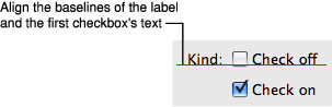
Be sure to align the baseline of the introductory label with the baseline of the closest checkbox’s label, as shown in Figure 15-25.
If you display an introductory label above a group of checkboxes, leave 8 pixels between the label and the first checkbox.
Control spacing: Typically, checkboxes are arranged vertically, because this arrangement makes it easier for users to distinguish one state from another. As described in “Checkbox Usage,” you should align a set of independent checkboxes so that all appear to be at the same level. If one checkbox describes a state or action that depends on the state of another checkbox, you can indent the dependent checkbox below the controlling one.
Use the following metrics when you lay out checkboxes in your window:
Regular size: 8 pixels between controls when stacked.
Small: 8 pixels between controls when stacked.
Mini: 7 pixels between controls when stacked.
Checkbox Implementation
Checkboxes are available in Interface Builder. To create one using Application Kit programming interfaces, create an NSButton object of type NSSwitchButton.
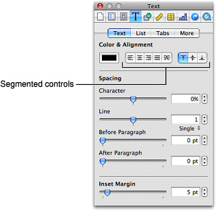
Segmented Controls
A segmented control is divided into two or more segments and behaves as a collection of radio buttons or checkboxes. Like a push button, a segmented control initiates an immediate action—that is, when the user clicks one of the segments, something should happen.
Mac OS X offers different styles of segmented controls for use in different window areas. The segmented control described in this section is suitable for use in the window body; it should not be used in the window-frame areas. For information on styles of segmented controls that are available for use in the window-frame areas (the toolbar and the bottom bar), see “Window-Frame Controls.” Figure 15-26 shows an example of segmented controls in a window-body area.
Segmented Control Usage
Use a segmented control when you want to offer the user a few closely related choices that affect a selected object. You can also use a segmented control to change views or panes in a window. Note that although a segmented control used as a view-changer looks similar to a tab view control, it does not behave the same: A segmented control is not attached to the panes, whereas a tab view control is attached to them. See “Tab Views” for more information about tab views.
If you need to provide a way for users to add and delete objects in a source list or other split view, don’t use a segmented control that contains the plus and minus symbols. Instead, if you need to put an add-delete control in a bottom bar, use a rectangular-style toolbar control (described in “Rectangular-Style Toolbar Controls”). If you need to put an add-delete control in the window body, use a gradient button (described in “Gradient Buttons”). Also, you don’t need to create the plus and minus icons for these controls, because Mac OS X v10.5 and later provides these and many other icons for your use (see “System-Provided Images” for more information).
Segmented Control Contents and Labeling
A segmented control can contain either icons or text, but not a mixture of both. However, when the control contains icons, you can place a text label below the control.
For the text in each segment, or the label below it, use a noun (or short noun phrase) that describes a view or an object, and use title-style capitalization (see “Capitalization of Interface Element Labels and Text” for more on this style).
If you choose to use icons in a segmented control, be sure to consider using the images that are available in Mac OS X v10.5 and later (see “System-Provided Images” for more information on these). If you need to design your own images, try to imitate the clarity and simple lines of the system-provided images. For some tips on how to create custom images of this type, see “Designing Icons for Rectangular-Style Toolbar Controls.”
Segmented Control Specifications
Control sizes: The height of a segmented control is fixed for each size, but you determine the width of the control. Be sure to make the width of each segment the same, because a segment of a different width might imply that it has different behavior or is of greater or lesser importance than the others.
Label spacing and fonts: The text in a segmented control and the label text is proportional to the size of the control (Interface Builder automatically supplies the appropriate font for the text within the control):
Regular size: System font for text within the control and for label text below it.
Small: Small system font for text within the control and for label text below it.
Mini: Mini system font for text within the control and for label text below it.
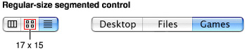
Icon sizes: If you need to design an icon for each segment, you should constrain the icon to the following dimensions:
Regular size: 17 x 15 pixels.
Small: 14 x 13 pixels.
Mini: 12 x 11 pixels.
Segmented Control Implementation
The segmented control is available in Interface Builder. To create one using Application Kit programming interfaces, use the NSSegmentedControl class.
Icon Buttons and Bevel Buttons with Pop-Up Menus
A bevel button or an icon button containing a pop-up menu has a single downward-pointing arrow. The button can behave like a standard pop-up menu, in which the image on the button is the current selection, or the button can represent the menu title and always display the same image.
Important: An icon button with a pop-up menu is one of the three window-body controls that can also be used in a window-frame area. To learn more about controls that are designed specifically for use in window-frame areas, see “Window-Frame Controls.”
An icon or bevel button with a pop-up menu is easy to create in Interface Builder. First, drag a pop-up button (an NSPopUpButton object) into your window. Select the button and in the Attributes pane of the inspector, change its type to Pull Down. Finally, for a Rounded or Square Bevel Button, change the style to Square or Shadowless Square, respectively. For an icon button, it doesn’t matter which style you choose, but you must deselect the Bordered checkbox. Resize the button as needed.
See “Bevel Buttons” and “Icon Buttons” for specifications for the buttons themselves. Figure 15-28 shows examples of these types of buttons with pop-up menus.
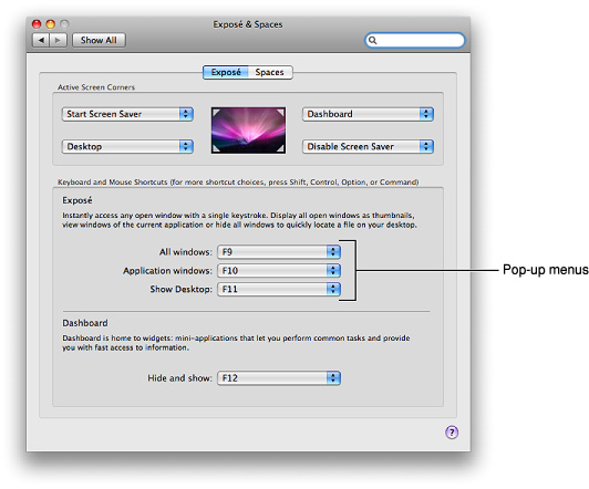
Pop-Up Menus
A pop-up menu presents a list of mutually exclusive choices in a dialog or window. The pop-up menu described in this section is suitable for use in window-body areas. If you need to provide pop-up menu functionality in a window-frame area (a toolbar or bottom bar), see “Window-Frame Controls” for more information on controls you can use. If you want to add pop-up menu functionality to a bevel or icon button, see “Icon Buttons and Bevel Buttons with Pop-Up Menus” for some specifications you can use. Figure 15-29 shows several pop-up menus in a window.
A pop-up menu behaves like other menus: Users press to open the menu and then drag to choose an item. The chosen item flashes briefly and is displayed in the closed pop-up menu. If users move the cursor outside the open menu without releasing the mouse button, the current value remains active. An exploratory press in the menu to see what’s available doesn’t select a new value.
Pop-Up Menu Usage
Use a pop-up menu to present up to 12 mutually exclusive choices that the user doesn’t need to see all the time. Sometimes a pop-up menu can be a good alternative to other types of selection controls. For example, if you have a dialog that contains a set of six or more radio buttons, you might consider replacing them with a pop-up menu to save space.
Avoid adding a submenu to any item in a pop-up menu. Doing so hides choices too deeply and is physically difficult for users to use.
Avoid using pop-up menus:
For more than 12 items; instead, use a scrolling list unless space is restricted.
When the number of items in the list can change.
When more than one simultaneous selection is appropriate, such as in a list of text styles (from which users might choose both bold and italic). In this situation, you should instead use checkboxes or a pull-down menu in which checkmarks appear.
Pop-Up Menu Contents and Labeling
A pop-up menu:
Usually has a label to the left (in left-to-right scripts). The label should have sentence-style capitalization (see “Capitalization of Interface Element Labels and Text” for more information on this capitalization style). The only exception is if the control is used as the title for a group box, which is not a common usage.
Has a double-arrow indicator.
Contains nouns (things) or adjectives (states or attributes), but not verbs (commands). If you need to display commands, use a pull-down menu instead. Use title-style capitalization for the item labels.
Displays a checkmark to the left of the currently selected value when open.
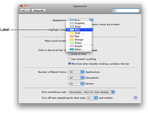
Figure 15-30 shows the components of a pop-up menu.
In special cases, you may want to include a command that affects the contents of the pop-up menu itself. For example, in the Print dialog, the Printer pop-up menu contains the Add Printer item, so users can add a printer to the menu; the new printer becomes the menu’s default selection. Put such commands at the bottom of a pop-up menu, below a separator.
Pop-Up Menu Specifications
Control sizes: The height of a pop-up menu is fixed for each size. The width should be wide enough to accommodate the longest item. If you display multiple pop-up menus in a stack the width of each control should be the same.
Label spacing and fonts: The menu-item text in a pop-up menu should be in a font that is proportional to the size of the control. The text of the introductory label should be an emphasized version of the same font. Use the following metrics and specifications for a pop-up menu:
Regular size:
Menu-item text: System font. Leave 9 pixels from the left edge of the control and at least 9 pixels from the double-arrow area.
Introductory text: Emphasized system font. Leave 8 pixels between the end of the text (colon) and the left edge of the control.
Small:
Menu-item text: Small system font. Leave 7 pixels from the left edge of the control and at least 7 pixels from the double-arrow area.
Introductory text: Emphasized small system font. Leave 6 pixels between the end of the text (colon) and the left edge of the control.
Mini:
Menu-item text: Mini system font. Leave 5 pixels from the left edge of the control and at least 5 pixels from the double-arrow area.
Introductory text: Emphasized mini system font. Leave 5 pixels between the end of the text (colon) and the left edge of menu.
Figure 15-31 shows how the pop-up menu introductory text and menu-item text are positioned.
Control spacing: When you display multiple pop-up menus stacked vertically, leave the following amounts of space between them (Figure 15-32 shows how this looks with regular-size controls):
Regular size: At least 10 pixels between stacked controls.
Small: At least 8 pixels between stacked controls.
Mini: At least 6 pixels between stacked controls.
Pop-Up Menu Implementation
Pop-up menus are available in Interface Builder. To create one using Application Kit programming interfaces, use the NSPopUpButton class.
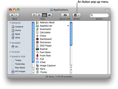
Action Menus
An Action menu is a specific type of pop-up menu that’s designed to replace an application-wide contextual menu. For example, in its default set of toolbar controls, the Finder includes an Action menu that performs tasks related to the currently selected item, as shown in Figure 15-33.
Important: An Action menu is one of the three window-body controls that can also be used in a window-frame area. To learn more about controls that are designed specifically for use in window-frame areas, see “Window-Frame Controls.”
Action Menu Usage
Use an Action pop-up menu when you want to provide a visible shortcut to a handful of useful commands. Although contextual menus also provide shortcuts to a small number of commands, the fact that they are hidden makes them difficult for new users to discover and for all users to remember. (You can learn more about contextual menus in “Contextual Menus.”) If you are thinking of providing (or already provide) an application-wide contextual menu, you might choose to replace it with an Action menu control in the toolbar.
You can also use an Action menu at the bottom of a list view or source list to provide commands that apply to items in the list. For example, Mail provides an Action menu at the bottom of its source list (shown in Figure 15-34). This Action menu contains commands that act on the account or mailbox selected in the source list.

Avoid placing an Action menu control anywhere else in the body of a window. Contextual menus appear when the user selects an object in a window and Control-clicks (or clicks the right button of a properly configured two-button mouse). Because such an object might appear anywhere in a window, there’s no reasonable, consistent location for an Action menu control that contains the commands specific to that object.
Action Menu Contents and Labeling
An Action menu should display only the Action icon and the standard downward-pointing arrow used in icon and bevel buttons with attached pop-up menus (for more information about these controls, see “Icon Buttons and Bevel Buttons with Pop-Up Menus”). It’s essential that you use the system-supplied Action icon so users understand what the control does (for more information on the Action icon and icons available for other types of controls, see “System-Provided Images”).
The contents of an Action menu should conform to the guidelines for contextual menus, such as ensuring that each Action menu item is also available as a menu command and avoiding the display of keyboard shortcuts. For more information on the guidelines that govern contextual menus, see “Contextual Menus.”
An Action menu does not need a label, because users are familiar with the meaning of the Action icon. The only exception is the label you should supply for an Action menu button in a toolbar, because users can customize the toolbar to view toolbar items as icons with text or as text instead of icons (see “Toolbars” for more information on toolbars).
Action Menu Specifications
Control sizes: The Action menu icon is available in regular and small sizes. Use the icon size that’s proportional to the size of the control you want to use.
Control spacing: Spacing depends on what type of control you use. For details, see “Rectangular-Style Toolbar Controls” (if you plan to put an Action menu in a toolbar) or “Gradient Buttons” (if you plan to put an Action menu below a source list or other type of list view).
Action Menu Implementation
You can create an Action menu in Interface Builder. If you need an Action menu control for a toolbar, select a rectangular-style toolbar control (see “Rectangular-Style Toolbar Controls” for more information about this control). In the Attributes pane of the inspector, specify NSActionTemplate for the image.
If you need an Action menu control at the bottom of a source list or list view, you can use a gradient button (see “Gradient Buttons” for information on this control).
Combination Boxes
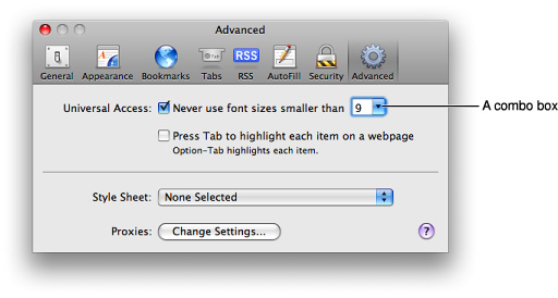
A combination box (or combo box) is a text entry field combined with a drop-down list. Combo boxes can display a list of likely choices while still allowing the user to type in an item not in the list. For example, Safari allows users to set a preference for the minimum font size to display. In its Advanced preferences pane (shown in Figure 15-35), Safari lists several font sizes in a combo box, and users can supply a custom font size if none of the listed choices is suitable.
Users can type any appropriate characters into the text field. If a user types in an item already in the list, or types in a few characters that match the first characters of an item in the list, the item is highlighted when the user opens the list. A user-typed item is not added to the permanent list.
Users open the list by pressing or clicking the arrow to the right of the text field. The list descends from the text field; it is the same width as the text field plus the arrow box, and it has a drop shadow.
When the user selects an item in the list, the item replaces whatever is in the text entry field and the list closes. If the list was opened by pressing the arrow, the user selects an item in the list by dragging to it. If the list was opened by clicking the arrow, the user selects an item by clicking it or by pressing the Up Arrow or Down Arrow key. The user can accept an item by pressing the Space bar, Enter, or Return.
If the list is open and the user clicks outside it, including within the text entry field, the list closes.
Combo Box Usage
Use a combo box when you want to give users the convenience of selecting an item from a list combined with the freedom of specifying their own custom item. A combo box does not allow multiple selections, so be sure to offer users a list of items from which they can choose only one at a time.
Combo Box Contents and Labeling
The default state of the combo box is closed, with the text field empty or displaying a default selection. Recall that user-supplied items are not added to the control’s permanent list.
The default selection (which may not be the first item in the list) should provide a meaningful clue to the hidden choices, but it’s a good idea to introduce a combo box with a label that helps users know what types of items to expect.
Don’t extend the right edge of the list beyond the right edge of the arrow box; if an item is too long, it is truncated.
Combo Box Specifications
Control sizes: The height of a combo box is fixed for each size, but its width should be wide enough to accommodate the longest list item.
Label spacing and fonts: The text of the list items in a combo box should be in a font that is proportional to the size of the control. The text of the introductory label should be an emphasized version of the same font. Use the following metrics and specifications for a combo box:
Regular size:
List-item text: System font. This font is automatically supplied by Interface Builder.
Introductory label: Emphasized system font. Leave 8 pixels between the end of the text (colon) and the left edge of the control.
Small:
List-item text: Small system font. This font is automatically supplied by Interface Builder.
Introductory label: Emphasized small system font. Leave 6 pixels between the end of the text (colon) and the left edge of the control.
Mini:
List-item text: Mini system font. This font is automatically supplied by Interface Builder.
Introductory label: Emphasized mini system font. Leave 5 pixels between the end of the text (colon) and the left edge of menu.
Figure 15-37 shows how the combo box introductory label and list-item text are positioned.
Control spacing: When combo boxes are stacked vertically, leave the following amounts of space between them:
Regular size: At least 12 pixels.
Small: At least 10 pixels.
Mini: At least 8 pixels.
Combo Box Implementation
Combo boxes are available in Interface Builder. To create one using the Application Kit programming interfaces, use the NSComboBox class.
Path Controls
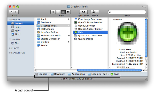
A path control displays the file-system path of the currently selected item. For example, the Finder uses one style of path control to display the path of the currently selected item at the bottom of the window, as shown in Figure 15-38.
There are three styles of path control, all of which are suitable for use in the window body:
Standard
Navigation bar
Pop up
Path Control Usage
Use a path control when you want to display the file-system location of the currently selected item in a way that is not overly technical. You can also use a path control to allow users to retrace their steps along a path and open folders they visited earlier.
Path Control Contents and Labeling
All three path-control styles display text in addition to icons for applications, folders, and document types. When users click the pop-up style path control, a pop-up menu appears, which lists all locations in the path and a Choose menu item. Users can use the Open dialog opened by the Choose item to view the contents of the selected folder. (See “The Open Dialog” for more information on the Open dialog.)
Path Control Specifications
The standard-style path control is available in regular size only. The navigation bar and pop-up styles are each available in regular, small, and mini sizes.
You specify the horizontal length of the standard and navigation bar styles; if the displayed path is too long to fit in the control, the folder names between the first location and the last are hidden, as shown in Figure 15-39.
Path Control Implementation
The path control is available in Interface Builder. You can change the style of the control in the Attributes pane of the inspector panel. To create this control using Application Kit programming interfaces, use the NSPathControl class.
Color Wells
A color well is a small rectangular control that indicates the current color for a particular setting and, when clicked, displays the Colors window (using the Colors window, users can change a color setting). For example, the Graphic pane of the Pages inspector contains three color wells that allow users to change the color of an object’s fill, outline, and shadow, as shown in Figure 15-40.
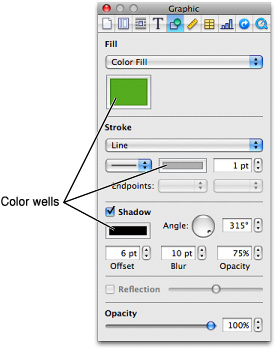
Multiple color wells can appear in a window. Color wells are available in Interface Builder. To create one using Application Kit programming interfaces, use the NSColorWell class.
Image Wells
Use an image well as a drag-and-drop target for an icon or picture. You could use a set of image wells to manage thumbnails in a clip-art catalog, for example. Don’t use image wells in place of push buttons or bevel buttons. Figure 15-41 shows the image well in Accounts preferences.
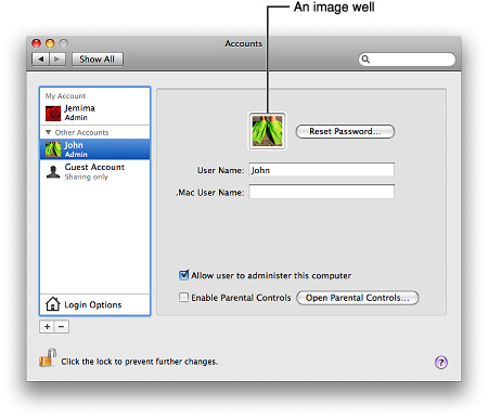
Some image wells (the user picture in the Password pane of Accounts preferences, for example) must always contain an image. If the user can clear an image well (leaving it empty) in your application, provide standard Edit menu commands and Clipboard support.
Image wells are available in Interface Builder. To create one using Application Kit programming interfaces, use the NSImageView class.
Date Pickers
A date picker allows users to select a specific date and time in a window. The date-picker control provides two styles of date and time selection:
A combination of a text field and stepper control
A graphical calendar and clock
The Date & Time preferences pane uses both types of date picker, as shown in Figure 15-42.

Date Picker Usage
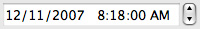
Use a date picker to provide time and date setting functionality in a window. The text field and stepper date picker is useful when space is constrained and you expect users to be making specific date and time selections. This style of date picker can be modified to display various combinations of date format (month, day, and year or month and year) and time format (hour, minute, and second, or hour and minute). It can also display a text field and stepper for either the date or the time by itself. The user adjusts the date and time by clicking the arrows of the stepper or by selecting the field to change (such as the month or minute field) and typing a new value. For example, Figure 15-43 shows a text field and stepper date-picker control that allows month, day, and year selection for the date, and hour, minute, and second selection for the time.
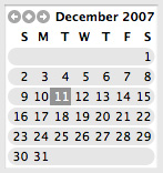
The graphical style of the date-picker control displays a calendar and a clock. Use this style when you want to give users the option of browsing through days in a calendar or when the look of a clock face is appropriate for the style of your application. You can display either the calendar or the clock in your window or both together. The user selects a month by clicking the left or right arrows in the upper-left corner of the calendar display and selects a day by clicking its date in the month. A specific time is selected by dragging the hands of the clock. Figure 15-44 shows a date-picker control that displays both a calendar and a clock.
Date Picker Implementation
The date-picker control is available in Interface Builder. You can change the style from textual to graphical in the Attributes pane of the inspector. To create one using Application Kit programming interfaces, use the NSDatePicker class.
Command Pop-Down Menus
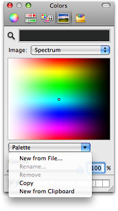
A command pop-down menu is similar to a pull-down menu, but it appears within a window rather than in the menu bar. A command pop-down menu presents a list of commands that affect the containing window’s contents. For example, the Colors window (shown in Figure 15-45) contains a menu with commands that can be used to change the contents of the Colors window itself. (If your application uses the Colors window, don’t create your own menu with these same commands; see “Fonts Window and Colors Window” for more information on the Colors window.)

Command Pop-Down Menu Usage
Use a command pop-down menu only when the containing window is shared among multiple windows or applications and the menu contains commands that affect the window’s contents. For example, the Colors window (shown in Figure 15-45) can be used in any application. The items in its command pop-down menu allow users to make new palettes of colors available in the Colors window (the open command pop-down menu in the Colors window is shown in Figure 15-46).
Command pop-down menus should contain between 3 and 12 commands. The items in a command pop-down menu do not have to be mutually exclusive.
Command Pop-Down Menu Contents and Labeling
Command pop-down menus do not require an introductory label. A closed command pop-down menu always displays the same text, which acts as the menu title. This is in contrast to a closed pop-up menu, which displays the currently selected item.
Command pop-down menus contain a single, downward-pointing arrow and may display check marks to the left of all currently active selections.
Command Pop-Down Menu Specifications
The specifications for command pop-down menus are the same as those for pop-up menus; see “Pop-Up Menu Specifications” for the appropriate metrics. Figure 15-47 shows how the command pop-down menu text is positioned.
Command Pop-Down Implementation
You can use Interface Builder to create a command pop-down menu: select an NSPopUpButton object and change its type to Pull Down in the Attributes pane of the inspector. To create a command pop-down menu using Application Kit programming interfaces, use the NSPopUpButton class.
Sliders
A slider lets users choose from a continuous range of allowable values. For example, Energy Saver preferences (shown in Figure 15-48) provides two sliders that allow users to specify when the computer and the display should sleep.

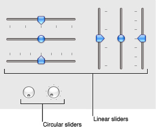
Sliders can be linear (as shown in Figure 15-48) or circular, as shown in Figure 15-49. Typically, users can spin circular sliders in either direction and through the point between the beginning and ending values.
Slider Usage
Sliders support live feedback (live dragging), so they’re especially useful when you want users to be able to see the effects of moving a slider in real time. For example, users can watch the size of Dock icons change as they move the Dock Size slider in Dock preferences.
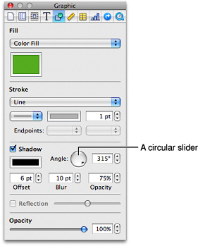
To decide whether a slider should be linear or circular (and, if linear, whether it should be horizontal or vertical), examine the user’s mental model of the task your application performs and try to meet their expectations of similar real-world controls. (You can learn more about the user’s mental model in “Reflect the User’s Mental Model.”) For example, the circular slider in Figure 15-49 allows users to choose the angle of the drop shadow displayed for an object. The circular slider not only displays the full range of values (0 to 360 degrees) in a compact way, it also mirrors the placement of the drop shadow itself as it is displayed on different sides of the object.
On the other hand, a linear slider is appropriate in Energy Saver preferences (shown in Figure 15-48) because the values range from very small (the screen saver should start after 3 minutes) to very large (the screen saver should never start) and do not increase at consistent intervals. In this case, a linear slider brings to mind a number line that stretches from the origin to infinity.
You can display tick marks with both linear and circular sliders. In general, you should display tick marks when it’s important for users to understand the scale of the measurements or when users need to be able to select specific values. If, on the other hand, users don’t need to be aware of the specific values the slider passes through (as in the Dock size and magnification preferences, for example), you might choose to display a slider without tick marks.
Slider Contents and Labeling
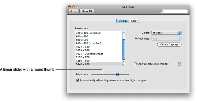
The movable part of a linear slider is called the thumb. The thumb can be either directional or round. The directional thumb is especially useful for sliders with tick marks, because the point of the thumb helps show users the current value (see Figure 15-48 for examples of directional slider thumbs). However, you can also display a directional-thumb slider without tick marks. The round thumb is recommended for sliders that don’t display tick marks, because the rounded lower edge of the thumb does not appear to point to a specific value. (If you use Interface Builder to create a slider, note that specifying any nonzero number of tick marks automatically changes a round thumb to a directional one.) Figure 15-50 shows an example of slider with a round thumb.
A circular slider displays a small circular dimple that provides the same functionality as the thumb of a linear slider: Users drag the dimple clockwise or counter-clockwise to change the values.
If you want to display tick marks with a slider, be sure to label at least the starting and ending values. You can do this using numbers or words, depending on what the values represent. If each tick mark represents an equal fraction of the entire range, it may not be necessary to label each one. However, if users can’t deduce the value of each tick mark from its position in the range, you probably should label each one to prevent confusion. For example, it’s important to label some of the interior tick marks in Energy Saver preferences (shown in Figure 15-48), because the intervals do not all represent an equal amount of time. In addition, it’s a good idea to set the context for a slider with an introductory label so users know what they’re changing. Figure 15-51 shows both types of sliders, with and without tick marks.
Slider Control Specifications
Control sizes: Linear sliders are available in regular, small, and mini sizes. Circular sliders are available in regular and small sizes. The dimensions of sliders are fixed for each size and type, but the inclusion of tick marks changes the effective size of the control. These measurements are stated below to help you with your layout.
Height of horizontally positioned linear sliders:
Regular size, directional thumb: 19 pixels without tick marks, 25 pixels with tick marks.
Regular size, round thumb: 15 pixels.
Small, directional thumb: 14 pixels without tick marks, 19 pixels with tick marks.
Small, round thumb: 12 pixels.
Mini, directional thumb: 11 pixels without tick marks, 17 pixels with tick marks.
Mini, round thumb: 10 pixels.
Width of vertically positioned linear sliders:
Regular size, directional thumb: 18 pixels without tick marks, 24 pixels with tick marks.
Regular size, round thumb: 15 pixels.
Small, directional thumb: 14 pixels without tick marks, 19 pixels with tick marks.
Small, round thumb: 11 pixels.
Mini, directional thumb: 11 pixels without tick marks, 17 pixels with tick marks.
Mini, round thumb: 10 pixels.
Diameter of circular sliders:
Regular size with tick marks: 32 pixels.
Regular size without tick marks: 24 pixels.
Small with tick marks: 22 pixels.
Small without tick marks: 18 pixels.
Label spacing and fonts: For the labels that describe the range of values, use the following font sizes:
Regular size: Label font.
Small: Label font.
Mini: 9-point label font.
Control spacing: When you display multiple linear sliders, leave the following amounts of space between them:
Slider Control Implementation
Sliders are available in Interface Builder. To create one using Application Kit programming interfaces, use the NSSlider class.
The Stepper Control (Little Arrows)
The stepper control (also known as little arrows) allows users to increment or decrement values. The control is usually used in conjunction with a text field that indicates the current value. The text field may or may not be editable. Figure 15-52 shows several examples of the stepper control.
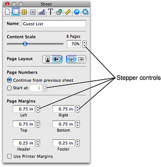
The stepper control is available in Interface Builder. To create one using Application Kit programming interfaces, use the NSStepper class.
Stepper Control Specifications
Control sizes: Stepper controls are available in regular, small, and mini sizes. The dimensions of the stepper control are fixed for each size.
Control spacing: Use the following recommended spacing between the stepper and the text field it modifies:

Placards
A placard is a small control at the bottom of a window used to display information, such as the current page number or the current magnification level.
Typically, placards are used in document windows as a way to quickly modify the view of the contents—for example, to change the current page or the magnification. The most familiar use of the placard is as a pop-up menu placed at the bottom of a window, to the left of the horizontal scroll bar, as shown in Figure 15-54.
If you need to offer a menu of commands that affect the contents of the window in ways other than magnification or number of pages per view, don’t add the commands to the placard’s menu. Instead, you should use an Action menu (see “Action Menus” for more information on Action menus).
Placards are not available in Interface Builder. To create one using Application Kit programming interfaces, subclass NSScrollView (for an example of how to do this, see the Sketch sample code located in /Developer/Examples/AppKit when the Developer package is installed). A placard is 15 pixels high and text on it should be in either the small system font or the label font.
Indicators
Indicators are controls that show users the status of something. For the most part, users don’t interact with indicators.
Important: The controls described in this section are suitable for use in the window body; they should not be used in the window-frame areas. See “Window-Frame Controls” for controls designed specifically for use in the toolbar and bottom-bar areas in your window.
Progress Indicators
Progress indicators inform users about the status of lengthy operations. (For guidelines on when to provide such information, see “Feedback and Communication.”)
Progress indicators often appear in a dialog that describes the progress of a process. When the process being performed can be interrupted, the progress dialog should contain a Cancel button (and support the Esc key). If interrupting the process will result in possible side effects, the button should say Stop instead of Cancel. To learn more about dialogs in general, see “Dialogs.” To supply a Cancel (or Stop) button, you use a push button; for more information about this control, see “Push Buttons.”
Be sure to locate progress indicators in consistent locations in your windows and dialogs. For example, the Mail application displays the asynchronous progress indicator in the far right of the To field as it finds and displays email addresses that match what the user types. Choosing a consistent location for progress indicators allows users to quickly check a familiar place for the status of an operation. See “Consistency” for more information on the importance of providing consistency in your application.
There are three types of progress indicators, each of which is suitable for a specific situation:
Determinate progress bar
Indeterminate progress bar
Asynchronous progress indicator
Determinate Progress Bars
A determinate progress bar shows users that a process is occurring and gives them a rough idea of when it will finish. For example, Figure 15-55 shows the progress indicator Software Update displays when it is checking for new software.
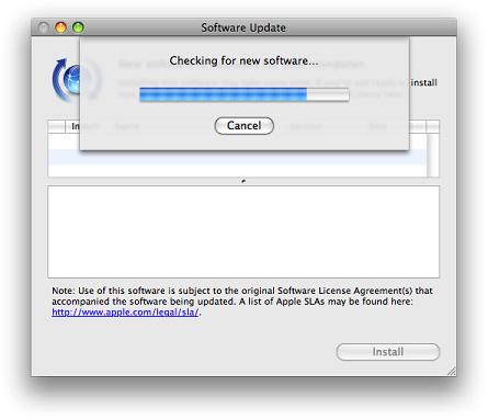
Determinate Progress Bar Usage
Use a determinate progress bar when the full length of an operation can be determined and you can tell the user how much of the process has been completed. For example, you could use a determinate progress bar to show the progress of a file conversion.
You should ensure that a determinate progress bar in your application accurately associates progress with time. A progress bar that becomes 90 percent complete in 5 seconds but takes 5 minutes for the remaining 10 percent, for example, would be annoying and lead users to think that something is wrong.
Determinate Progress Bar Contents and Labeling
In a determinate progress bar, the “fill” moves from left to right and should fill in completely before it is dismissed. The fill is provided automatically, but you can determine the minimum and maximum values that should be represented.
If necessary, you can provide a complete or partial sentence that appears as a label with a determinate progress bar in a dialog. You can do this so users understand the context in which the process is occurring. Such a label should have sentence-style capitalization (see “Capitalization of Interface Element Labels and Text” for more information on this style).
Determinate Progress Bar Specifications
Determinate progress indicators are available in regular and small sizes. The height of a determinate progress indicator is fixed for each size, but you can specify the length. Figure 15-56 shows a regular-size determinate progress bar as it looks when active and inactive.
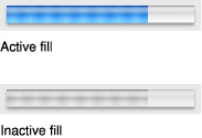
Determinate Progress Bar Implementation
Determinate progress bars are available in Interface Builder. In the Attributes pane of the inspector, select Bar for the style and deselect the Indeterminate checkbox. To create a determinate progress bar using Application Kit programming interfaces, use the NSProgressIndicator class with style NSProgressIndicatorBarStyle.
Indeterminate Progress Bars
An indeterminate progress bar shows users that processing is occurring, but does not give any indication of when it will finish. For example, Keynote displays an indeterminate progress bar as it begins opening a file, as shown in Figure 15-57.
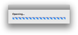
Indeterminate Progress Bar Usage
Use an indeterminate progress bar when the duration of a process can’t be determined. For example, if your application attempts to make a dial-up communication connection, you have no way to accurately determine how long it will take, so you can use an indeterminate progress indicator to let users know that processing is ongoing. If an indeterminate process reaches a point where its duration can be determined, switch to a determinate progress bar (see “Determinate Progress Bars” for more on determinate progress bars).
Indeterminate progress bars work best in a dialog or window that focuses on the occurring process. For example, the indeterminate progress bar Keynote displays is in a dialog that is focused solely on the opening of the file (this dialog is shown in Figure 15-57). If you need to provide an indication of an indeterminate process that’s associated with a part of a window, such as a control, or if space is limited, consider using an asynchronous progress indicator instead. (See “Asynchronous Progress Indicators” for more information on asynchronous progress indicators.)
Indeterminate Progress Bar Contents and Labeling
An indeterminate progress bar displays a spinning striped cylinder to indicate an ongoing process. Mac OS X provides this appearance automatically.
If necessary, you can provide a complete or partial sentence that appears as a label with an indeterminate progress bar in a dialog. You can do this so users know what process is occurring. Such a label should have sentence-style capitalization (see “Capitalization of Interface Element Labels and Text” for more information on this style). Also, you can end the label with an ellipsis (...) to emphasize the ongoing nature of the processing.
Indeterminate Progress Bar Specifications
Indeterminate progress bars are available in regular and small sizes. The height of an indeterminate progress bar is fixed for each size, but you can specify the length. Figure 15-58 shows both regular-size and small indeterminate progress bars as they look when active and inactive.
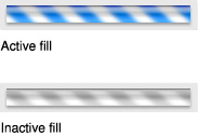
Indeterminate Progress Bar Implementation
Indeterminate progress bars are available in Interface Builder. In the Attributes pane of the inspector, select Bar for the style and be sure the Indeterminate checkbox is selected. To create an indeterminate progress bar using Application Kit programming interfaces, use the NSProgressIndicator class with style NSProgressIndicatorBarStyle.
Asynchronous Progress Indicators
An asynchronous progress indicator shows users that processing is occurring but does not give any indication of when the process will finish. For example, Mail briefly displays an asynchronous progress indicator in the To: field of a New Message window while it performs a search on the name the user types, as shown in Figure 15-59.
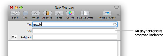
Asynchronous Progress Indicator Usage
Use an asynchronous progress indicator when space is very constrained, such as in a text field or near a control. Because this indicator is small and unobtrusive, it is especially useful for asynchronous events that take place in the background, such as retrieving messages from a server.
Don’t use the asynchronous progress indicator in operations that start out indeterminate but could become determinate, because the determinate progress indicator is a different shape and takes up much more space. If the process might change from indeterminate to determinate, use an indeterminate progress bar instead of an asynchronous progress indicator, because it is the same shape and size as the determinate progress bar. (See “Indeterminate Progress Bars” for more information about indeterminate progress bars.)
Asynchronous Progress Indicator Contents and Labeling
Because an asynchronous progress indicator typically appears when the user initiates a process, a label may not be necessary. If you decide to provide a label that appears with the indicator, create a complete or partial sentence that briefly describes the process that is occurring.
If you decide to provide a label that appears with an asynchronous progress indicator, be sure to use sentence-style capitalization (see “Capitalization of Interface Element Labels and Text” for more information on this style). Also, you can end the label with an ellipsis (...) to emphasize the ongoing nature of the processing.
Asynchronous Progress Indicator Specifications
The appearance of the asynchronous progress indicator is provided automatically, but you can choose the size that fits best in your window layout. Asynchronous progress indicators are available in regular, small, and mini sizes. Figure 15-60 shows a regular-size asynchronous progress indicator.

Asynchronous Progress Indicator Implementation
Asynchronous progress indicators are available in Interface Builder. In the Attributes pane of the inspector, select Spinning for the style and be sure the Indeterminate checkbox is selected. To create an asynchronous progress indicator using Application Kit programming interfaces, use the NSProgressIndicator class with style NSProgressIndicatorSpinningStyle.
Level Indicators
A level indicator provides graphical information about the level or amount of something. Level indicators can be configured to display different colors to warn users when values are reaching critical levels.
There are three styles of level indicator:
Capacity
Rating
Relevancy
Capacity Indicators
A capacity indicator, as its name suggests, provides graphical information about the current state of something that has a finite capacity, such as storage space or battery charge. There are two styles of capacity indicator, continuous and discrete. A continuous capacity indicator is a translucent track that is filled with a colored bar that indicates the current value. For example, Figure 15-61 shows a continuous capacity indicator that represents how much space has been used (and how much space is left) in the user’s mail account.
Figure 15-61 A continuous capacity indicator shows a fine-grained representation of current capacity
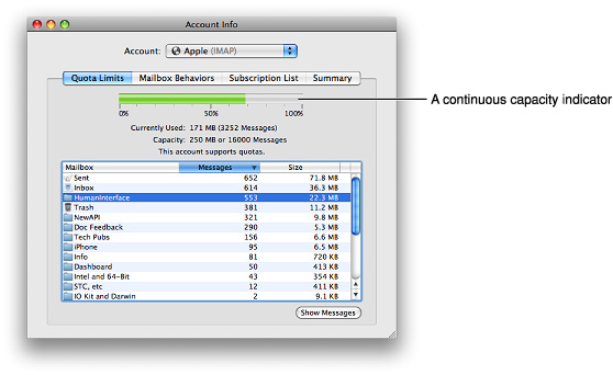
A discrete capacity indicator is a row of separate, rectangular segments equal in number to the maximum value set for the control. Figure 15-62 shows a discrete capacity indicator that represents the battery charge in a Bluetooth mouse.
Figure 15-62 A discrete capacity indicator shows a medium-grained representation of current capacity
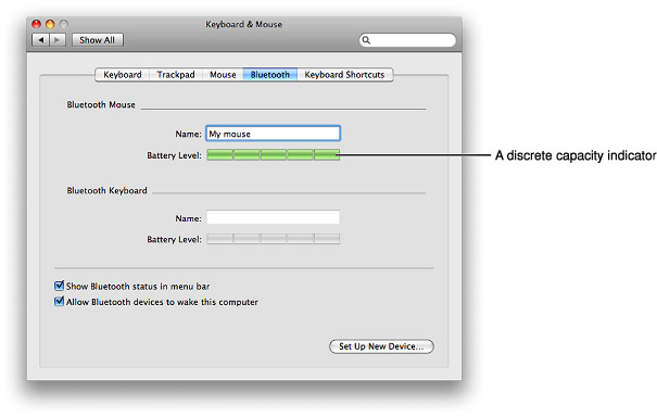
Capacity Indicator Usage
Use a capacity indicator to provide information about the level or amount of something that has well defined minimum and maximum values. You can configure a capacity indicator to display a different color fill when the current value enters a warning or critical range that you define (for more on this, see “Capacity Indicator Contents and Labeling”). Because capacity indicators provide a clear, easily understood picture of a current state, they’re especially useful in dialogs and preferences windows that users tend to view briefly.
Note that the discrete capacity indicator displays the current value rounded to the nearest integer, and the segments are stretched or shrunk to a uniform width to fit the specified length of the control. This means that the segments in the discrete capacity indicator are either completely filled or empty, never partially filled. This makes a discrete capacity indicator better for showing coarser-grained values than a continuous capacity indicator.
Capacity Indicator Contents and Labeling
The default color of the fill in both capacity indicator styles is green. If you define a value for a warning level, the fill color changes to yellow when it reaches that value. If you define a value for a critical level, the fill color changes to red when it reaches that value.
You can specify which end of the indicator is critical (red) by setting appropriate values. If you define a critical value that is greater than the warning value, the fill is green at values less than the warning level, yellow between the warning and critical levels, and red above the critical level. This orientation is useful if you need to display a warning when a capacity is approaching the maximum value, such as the limit of storage space.
If you define a critical value that is less than the warning value, the fill is red below the critical value, yellow between the critical and warning values, and green above the warning value (up to the maximum). This orientation is useful if you need to warn the user when a capacity is approaching the minimum value, such as the end of battery charge.
For example, Figure 15-63 shows different states of a continuous capacity indicator. Below it, Figure 15-64 shows different states of a discrete capacity indicator.
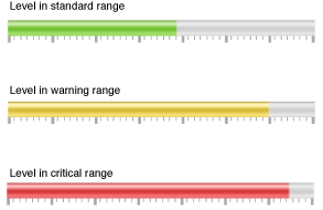
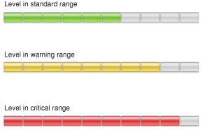
Both continuous and discrete capacity indicators allow the display of tick marks above or below the indicator control to give context to the level shown by the fill. However, only the continuous capacity indicator should display the tick marks because the number and width of the segments in the discrete capacity indicator provide similar context, making tick marks redundant. If you find that you need to display very small segments in a discrete capacity indicator to appropriately represent the scale of values, you might want to use a continuous capacity indicator instead.
You should label at least the first and last tick marks to define the scale of the control and provide context for the user.
Capacity Indicator Specifications
Control sizes: Both styles of capacity indicators are available in regular size only (the bar or segment has a height of 16 pixels), but you determine the horizontal width of the control. Note that as you stretch a discrete level indicator, the number of segments remains constant, but the width of each segment stretches accordingly.
Label spacing and fonts: If you want to provide labels for tick marks in a continuous capacity indicator, use the label font (see “Fonts” for more information about this font). These labels should be placed 3 pixels below the lower edge of the tick marks.
Capacity Indicator Implementation
Continuous and discrete capacity indicators are available in Interface Builder. You can change the style from discrete to continuous in the Attributes pane of the inspector. To create one using Application Kit programming interfaces, use the NSLevelIndicator class with style NSDiscreteCapacityLevelIndicatorStyle or NSContinuousCapacityLevelIndicatorStyle.
Rating Indicators
A rating indicator displays a number of stars that corresponds to the rating of something. For example, Figure 15-65 shows the rating a user assigned an item in iTunes.
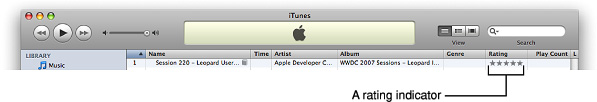
Figure 15-66 shows rating indicators displaying different values.
Rating Indicator Usage
Use a rating indicator to provide a graphic representation of the rating of an object. Because a rating indicator conveys the ranking of one item relative to all other items in a category, such as favorite images or most-visited webpages, it’s most useful in a list or table view that contains many items.
You might want to allow the user to set ranking criteria (perhaps in a preferences window) that you use to determine what rating should be displayed for each item as it appears. Or, you can make a rating indicator editable so the user can increase or decrease the ranking of an item in a table or list.
Rating Indicator Contents and Labeling
By default, the rating indicator displays stars, but you can supply a custom image to replace the stars. Although this section assumes that the rating indicator displays stars, the information applies equally to an image you supply.
A rating indicator does not display partial stars. Instead, it rounds the current value to the nearest integer to display only whole stars. The stars in a rating indicator are not expanded or shrunk to fit the specified length of the control and no space is added between them.
Rating Indicator Implementation
Rating indicators are available in Interface Builder. Start with a discrete level indicator object and change its style to Rating in the Attributes pane of the inspector. To create one using Application Kit programming interfaces, use the NSLevelIndicator class with style NSRatingLevelIndicatorStyle.
Relevance Indicators
A relevance indicator is a style of level indicator that displays the relevance of items, such as search results. For example, Preview uses relevance indicators to show users the relevance of search results, as shown in Figure 15-67.
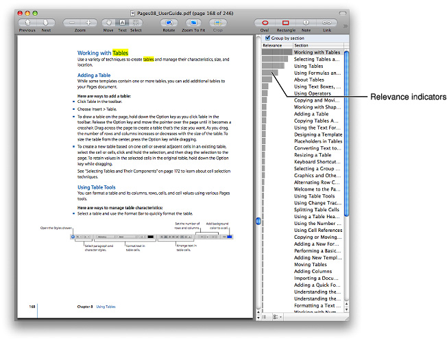
Some of the states a relevance indicator can display are shown in Figure 15-68.
Relevance indicators are especially useful as part of a list or table view. This is because relevance as a quantity is easier for users to understand when it is shown in comparison with the relevance of several items.
Relevance indicators are available in Interface Builder. Start with a discrete level indicator and change its style to Relevancy in the Attributes pane of the inspector. To create one using Application Kit programming interfaces, use the NSLevelIndicator class with style NSRelevancyLevelIndicatorStyle.
Text Controls
This section describes controls that either display text or accept text as input. The combination box, which includes a text input field, is not covered in this section; see “Combination Boxes” for information about combination boxes.
Important: The controls described in this section are suitable for use in the window body; they should not be used in the window-frame areas. The single exception is the search field, which can also be used in a toolbar. See “Window-Frame Controls” for controls designed specifically for use in the toolbar and bottom-bar areas in your window.
Static Text Fields
Use a static text field for informational text (text not intended to be modified by users) in a dialog or window. Static text fields have two states: active and dimmed.
When it provides an obvious user benefit, static text should be selectable. For example, a user should be able to copy an error message, a serial number, or an IP address to paste elsewhere. Figure 15-69 shows several examples of static text used to give information to users.

Static text fields in various standard fonts are available in Interface Builder. You can use system font, small system font, or mini system font, depending on the layout of your window. To create a static text field using Application Kit programming interfaces, use the NSTextField class.
Text Input Fields
A text input field, also called an editable text field, is a rectangular area in which the user enters text or modifies existing text. The text input field can be active or disabled. It supports keyboard focus and password entry. For example, iTunes preferences allows the user to specify a library name for sharing, as shown in Figure 15-70.
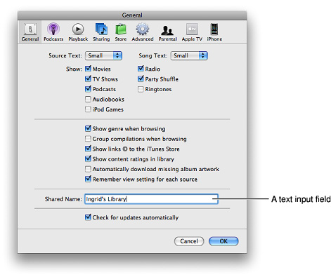
Be sure to use a combination box control when you want a text input field combined with a menu or list of choices; don’t try to create one by putting a text input field and a menu together. See “Combination Boxes” for more information about combination boxes.
Text Input Field Usage
Use a text input field when you need to get information from the user. When you receive user input, be sure to perform appropriate edit checks. For example, if the only legitimate value for a field is a string of digits, an application should issue an alert if the user types characters other than digits. In most cases, the appropriate time to check the data in the field is when the user clicks outside the field or presses the Return, Enter, or Tab key.
Text Input Field Contents and Labeling
A text input field contains user-supplied text in a system font that is appropriate for the size of the control. In addition, a text input field can contain a token field control, which displays the user input in the form of a draggable token (see “Token Fields” for more information on tokens).
It’s a good idea to display an introductory label with a text input field to help users understand what type of information they should enter. Generally, these labels should have title-style capitalization (see “Capitalization of Interface Element Labels and Text” for more information on this style).
Text Input Field Specifications
Control sizes: Text input fields are available in regular, small, and mini sizes. The height is fixed for each size, but you decide how long to make the control. In general, try to ensure that the length of the text input field comfortably accommodates the average length of the expected input. In addition, if you display multiple text input fields in a window, be sure they all have the same length. The height of each size of text input field is listed below (Figure 15-71 shows a regular-size text input field in different states):
Regular size: 22 pixels high.
Small: 19 pixels high.
Mini: 15 pixels high.
Label spacing and fonts: The introductory label for a text input field should be in a font that is proportional to the size of the control. In addition, the space between the introductory label and the input field should be consistent. Use the following metrics when you use a text input field in your window layout:
Regular size: Use system font for the introductory label. Leave 8 pixels between the end of the introductory label (the colon) and the left edge of the text input field.
Small: Use small system font for the introductory label. Leave 6 pixels between the end of the introductory label (the colon) and the left edge of the text input field.
Mini: Use mini system font for the introductory label. Leave 5 pixels between the end of the introductory label (the colon) and the left edge of the text input field.
For more information about highlighting selections in text fields, see “Keyboard Focus and Navigation” and “Selections in Text.”
Control spacing: If you want to use more than one text input field in a window, you need to leave enough space between them so users can easily see which input field belongs with each introductory label. If you need to position more than one text input field at the same height (that is, in a horizontal line), be sure to leave plenty of space between the end of one text field and the introductory label of the next. Typically, however, multiple text input fields are stacked vertically, as in a form users fill out. When you position text input fields in a vertical stack, be sure to leave the following amounts of space between them:
Regular size: At least 10 pixels.
Small: At least 8 pixels.
Mini: At least 8 pixels.
Text Input Field Implementation
Text input fields are available in Interface Builder. To create one using Application Kit programming interfaces, use the NSTextField class.
Token Fields
A token field is a control that creates a token out of input text. The token field control supports behavior similar to that of the address field in the Mail application.
Figure 15-72 shows various states of the token field control (no contextual menu support is shown).
Token Field Usage
Use a token field control in a text input field (see “Text Input Fields” for more information about text input fields). As the user types in the text input field, the token field control invokes text completion after a delay you specify. When the user types the comma character or presses Return, the preceding text input is transformed into a token.
A token is draggable and, if you add code to support a menu, displays a disclosure triangle that reveals a contextual menu when the user presses or clicks it. In this menu, you might offer more information about the token and ways to manipulate it. In Mail, for example, the token menu displays information about the token (the email address associated with the name) and items that allow the user to edit the token or add its associated information to Address Book, as shown in Figure 15-73.
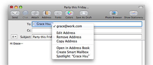
Token Field Specifications
Control sizes: Token field controls fit inside the standard sizes of text input fields. The heights of token field controls are fixed for each size, and their lengths are determined by the length of the token. The height of a token field control is a few pixels less than the height of the text input field that contains it:
Regular size: 16 pixels high.
Small: 14 pixels high.
Mini: 11 pixels high.
Token Field Implementation
Token field controls are available in Interface Builder. To create one using Application Kit programming interfaces, use the NSTokenField class.
Search Fields
A search field is a text field with rounded ends in which the user enters new text or modifies existing text that identifies items to search for. For example, the Finder provides a search field in its toolbar, as shown in Figure 15-74. For information on ways to provide search functionality in your application, see “Spotlight” and “Scope Bars.”
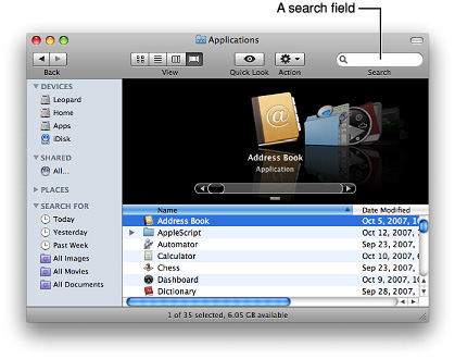
Important: A search field is one of the three window-body controls that can also be used in a window-frame area. To learn more about controls that are designed specifically for use in window-frame areas, see “Window-Frame Controls.”
Search Field Usage
Use a search field to allow users to search for terms within your application. A search field supports keyboard focus, so if searching is important in your application, provide the keyboard shortcut Command-Option-F, which allows users to navigate to a search field without using the mouse.
Depending on how you implement searching functionality in your application, you can specify a search field that begins searching as soon as the user starts typing, or that begins the search when the user presses Return or Enter.
Search Field Contents and Labeling
By default, a search field displays the magnifying icon at its left edge. A search field can also contain an icon the user clicks to stop the search or clear the field. It’s appropriate to use this icon if the user has to click a button or press a key to initiate the search, especially if the search might take more than a second or two. If you use this icon, consider displaying a progress indicator for lengthy searches. The magnifying glass and stop-search icons are supplied automatically.
A search field can include a menu that allows users to view a history of recent searches. However, if you provide this functionality you should consider not providing it by default; you should also allow users to turn it off for privacy reasons. If you need to allow users to choose different types of searches or define the context or scope of a search, consider providing a scope bar in your window (see “Scope Bars” for more information).
A search field does not need an introductory label because users recognize this control (and the magnifying glass icon) from elsewhere in Mac OS X. If you place a search field in a toolbar, however, you should supply the label “Search” to be displayed when users customize the toolbar to show icons and text or text only.
Search Field Specifications
Control sizes: Search fields are available in regular and small sizes. The height of a search field is fixed for its size, but you decide how long the control should be. The heights for each size of search field are listed below (Figure 15-75 shows a regular-size search field):
Regular size: 22 pixels high.
Small: 19 pixels high.
Search Field Implementation
Search field controls are available in Interface Builder. To create one using Application Kit programming interfaces, use the NSSearchField class.
Scrolling Lists
A scrolling list is a list that uses scroll bars to reveal its contents. Users can scroll through the list without selecting anything, click an item to select it, use Shift-click to select more than one contiguous item, or use Command-click for a discontinuous selection. Users can press the arrow keys to navigate through the list and can quickly select an item by typing the first few characters. You can see this behavior in a Finder window, when the Finder is in column-view mode. Each Finder-window column behaves as a scrolling list, as shown in Figure 15-81.
Scrolling List Usage
Use a scrolling list when you need to display an arbitrarily large number of items from which users can choose. Although scrolling lists aren’t directly editable, you can provide editing functionality that allows users to provide list items you feed into the list.
Don’t use a scrolling list to provide choices in a limited range. This is because a scrolling list might not display all items at once, which can make it difficult for users to grasp the scope of their choices. If you need to display a limited range of choices, a pop-up menu (described in “Pop-Up Menus”) might be a better choice.
Scrolling List Contents and Labeling
A scrolling list can get its contents from items you supply or from users. If an item is too long to fit in the list box, insert an ellipsis in the middle and preserve the beginning and end of the item. Users often add version numbers to the end of document names, so both the beginning and end should be visible.
The background of a scrolling list can be white or white striped with blue. If the list contains a large number of items that can look similar at a glance, it might be easier for users to view them on a striped background.
In most cases, it’s a good idea to provide an introductory label for a scrolling list so users understand the types of items that are available to them. Use the regular system font for this label. The list items should be in view font (12-point Lucida Grande Regular), by default.
Scrolling List Specifications
Control sizes: You determine the size of a scrolling list. As a rule of thumb, make sure that the list displays only the full height of lines of text (don’t cut text off horizontally), and make sure that the scrolling increment is one list element.
Scrolling List Implementation
Scrolling lists are available in Interface Builder. Start with a table view object and ensure that it is sized so that only the vertical scroller is displayed. Then, in the Attributes pane of the inspector, set the number of columns to 1 and deselect the Headers checkbox. To create a scrolling list using Application Kit programming interfaces, use the NSTableView class.
View Controls
The controls described in this section allow users to modify how information is presented to them in a window. Some view controls allow you to provide additional information or functionality that remains hidden until users choose to see it, and others give you a frame for organizing and displaying data, such as a list.
Important: The controls described in this section are suitable for use in the window body; they should not be used in the window-frame areas. See “Window-Frame Controls” for controls designed specifically for use in the toolbar and bottom-bar areas in your window.
Disclosure Triangles
A disclosure triangle allows the display, or disclosure, of information or functionality associated with the primary information in a window. For example, in a System Preferences authentication dialog (shown in Figure 15-76) a disclosure triangle reveals details that most users don’t often choose to see.
Disclosure Triangle Usage
Use a disclosure triangle when you want to provide a simple default view of something but need to allow the user to view more details or perform additional actions at times. Specifically, you can use a disclosure triangles in either of the two following ways:
To reveal more information in dialogs that have a minimal state and an expanded state. See Figure 15-76 for an example of a disclosure triangle in a dialog.
To reveal subordinate items in a hierarchical list. See Figure 15-80 for an example of a disclosure triangle in a hierarchical list.
Don’t use a disclosure triangle to display additional choices associated with a specific control, such as a pop-up menu. If you need to do this, use a disclosure button (see “Disclosure Buttons”).
Disclosure Triangle Contents and Labeling
Disclosure triangles should be in the closed position (that is, pointing to the right) by default. When the user clicks a disclosure triangle, it points down and the additional information is displayed.
Disclosure triangles in dialogs should have a label indicating what is disclosed or hidden. Ideally, the label changes depending on the position of the disclosure triangle. For example, when closed it might say, “Show advanced settings,” and when open, “Hide advanced settings.”
Disclosure Triangle Specifications
Control sizes: Disclosure triangles are available in a single size, 13 x 13 pixels, as shown in Figure 15-77.
Disclosure Triangle Implementation
Disclosure triangles are available in Interface Builder. To create one using Application Kit programming interfaces, use NSButton and set the bezel style to NSDisclosureBezelStyle and the button type to NSPushOnPushOffButton.
Disclosure Buttons
A disclosure button expands a dialog or panel to offer the user a wider range of choices related to a specific selection control, such as a pop-up menu, combination box, or command pop-down menu. For example, the minimal Save dialog (shown in Figure 14-57) uses a pop-up menu to provide the user with a list of standard and recently accessed locations in which to save a file. To get a wider range of choices, the user clicks the disclosure button, which puts the file system at the user’s fingertips without requiring the user to leave the context of the Save dialog. An example of the expanded Save dialog is shown in Figure 15-78.
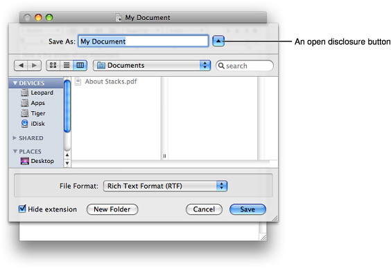
Disclosure Button Usage
Use a disclosure button when you need to provide additional options that are closely related to a specific list of choices. If you need to display additional information or functionality related to the contents of a window or a section of a window, or if you need a way to reveal subordinate items in a hierarchical list, use a disclosure triangle instead. See “Disclosure Triangles” for more information on this control.
Disclosure Button Contents and Labeling
Because a disclosure button is closely associated with a control, it does not need a label. By default, disclosure buttons should be in the closed position, that is, pointing down. When the user clicks a disclosure button, the window expands and the disclosure button changes to point up.
Disclosure Button Specifications
Control sizes: A disclosure button should be aligned with the pop-up menu or other list-based selection control (such as a command pop-down menu) it affects. In addition, the disclosure button should be close enough to the associated control to clearly indicate a relationship between them.
Disclosure Button Implementation
Disclosure buttons are available in Interface Builder. To create one using Application Kit programming interfaces, use NSButton and set the bezel style to NSRoundedDisclosureBezelStyle and the button type to NSPushOnPushOffButton.
List Views
A list view displays ordered records in a table in which users can resize, rearrange, and sometimes add and subtract, columns representing attributes of the data. A list view displays the entire set of objects in the leftmost column, including objects that may be contained in other objects if the data is hierarchically organized. When users reveal hidden objects in a hierarchy, the list lengthens. The other columns may shift to the right when these hidden objects are revealed, but they do not change their headings or order, because they still contain the same types of information regardless of the number of objects listed. Figure 15-79 shows an example of a list view that displays a flat list of objects (a hierarchical list of objects is shown in Figure 15-80).
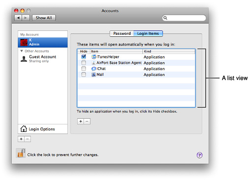
List View Usage
Use a list view when you need to display items along with various attributes of each item. If you need to display a list of items, but you don’t need to display any additional attributes, you might want to use a scrolling list instead (see “Scrolling Lists” for more information about scrolling lists). Using a list view, you can create a column for each attribute you need to display.
Sort the rows in the list view by the selected column heading. You can implement sorting on secondary attributes behind the scenes, but the user should see only one column selected at a time. If a user clicks an already selected column heading, change the direction of the sort.
Items may be editable depending on the purpose of your application. In the Finder, for example, items in the Name column (the leftmost column) are editable when in list view, but nothing else is.
List View Contents and Labeling
List views can contain disclosure triangles to reveal a list hierarchy, but only in one column. Column headers should be nouns or short noun phrases that describe an attribute of the data. Figure 15-80 shows an example of the Finder list view that includes disclosure triangles to reveal additional levels of hierarchy and short, clear column headers.
List views can contain icons in addition to text. Usually, however, the icons in a list view are an integral part of the data items (such as the folder and document icons in Figure 15-80). In general, it’s best to include an attributes column and use text to describe the attributes.
List View Implementation
List views are available in Interface Builder. To create a simple list view using Application Kit programming interfaces, use the NSTableView class. To get disclosure triangles in a list, use an NSOutlineView object in column format.
Column Views
A column view provides a way for users to view and select items from an organized hierarchy of data. When users click an object in one column, its contents (its descendants in the hierarchy) are revealed in a column to the right. Each column displays only those objects that are descendants of the item selected in the previous column. If the item selected in the previous column has no descendants, the column to the right might display details about the item.
Columns in a column view are usually resizable. In addition, a column view includes a vertical scroll bar between each pair of columns and a horizontal scroll bar along the bottom of all columns. A good example of a column view is the column-view mode of the Finder, shown in Figure 15-81.
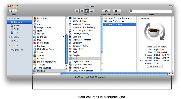
Column View Usage
Use a column view when there is only one way the data can be sorted or when you want to present only one way of sorting the data. A column view is also useful for displaying a deep hierarchy, such as a file system, where users frequently move back and forth among multiple levels.
When you use a column view to display a hierarchy, be sure to display the first level of the hierarchy (the root level) in the leftmost column. As users select items, the focus moves to the right, displaying either the child objects at that node or, if there are no more children, the terminal object (a leaf node in the hierarchy). When the user selects a terminal object, you can display additional information about it in the rightmost column.
Column View Contents and Labeling
Column views do not display disclosure triangles. The triangle displayed to the right of an item is merely an indicator that means the item contains other objects (to reveal those objects, users click anywhere on the item’s row).
Columns in column views do not have headings, because a column view does not behave like a table. A column in a column view contains the objects that exist at a particular node in the hierarchy, it does not contain an attribute of every object in the hierarchy.
Although a column view does not require a label, it can be helpful to display the current position in the hierarchy in a way that’s easy for users to see at a glance. The Finder does this by using the name of the parent object as the title of the window. For example, in Figure 15-81, the title of the window (Java) is the name of the currently selected item’s parent.
Column views can contain icons in addition to text. Usually, however, the icons in a column view are an integral part of the data items (such as the folder and application icons shown in Figure 15-81).
Column View Implementation
Column views are available in Interface Builder. To create one using Application Kit programming interfaces, use the NSBrowser class or an NSOutlineView object in column format.
Split Views
A split view groups together two or more other views, such as column or list views, and allows the user to adjust the relative width or height of those views. A split view includes a splitter bar, or splitter, between each of its subviews; for example, a split view with five subviews would have four splitters.
Note: In Mac OS X v10.5 and later, the standard splitter bar is known as a “zero-width” splitter. This splitter is actually 1 pixel wide and, as with wider splitter bars, the pointer changes to one of the move or resize cursors when hovering over it, depending on which direction the splitter can move (see “Standard Cursors” for more information on different cursor styles).
A wider splitter bar (9 pixels in width) is also available, but not as frequently used.Figure 15-82 shows the splitter between the source list and the content view in iCal and the way the pointer looks when hovering over it. (For more information on source lists, see “Source Lists.”)
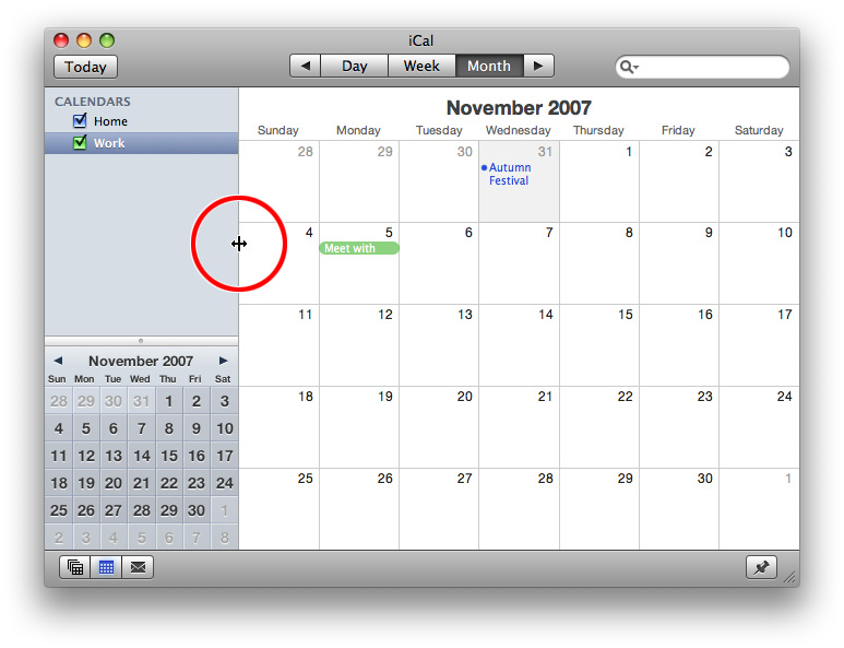
Split View Usage
Use a split view when you want to display two or more different content views that the user can resize. A single split view does not display a combination of vertically and horizontally oriented subviews. However, a single window might contain different split views that each display a different orientation. For an example of how this might look, see the Automator window shown in Figure 15-83.
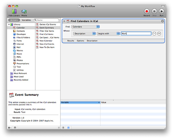
Users can adjust the relative widths or heights of the subviews in a split view by dragging anywhere on the splitter. The wide splitter bar displays a circular dimple at its midpoint that indicates to the user that it is draggable. For both zero-width and wide splitters, the entire splitter bar is a hot zone. In other words, when the pointer passes over any part of the splitter, the cursor changes to one of the move or resize cursors. For zero-width splitters, the hot zone includes two pixels on both sides of the splitter.
If a user drags a wide splitter bar all the way to the edge of the split view (or to the next splitter bar), the subview should disappear but the splitter bar should not. The splitter bar should remain in view to remind the user where the hidden subview is and to make it easier for the user to uncover it. However, a zero-width splitter bar does not remain visible when the user drags it far enough to hide the subview. For this reason, you can define minimum and maximum sizes for subviews so users can’t lose the splitter. Alternatively, if you want to allow users to completely hide a subview by dragging a zero-width splitter, you should provide a button that re-opens the subview.
Split View Specifications
Control sizes: Split views are available with a horizontal splitter (the views are stacked one above another) or a vertical splitter (the views are side by side), and splitters can be either zero-width (1 pixel wide) or “thick” (9 pixels wide).
Split View Implementation
Split views are available in Interface Builder. Specify the splitter width by selecting Thick divider or Thin divider from the Style pop-up menu in the Attributes pane of the inspector. To create one using Application Kit programming interfaces, use the NSSplitView class (note that the splitter bars are horizontal by default).
Tab Views
A tab view provides a convenient way to present information in a multipane format. The tab control is displayed horizontally centered across the top edge of a content area. Users click a tab to see the content associated with it. For example, QuickTime preferences provides five tabs, each of which displays a group of preference settings, as shown in Figure 15-84.

Tab View Usage
Use a tab view when you want to present a small number of different content views in one place within a window. Depending on the size of the window, you can create a tab view that contains between two and about six tabs.
The content area below a tab is called a pane, and each tab is attached to a specific pane. Within a pane, provide controls and information that affect only the objects contained in the pane, not objects in the rest of the window or in other panes.
You can position a tab view in two different ways (see “Tab View Specifications” for examples of these styles):
Extend the side and bottom edges of the tab view to the window edges, so there is no window-body area visible to the sides or below the tab view.
Use this style when you want the contents of the entire window-body area below the tab control to be managed by the tabs.
Inset the tab view in the window, so that a margin of window-body area is visible on all sides of the tab view.
Use this style when you want to be able to provide controls that affect the entire window, not just the current pane. (The global controls should be in the window-body area below the tab view; see “Tab View Specifications” for layout guidelines for this style.)
Iif you have too many tabs to fit into a window properly it’s acceptable, although not highly recommended, to use instead a pop-up menu to change the contents of a group box (Figure 15-87 shows how this looks). Another alternative to a tab view is a segmented control, which also provides a way to switch among panes. A segmented control looks similar to a tab view, but it is not attached to the panes (see “Segmented Controls” for more information about segmented controls).
Tab View Contents and Labeling
Each tab requires a label that describes the contents of the attached pane. Nouns or very short noun phrases are generally best, although a verb (or short verb phrase) might make sense in some contexts. Tab labels should have title-style capitalization (see “Capitalization of Interface Element Labels and Text” for more information on this style).
Within a pane, you can use standard window-body controls, such as push buttons, checkboxes, sliders, and text fields. You can also provide icons and information displayed as static text fields, when necessary.
Tab View Specifications
Control sizes: Tab views are available in regular, small, and mini sizes. The tab height is fixed for each size, but you control the size of the pane area. The tab heights for each size are listed below:
Regular size: 20 pixels.
Small: 17 pixels.
Mini: 15 pixels.
Label spacing and fonts: The tab labels should be in a font that’s proportional to the size of the tab view control. In addition, the label should be placed so that there are equal margins of space before and after it. The guidelines below provide the specifications you should use for tab labels:
Regular size: System font. Center in tab, leaving 12 pixels on each side.
Small: Small system font. Center in tab, leaving 10 pixels on each side.
Mini: Mini system font. Center in tab, leaving 8 pixels on each side.
Control spacing: Whether you decide to inset a tab view in a window or extend its edges to the window sides and bottom, you should place the top edge of the tab view 12 or 14 pixels below the bottom edge of the title bar (or toolbar, if there is one). If you choose to inset a tab view in a window, you should leave a margin of 20 pixels between the sides and bottom of the tab view and the sides and bottom of the window (although 16 pixels is also an acceptable margin-width). If you need to provide controls below the tab view, leave enough space below the tab view so the controls are 20 pixels above the bottom edge of the window and 12 pixels between the tab view and the controls. Figure 15-85 shows how an inset tab view should look.
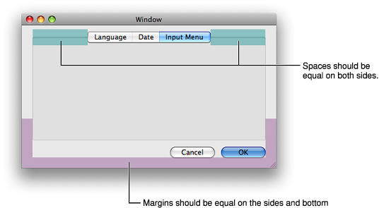
If you choose to extend the tab view sides and bottom so that they meet the window sides and bottom, you should leave a margin of at least 20 pixels between the content in the tab view and the tab-view edges. Figure 15-86 shows how this should look.
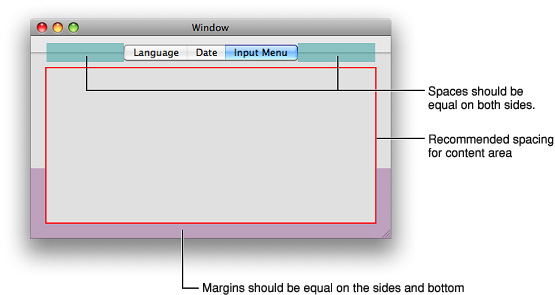
If you need to use a pop-up menu at the top of a group box (because, for example, you have too many tabs to fit in the window), be sure to center the control along the top of the group box, as shown in Figure 15-87:
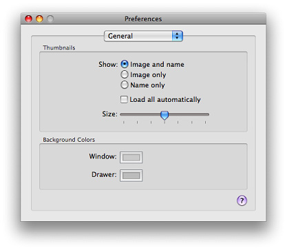
Tab View Implementation
Tab views are available in Interface Builder. To create one using Application Kit programming interfaces, use the NSTabView class.
Grouping Controls
This section describes controls that visually group other controls in a window. When there is more than one logical collection of controls and information in a window, the use of grouping controls helps users distinguish between them.
There are two types of grouping controls in Mac OS X: separators and group boxes. For help in deciding whether to use a group box or a separator, and for examples of layouts with them, see “Grouping Controls in a Window Body.”
Important: The controls described in this section are suitable for use in the window body; they should not be used in the window-frame areas. See “Window-Frame Controls” for controls designed specifically for use in the toolbar and bottom-bar areas in your window.
Separators
A separator is a thin vertical or horizontal line. Separators have a lightweight appearance that’s good for separating controls into categories or subgroups of related functionality. For example, the Appearance preferences pane (shown in Figure 15-88) provides controls that determine a wide range of high-level appearance characteristics, such as highlight color and the placement of scroll arrows. Although each control affects some aspect of the Mac OS X appearance, the window uses separators to create four subgroups of related controls.
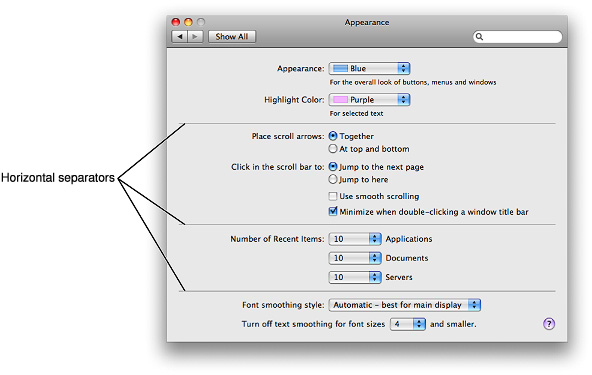
Separator Usage
Use a separator to divide a window body into distinct visual parts. You can place separators either vertically or horizontally, depending on the overall layout of your window.
Note: The separator control is not used in a toolbar; the vertical separator you can see in a toolbar is an NSToolbarSeparatorItem object (which is available in Interface Builder).
In general, you should avoid stretching a separator to span the entire width or height of a window; a separator that spans a window can give the appearance of slicing a window into unrelated rows or columns. If the categories of content in your window are completely unrelated, and it might be confusing to see all categories simultaneously, it might be better to display each category in a pane of a tab view instead (see “Tab Views” for more information about using a tab view).
Separator Labeling
A label can accompany a separator, but it is not required. A separator label should have title-style capitalization (see “Capitalization of Interface Element Labels and Text” for information on this style).
The separator line should be at the base of the text of the label. Figure 15-62 shows how this looks.
Separator Specifications
Control sizes: Separators are available in a single thickness, but you determine their length. Figure 15-89 shows a vertical and a horizontal separator.
Label spacing and fonts: Separator labels should be in a font that corresponds to the controls in the window. Specifically, separator labels should use:
System font, when other controls are regular size.
Small system font, when other controls are small.
Mini system font, when other controls are mini.
Separator labels should be 2 pixels from the beginning of the separator control.
Control spacing: Separators should be at least 10 pixels away from other controls. Both ends of a separator should be an equal distance from the window edges. If you use more than one separator in a window, be sure every separator with the same orientation (vertical or horizontal) is the same length.
Separator Implementation
Separators are available in Interface Builder. To create one using Application Kit programming interfaces, use the NSBox class.
Group Boxes
A group box, like a separator (described in “Separators”), is used to break a window into distinct logical areas. A group box has a heavier look than a separator, which means that it provides a more pronounced differentiation of content. For example, the Expose pane in Expose & Spaces preferences uses group boxes to separate screen-corner functionality from keyboard and mouse shortcuts, as shown in Figure 15-90.
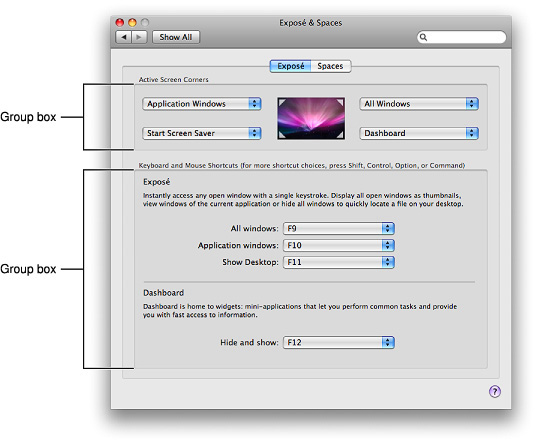
Group Box Usage
Use a group box when you want users to understand logical groupings of controls in a window. You can use group boxes in the window-body area, including within tab-view panes.
Although group boxes are very useful for separating logical collections of content, avoid nesting them when possible; nested group boxes use a lot of space, and it can be difficult to perceive individual boundaries when group boxes are nested too deeply. Instead, consider using a separator or white space to group content within a group box. (See “Separators” for more information on using separators; see “Grouping with White Space” for guidance on using white space.) Strive to place roughly equal numbers of controls in each group box in a window, to create a visually balanced appearance.
Group Box Contents and Labeling
Group boxes can be untitled or titled. If titled, they may have text-only titles, checkbox titles, or pop-up menu titles. If the group box uses a checkbox title, the items in the group box should be active only when the checkbox is selected.
Group box titles should have sentence-style capitalization. See “Capitalization of Interface Element Labels and Text” for more information on this style.
Group Box Specifications
Control sizes: There are no standard sizes for group boxes; you control the size of the boundaries based on the needs of your window. As you place a group box in your window, be sure to follow the spacing recommendations described below.
Label spacing and fonts: Group box titles can use different font sizes, depending on the size of the rest of the controls and text in your window:
Regular size: System font
Small: Small system font
Mini: Mini system font
Control spacing: Leave at least 20 pixels from the edge of the group box to the edge of the window. Nesting group boxes isn’t recommended, because it wastes space. However, if you decide to nest group boxes, see “A Tabbed Window” for some spacing guidelines.
Group Box Implementation
Group boxes are available in Interface Builder. To create one using Application Kit programming interfaces, use the NSBox class.
© 1992, 2001-2003, 2008 Apple Inc. All Rights Reserved. (Last updated: 2008-06-09)