Layout Guidelines
This chapter contains guidelines that help you lay out windows and alerts. In most cases, these guidelines do not dictate exact pixel measurements you must use, but instead describe the fundamental Aqua layout principles of center equalization, text and control alignment, appropriate use of white space, and visual balance. When you follow these guidelines, you create functional, aesthetically pleasing windows that are easy for Macintosh users to understand and use.
As you design the layout of your window, be sure to observe the principle of consistency in the decisions you make (for more on this human interface design principle, see “Consistency”). In particular, if you have a good reason to bend some of the layout guidelines, be sure you do it in a consistent way. People tend to ignore symmetry and balance, but notice inconsistency. When there is inconsistency in a window users not only notice it, but often assume that there is a functional reason for the difference. To avoid misleading users, therefore, be sure that any inconsistencies in your window are there because you want to call attention to an element in the window.
Inconsistencies in a window can also lead users to conclude that the window was merely poorly designed. For example, users probably won’t notice if the margins inside your window edges are 18 pixels wide (instead of the typically recommended 20 pixels), but they are likely to notice if the left margin is wider than the right one.
The easiest way to ensure that your windows are attractive and consistent is to use Interface Builder to design your layout. When you do this, you can take advantage of the Aqua guides that show you most of the spacing recommended in this chapter (see Interface Builder User Guide for help using Interface Builder).
In this section:
Positioning Regular-Size Controls in a Window Body
Positioning Small and Mini Controls in a Window Body
Grouping Controls in a Window Body
Positioning Text and Controls in a Bottom Bar
Positioning Regular-Size Controls in a Window Body
Although there are many ways to arrange controls in a given window, there are guidelines you should follow so that your application has the clean, balanced Aqua look. This section provides examples of properly designed windows and alerts that use regular-size controls. For guidelines on the use of mini and small controls, see “Positioning Small and Mini Controls in a Window Body.” Although some of the guidelines presented in this section are specific to the examples shown, most are general guidelines that are applicable to all windows.
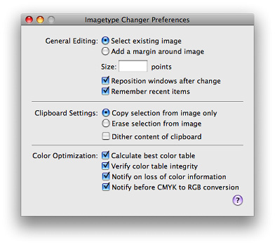
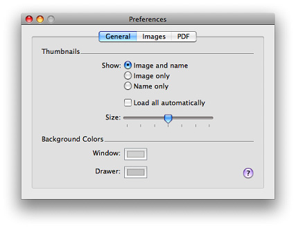
A Simple Preferences Window
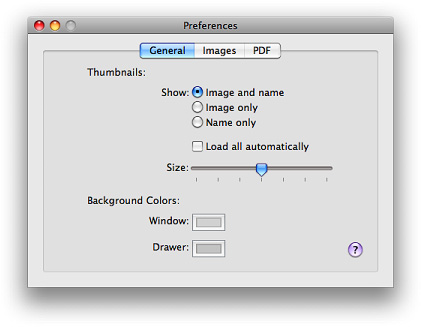
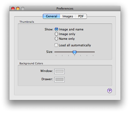
Figure 16-1 shows a very simple preferences window. Note that an application with more extensive preferences probably would use a toolbar in the preferences window to provide access to different categories of preferences (see, for example, Figure 14-54).
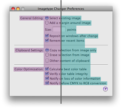
This window provides a good example of a center-equalized layout. Center equalization simply means that the visual weight is balanced on the right and left side of the content area. It does not mean center justification, where the left and right sides of an imaginary vertical line drawn through the center of a window contain exactly the same number of items or characters.
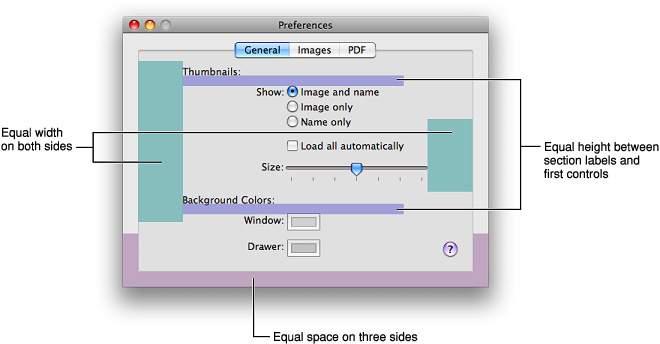
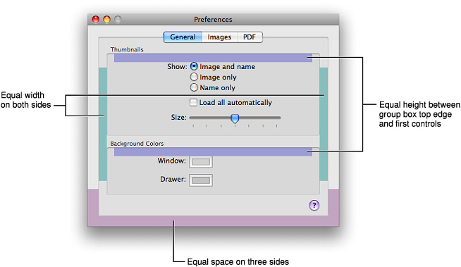
In Mac OS X, content should always be center-equalized in windows and panes. The shading in Figure 16-2 highlights this equalization. Notice that although the right side of the vertical line has more objects, it is balanced by the category labels on the left. The net result is a visually balanced window.
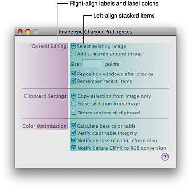
When labels and controls are stacked in a group, they should line up with each other vertically. When controls are vertically aligned, it helps users see at a glance that the controls are similar in importance and that one control does not depend on another. Of course, if there is a hierarchy of controls in your window and, for example, one control depends on another, you can indent the subordinate control to show its relationship to the control on which it depends. (See Figure 15-24 for an example of interdependent checkboxes.)
Figure 16-3 shows the vertical alignment of controls and labels in a window. Note that the colons for the main category labels are right-aligned, whereas the checkboxes and radio buttons are left-aligned. Right-alignment of the labels makes it easier to see the relationship between each label and the controls it describes.
In addition to ensuring that your content is center-equalized and appropriately aligned, it’s also important to use proper spacing in your window. Appropriate spacing not only makes a window look attractive and well-designed, but also makes it much easier for users to understand and use. When the margins inside the window edges and the spaces between user interface elements are adequate and consistent it helps to show the relationships between groups of controls and the overall flow of the window. For more examples of using white space appropriately, see “Grouping with White Space.”
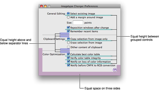
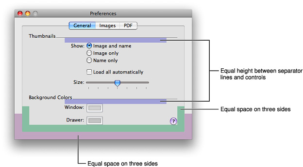
The preferences window used as an example in this section uses white space in a consistent way. For example, in Figure 16-4 you can see:
The same amount of space above and below each horizontal separator (the window in Figure 16-4 uses 12 pixels above and below each horizontal separator).
Equal margins on both sides and the bottom edge of the window (the window in Figure 16-4 uses a 20-pixel margin in these areas).
The same amount of space between individual controls (the window in Figure 16-4 uses 8 pixels between individual controls).
For the recommended spacing between members in a set of controls, such as between each radio button in a radio-button group, see the section that describes that control.
In addition, the window in Figure 16-4 uses a 14-pixel margin between the top controls and the bottom edge of the title bar (this margin would be the same width if the window contained a toolbar). Also, the controls in the main part of the window are separated from the Help button at the lower edge of the window by an 18-pixel space (a space of at least 16 pixels is recommended).
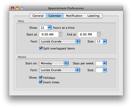
A Tabbed Window
A tabbed window, like the one shown in Figure 16-5 follows the same general guidelines as those outlined in “A Simple Preferences Window.” However, it illustrates another implementation of many of the same basic guidelines you’ve seen so far, along with some new guidelines.
Center-equalization is again evident in Figure 16-6. The overall effect of the window is a balance between the visual weight of the controls on one side of the invisible center axis with the weight of the controls on the other side. The controls are also collectively balanced within each group box so that the distance from the farthest control on each side of the group box is the same for both the right and left sides.
Also as shown in Figure 16-6, always center a tab view within a window.
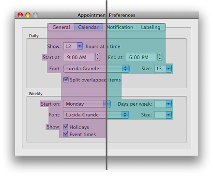
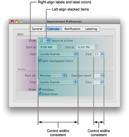
Figure 16-7 illustrates a few guidelines about control placement:
The colons for stacked labels are right-aligned.
Stacked controls are left-aligned when appropriate.
Similar controls have consistent widths. For example, the sizes of the Font pop-up menus and the Size combo boxes are the same in each group box.
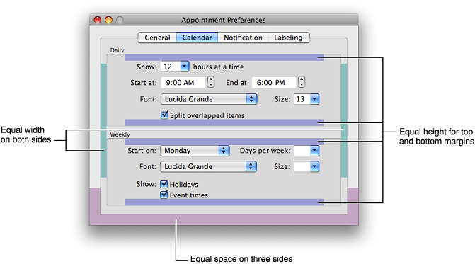
Like the simple preferences window example in “A Simple Preferences Window,” the tabbed window shown in this section uses white space in a consistent way. For example, in Figure 16-8, you can see:
Equal margins between the sides of the group boxes and the tab-pane side edges (the window in Figure 16-8 uses a 16-pixel margin in these areas).
Equal margins between the sides and bottom of the tab pane and the window edges (the window in Figure 16-8 uses a 20-pixel margin in these areas).
In both group boxes, the same amount of space between the bottom control and the lower edge of the group box, and the same amount of space between the top control and the upper edge of the group box. (The window in Figure 16-8 uses a 16-pixel margin between the bottom controls in each group box and the lower edge of the group box, and a 10-pixel margin between the top controls in each group box and the upper edge of the group box.)
In addition, the window in Figure 16-8 uses a 12-pixel margin between the top of the tab bar to the bottom of the title bar (see “Tab Views” for more information about tab views). Note that this margin would be the same width if the window included a toolbar.
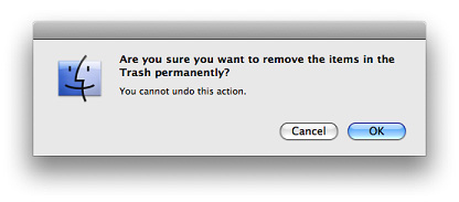
A Standard Alert
A standard alert is shown in Figure 16-9.
Although the standard alerts take care of the general layout for you, there are a few details you are responsible for:
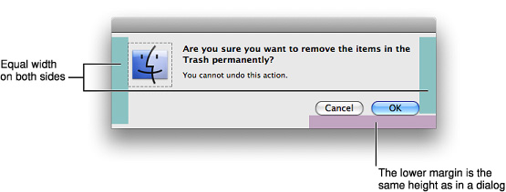
Make sure that the application icon you use in the alert is 64 x 64 pixels.
Make sure to include both the main message text and the informative text. An alert with only message text is not a complete alert and typically is not very useful to the user.
Always put the action button in the bottom-right corner of the alert. This is the button that completes the action that the user initiated before the alert was displayed. Remember that the action button is not always the default button as it is in this example (the default button has color and pulses and receives a click when the user presses Return or Enter). In situations where clicking the action button can have dangerous consequences (such as data loss) the default button can be Cancel, but when this is the case it should not be located in the action button position.
Alerts look best when the margin at the bottom edge is the same height as in other windows (for example, in Figure 16-10, this margin is 20 pixels). In addition, you should ensure that there is an equal amount of space in the margins at the sides. The standard alert shown in Figure 16-10 uses a 24-pixel wide margin at the sides of the window.
See “The Elements of an Alert” for more details on designing alerts.
Positioning Small and Mini Controls in a Window Body
Use smaller versions of controls only when necessary. Your first choice in designing for Aqua should always be to use the regular-size controls.
You can use the smaller versions of controls when space is at a premium, such as in tool panels, other types of panels, or Automator actions (for more information on Automator, see “Automator”). Avoid mixing different sizes of controls in the same window. In a window with a multiple panes, it is acceptable to use small or mini controls within the pane and standard controls outside the pane. However, all panes of a window should use controls of the same size.
Layout Example for Small Controls
Figure 16-11 shows a well designed panel with small controls.
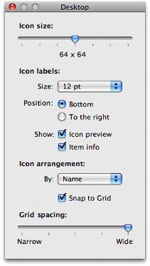
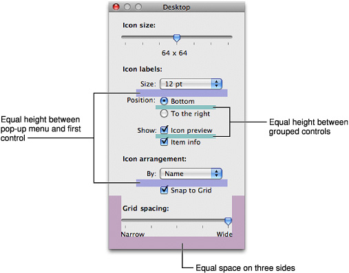
As you do when using regular-size controls, you should use the center-equalized approach to laying out small controls. This visually balanced layout can be seen in Figure 16-12.
Small controls, like regular-size controls, should be aligned vertically when stacked. In addition, similar controls should have consistent widths and be aligned with each other, as shown in Figure 16-13.
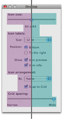
Consistent use of white space is as important in windows with small controls as it is in windows with regular-size controls. For example, in Figure 16-14, you can see:
Equal margins at the window sides and bottom edge (the window in Figure 16-14 uses 20-pixel margins in these areas). Note that if you use group boxes in a panel with small controls, a narrower margin (such as 10 pixels) is more suitable.
Equal spacing between groups of controls (the window in Figure 16-14 uses 12 pixels in these areas).
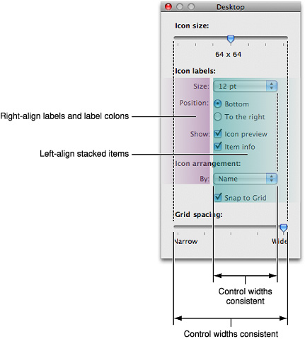
Equal spacing between section labels and the first control in the section (the window in Figure 16-14 uses 8 pixels between the label of a control section, such as “Icon labels,” and the first control in that section).
In addition, the panel shown in Figure 16-14 uses a 14-pixel margin between the title bar and the top item in the window. To save space while creating distinct sections of controls, the example window uses bold font to label each section, instead of using horizontal separators or group boxes.
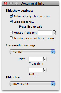
Layout Example for Mini Controls
Figure 16-15 shows a well designed panel with mini controls. As you can see, this window observes the principles of center equalization, text and control alignment, and visual balance. In particular, notice that:
Stacked controls are left-aligned.
Similar controls have the same width.
The overall layout is center-equalized and visually balanced.
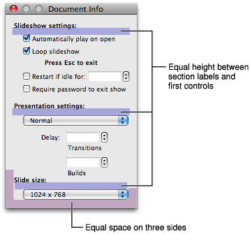
In addition, the panel uses white space in a consistent way. For example, in Figure 16-16, you can see:
Equal margins at the window sides and bottom edge (the window in Figure 16-16 uses 20-pixel margins in these areas).
Equal spacing between groups of controls (the window in Figure 16-16 uses 12 pixels in these areas).
Equal spacing between section labels and the first control in the section (the window in Figure 16-16 uses 8 pixels between the label of a control section, such as “Slideshow settings,” and the first control in that section).
In addition, the panel shown in Figure 16-16 uses a 10-pixel margin between the title bar and the top item in the window. To save space while creating distinct sections of controls, the example window uses bold font to label each section, instead of using horizontal separators or group boxes.
Grouping Controls in a Window Body
Grouping related controls helps users understand what particular controls do and helps them locate the controls that affect the specific actions they want to perform. This section provides examples of different ways to group controls.
The three examples show different ways to group the same set of controls within a tabbed window using three grouping elements:
White space, shown in Figure 16-18
Separators, shown in Figure 16-20
Group boxes, shown in Figure 16-21
Note that none of these examples are more or less correct than any other. The effectiveness of a layout in your application depends on the overall aesthetic of your other windows as well as your application’s workflow.
Grouping with White Space
White space is an especially useful grouping element when you are dealing with small groups of controls.
Grouping with Separators
Separators provide a very efficient use of space and are most useful when space is at a premium.
Grouping with Group Boxes
Group boxes provide the strongest visual indication of distinct groups but require the most space within the window.
Positioning Text and Controls in a Bottom Bar
As described in “Bottom Bars,” a bottom bar is a part of the window frame that extends below the content in the window body. Controls in a bottom bar are frequently used, but not as frequently used as controls in a toolbar. In addition, bottom-bar controls are closely related to the content in the view directly above them.
To create a bottom bar, leave a strip of window frame below the content view in the window body. To do this using Interface Builder, select a Textured Window object from the Library. You need to use this object, not the Window object, because it displays the window-frame surface from top to bottom.
Place the appropriate content view in the new window and size the content view so that its bottom edge does not reach the bottom edge of the window. (Note that windows do not expose any window-frame surface at the sides of the content view in Mac OS X v10.5 and later; see “Window Appearance” for more information.) The strip of window frame visible below the content view should be:
32 pixels high, if you plan to use regular size controls
22 pixels high, if you plan to use small size controls
The layout guidelines for bottom bars focus on visual balance and consistent spacing. Note that the guidelines for both regular-size and small controls recommend fewer pixels above the control than below it. This is because precisely centering controls in a bottom bar makes them too close to the bottom edge and decreases the sense of visual balance.
If you want to use regular-size controls in a bottom bar, use the following layout guidelines (illustrated in Figure 16-23):

All controls should be 3 pixels from the top edge of the bottom bar.
Leave a consistent amount of space between individual controls or sets of controls. (The bottom bar in Figure 16-23 uses 8 pixels between controls.)
Leave a margin between the left edge of the bottom bar and the leftmost control. It works well to leave a margin that measures the same as the space you leave between controls (the bottom bar in Figure 16-23 uses 8 pixels in this area).
The text baseline should be 18 pixels below the top edge of the bottom bar.
If the window contains a source list and there are controls that relate to the content view controlled by the source list, left-align those controls with the splitter of the source list.
If you want to use small controls in a bottom bar, use the following layout guidelines (illustrated in Figure 16-24):
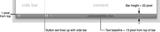
All controls should be 1 pixel from the top edge of the bottom bar.
Place the leftmost control 8 pixels from the left edge of the bottom bar.
Leave 8 pixels between controls.
The text baseline should be 13 pixels below the top edge of the bottom bar.
If the window contains a source list and there are controls that relate to the content view controlled by the source list, left-align those controls with the splitter of the source list.
© 1992, 2001-2003, 2008 Apple Inc. All Rights Reserved. (Last updated: 2008-06-09)